 Brixmor Logo PNG
Neighborhood shopping centers bring together supermarkets, pharmacies, and service outlets, allowing people to take care of everyday needs in one place. Such facilities generate a steady flow of visitors through regular shopping and proximity to residential neighborhoods. The Brixmor logo is associated with a company that owns and operates shopping centers in the US, focused on residents’ everyday needs.
Brixmor Property Group traces its history to the Australian company Centro Properties Group, which invested in US retail real estate since the late 1990s. In 2003, Centro created the Watt division. By 2007, it managed more than seven hundred shopping centers in the United States. The 2007 financial crisis led the company to default on debts totaling about 1.3 billion Australian dollars. Large-scale restructuring followed.
In 2011, the American investment fund Blackstone Group acquired the Centro Watt portfolio for $ 9.4 billion. From this, Brixmor Property Group was created. In 2012, the company expanded its assets by acquiring an additional 46 centers from Centro. By 2013, the company had 500 properties. In October 2013, the company went public on the New York Stock Exchange at $20 per share. The company’s total valuation was about $ 7.2 billion.
At the time of the listing, Brixmor owned 522 shopping centers in thirty-eight US states. The properties covered 87 million square feet. In 2014 and 2015, the company invested hundreds of millions of dollars in upgrades and renovations. After the Blackstone fund exited in 2016, Brixmor began optimizing its portfolio. It sold less profitable centers and shifted its focus to key markets.
In 2017 and 2018, the company revised its tenant structure, focusing on promising segments. These included grocery chains, restaurants, fitness, and healthcare. In 2019, the company sold about thirty centers.
In 2022, Brixmor expanded its presence in Texas and Florida. The company began integrating residential projects into shopping complexes. In 2023, the company announced a $300 million redevelopment program. In 2024, it completed pilot projects and added more than 1,000 residential units.
The company manages about 380 shopping centers totaling 65 million square feet. It continues to develop the mixed-use format and strengthen its position in the US retail real estate market.
Meaning and History
What is Brixmor?
An American real estate investment trust based in New York, operating in the suburban shopping center segment. The company’s portfolio includes 365 complexes totaling about 6.2 million square meters across 39 states. Major tenants include supermarket chains Kroger, Publix, Albertsons, Giant Food, and Whole Foods, which ensure a stable flow of visitors.
before 2011
Centro’s American business began in late 2003. Australia’s Centro Properties Group and Watt Commercial Realty formed Centro Watt to invest in US retail real estate. The portfolio grew through acquisitions, including Kramont Realty Trust. Centro purchased its partner’s stake in 2007 and renamed the division Centro Properties Group US.
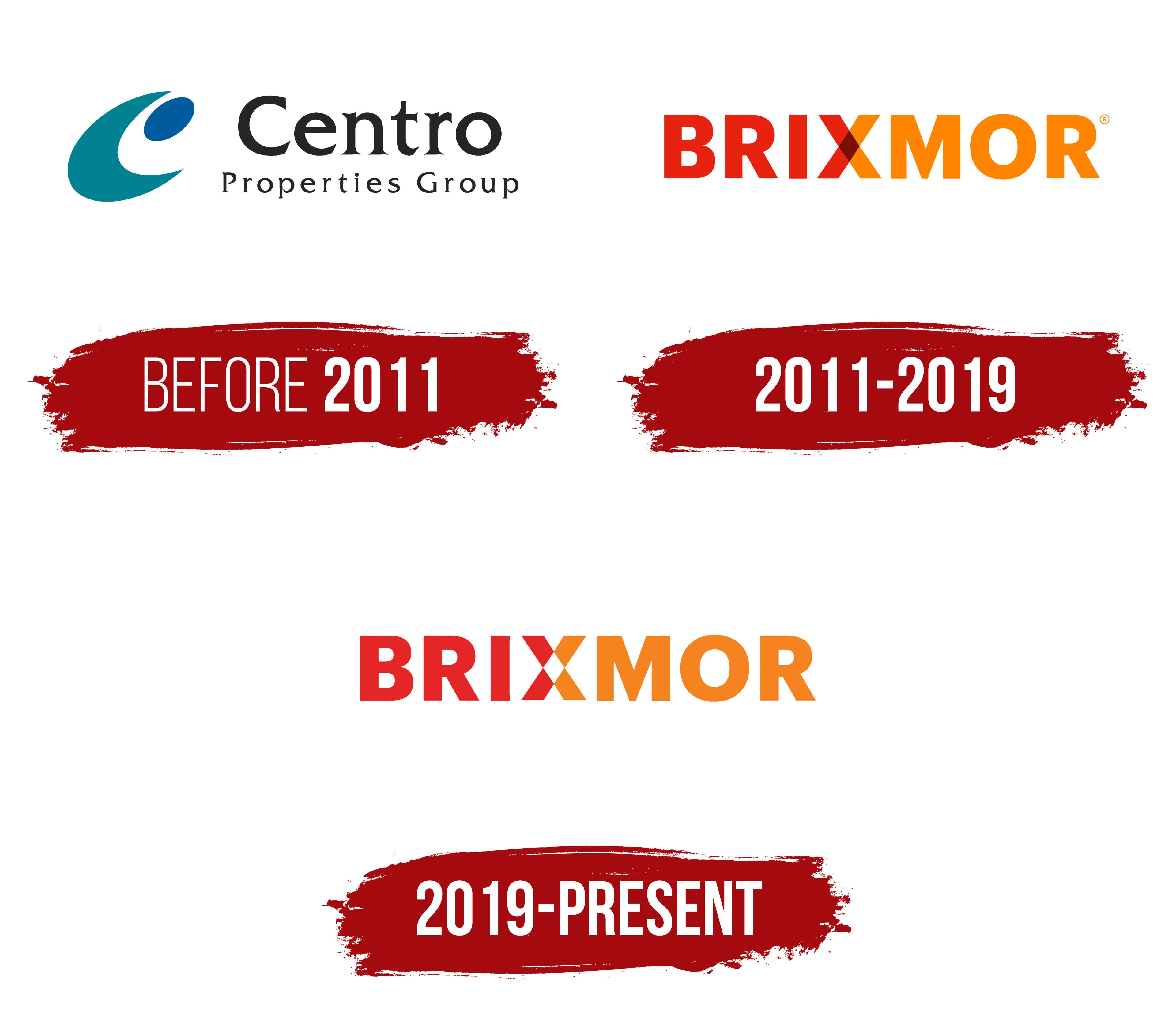
Following the structural change, the American shopping properties continued operating under the parent group’s name. The project did not introduce a separate name for the US division. Centro Properties Group represented the company in communications with tenants, investors, and business partners. The logo combined a turquoise-blue emblem on the left with the full corporate name on the right.
The emblem centered on a large curved figure resembling the “C” in Centro. Its broad turquoise outline had smooth rounded edges and an opening on the right. The open area inside contained a second colored element, making the initial letter the foundation of the composition.
A small dark blue oval appeared in the upper-right area. Its position was offset from the center, and its color differed from the turquoise foundation. The combination of the large “C” outline and oval created a compact emblem for documents, signs, and shopping center materials.
Centro Properties Group occupied 2 lines. Centro appeared on top in a larger size. Its initial “C” was uppercase, while the remaining letters were lowercase. Properties Group appeared below in a smaller size and used expanded spacing to extend across the width.
Both lines used a dark color close to black. The name appeared in a serif typeface. Its letterforms resembled Trajan and Times, though the available information does not identify the exact typeface. The lower line used a lighter weight. Differences in size, weight, and letter spacing gave Centro prominence.
The horizontal arrangement kept the emblem and full name within one block. The turquoise “C” served as a shortened identifier for Centro, while the blue oval introduced a second color. The 2-line wordmark showed the American properties’ affiliation with the international group.
Blackstone Real Estate Partners VI acquired the American company in 2011. Following the transaction, the business adopted the Brixmor name, separating the retail real estate portfolio from Centro Properties Group. The Centro identity represented the US division until the name change, after which the properties operated under the Brixmor brand.
2011 – 2019
The American company Centro Properties Group adopted the Brixmor name and a new corporate identity on September 28, 2011. The renaming followed Blackstone Real Estate Partners VI’s acquisition of the business. The new brand separated the shopping center portfolio from Australia’s Centro Properties Group and reflected the ownership change.
Company employees participated in the naming process. During a 5-day internal competition, they submitted 1,120 proposals. Christine Shields, vice president of corporate operations, submitted the winning entry. Her proposed name entered use with the new logo.
Information from the International Council of Shopping Centers connects Brixmor with the English expression “bricks and mortar.” The phrase refers to businesses operating from physical locations and relates to tangible retail real estate. The name combined shortened sections of bricks and mortar. Its 7-letter form retained parts of both words and joined them into a compact commercial name.
During the presentation, executive Michael Carroll explained the name through the business’s physical foundation. Shopping properties were presented as real spaces where the interests of property owners met the needs of tenants. The interpretation corresponded with the company’s work managing a large American portfolio of shopping centers.
Denver agency Monigle Associates developed the logo. BRIXMOR appeared in uppercase sans-serif letters. The heavy characters had angular contours, consistent stroke thickness, and tight spacing. The geometric style kept all 7 letters within one horizontal line and worked across signs, documents, and shopping center materials.
Color divided the name into BRI and MOR. The first 3 letters were bright red, while the last 3 were orange. The “X” between them was connected with both sections. Its left diagonal continued the red half, while the right diagonal transitioned into orange. The color division passed through the letter, uniting the abbreviated forms of bricks and mortar.
A small burgundy-brown diamond formed at the intersection of the “X” diagonals. It represented the area where red and orange mixed, separating the intersecting lines. The letter remained part of the name while serving as a visual device connecting BRI and MOR into one wordmark. Typography communicated the name’s origin through form and color.
Before the renaming, the American assets used a turquoise-blue emblem and the 2-line Centro Properties Group signature. After the Blackstone acquisition, they replaced it with the red-and-orange BRIXMOR wordmark. The new identity presented the company to tenants, investors, and business partners under a name connected with retail real estate.
2019 – today
After James Taylor became CEO, Brixmor Property Group Inc. commissioned Karnes Coffey Design to update its identity. The project launched in early 2019 and retained the foundation of the 2011 logo. The agency’s assignment was to develop the existing brand into a comprehensive system of guidelines for corporate communications.
The project covered the logo, typography, photography, illustration, and supporting forms. The client wanted to unify all parts of the identity while preserving continuity with the previous version. The project team included creative director Christine Coffey, strategy and copy specialist Jo Watson, designer Addie Johnson, photography art director Carolyn McGeorge, and illustrator Bizhan Khodabandeh.
BRIXMOR remained the logo’s foundation. The name used uppercase sans-serif letters. The heavy characters retained their angular contours and consistent stroke thickness but became more streamlined. The proportions changed only slightly, allowing tenants, investors, and business partners to continue recognizing the established name and its red-and-orange combination.
The color division continued to explain the name’s origin in the expression “bricks and mortar.” BRI and the left side of the “X” appeared in red. The right side of the “X” and MOR remained orange. The “X” joined the shortened forms of the 2 words at the center of the name.
The primary revision affected the construction of the “X.” Karnes Coffey Design built the letter from 4 triangular sections directed toward the center. The burgundy-brown diamond from the 2011 version gave way to a white opening. The red and orange sections received separate contours, leaving their intersection open.
The white opening formed a small diamond and defined the boundaries between the 4 sections. The left half continued the red BRI section, while the right joined the orange MOR section. The interior diagonals turned the “X” into an independent emblem intended for compact applications.
The “X” geometry continued throughout the corporate materials. Its triangular sections formed an arrow, a repeating pattern, and the outline of a speech bubble. All forms originated from one letter and remained connected to the full logo. The system allowed designers to create different materials using elements from the Brixmor brand.
The update included an expanded color range, photography guidelines, and a unified typographic system. Karnes Coffey Design chose a warm, welcoming tone tied to the role shopping centers play in local communities. The new system entered use across Brixmor Property Group Inc. materials in early 2019.