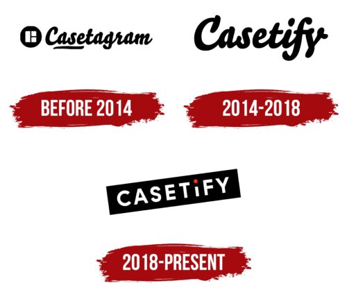
The Casetify logo symbolizes creativity, individuality, and technology, reflecting the brand’s desire to offer stylish and functional accessories for modern gadgets. The design conveys simplicity and versatility, highlighting the company’s focus on creating products that combine practicality with aesthetic appeal.
Casetify: Brand overview
The story of Casetify began in 2011 when Ronald Lee and Wesley Ng founded the company in Hong Kong. Initially called Casetagram, the company offered custom iPhone cases made from photos that users uploaded via Instagram. The idea came from Wesley Ng’s personal experience. As a photographer, Ng wanted to turn his favorite Instagram photos into a phone case but couldn’t find a suitable service. So, he decided to create one himself. Customizing phone cases with personal photos quickly resonated with consumers who wanted to personalize their devices.
The company’s launch was met with immediate success. In the rapidly growing smartphone accessory market, they offered something unique—an easy way for customers to create personalized cases using their images.
2012 marked a significant milestone when the business secured $2.5 million in investment from 500 Startups and other venture capital firms. This funding allowed the company to expand its technological platform and scale its operations. By 2013, they were broadening their product range, offering accessories for various popular smartphones and tablets, and expanding the materials and styles of their cases to cater to diverse customer preferences.
In 2014, the company rebranded itself as Casetify. This change reflected the expansion of the product line and the move beyond the initial association with Instagram. The new name also provided more flexibility for branding and marketing strategies.
The business expanded its global presence in 2015 by opening offices in Los Angeles and London to better serve customers in North America and Europe. That same year, the company launched a program for artists and designers, allowing them to create and sell their case designs through the platform.
2016 was a year of innovation. The company introduced a new printing technology that allows higher-quality and more durable graphics in its cases. A new design editor was also released, giving customers even more customization options for their cases.
By 2017, the brand began collaborating with well-known brands and celebrities, launching partnerships with Hello Kitty, Saint Laurent, and Pokémon. These collaborations attracted new customers and significantly boosted brand awareness.
2018, the company reached new heights by opening its first physical retail store in Hong Kong. This move allowed customers to interact with the products in person and create designs on the spot.
The brand continued to diversify its product range in 2019, adding screen protectors, wireless chargers, and accessories for AirPods. The company also increased its presence on social media, actively promoting its products on Instagram and other platforms.
Despite global economic challenges in 2020, the business experienced notable growth. The company enhanced its online presence and streamlined its shipping processes to adapt to changing market conditions. That year, a line of antibacterial cases was introduced in response to the growing demand for hygiene-focused products.
In 2021, the company continued collaborating with artists and brands, launching several successful collections. The business also expanded its retail presence by opening stores in major cities worldwide.
By 2022, the company will focus on technological innovation, introducing a new line of cases with enhanced drop protection using advanced materials and manufacturing techniques. It also launched a redesigned website with improved personalization options and a better user interface.
As of early 2023, the brand had established itself as a leading name in the customized mobile accessory market, continuing to expand its product offerings beyond just smartphone cases.
The company’s success illustrates how a business that began with a simple idea—customizing phone cases—grew into a globally recognized brand. Their success can be attributed to an innovative approach to product design, effective use of social media for marketing, strategic partnerships, and continuous product range expansion in response to evolving consumer demands. The brand has successfully blended the trends of fashion and personalization, making it a standout in the mobile accessory market.
Meaning and History
What is Casetify?
Based in Hong Kong, Casetify offers innovative custom design services for phone cases and electronic accessories, allowing customers to express their uniqueness through photos from Instagram and other social media. Whether it’s eye-catching collages or individual expressive photos, Casetify has quickly become the preferred choice for those looking to make a statement. Casetify was founded on October 1, 2011, by Ronald Jung and Wesley Ng, formerly called Casetagram and now operating as Casetify.
before 2014
2014 – 2018
2018 – today
The Casetify logo seems simple but contains several interesting details that make it unique. During the brand’s development, focused on producing mobile device accessories, the company aimed to stand out from competitors, and the visual identity reflected this aspiration.
The emblem’s main elements include a red dot above the letter “i” and a black rectangle serving as the background for the company name. These simple geometric details transform ordinary text into a unique symbol. The red dot symbolizes individuality, creativity, and attention to detail, which characterize the company’s approach to creating its products.
The black rectangle on which the name is placed adds contrast and makes the logo more strict and serious. The background emphasizes the brand’s business approach, showing that despite the bright accents, the company takes its work seriously.
The slanted text creates a sense of movement and dynamism, symbolizing constant development and the pursuit of innovation. The white uppercase letters on the black background make the name readable, adding confidence and solidity to the emblem.


