 Kao Corporation Logo PNG
Personal and home care products are part of the daily shopping routine, repeated day after day. Soap, shampoo, laundry detergent, and cosmetics are used regularly, shaping our daily routines. The Kao logo is associated with a Japanese company that manufactures personal hygiene, skincare, and household cleaning products.
Tomiro Nagase founded Kao Corporation in Tokyo in 1887. The company was originally named Nagase Shoten. In 1890, it launched Kao Sekken soap, marking the beginning of Japan’s personal hygiene products market. By the 1920s, the company had started developing synthetic detergents. After World War II, it became a leading producer of household chemicals.
In 1934, the company established the Home Science Laboratory. It studied consumers’ household habits. In the 1960s, the company began expanding into Asia. It opened branches in Thailand and Taiwan. In the 1970s, the company introduced the New Beads laundry detergent, Humming fabric softener, and Haiter bleach.
In 1982, the company entered the cosmetics market with the Sofina brand. In 1983, it introduced Merries diapers. In 1985, the company changed its name to Kao Corporation. This reflected the company’s business growth. During the same period, it entered the electronics sector and established Kao Infosystems in the United States.
In 1987, Kao launched Attack laundry detergent. In the late 1980s, Kao acquired the American company Andrew Jergens and the German firm Goldwell. These acquisitions strengthened the company’s position in cosmetics and hair care.
In the 1990s, operations expanded into China and Vietnam. The products Quickle Wiper and Bioré Pore Pack became international bestsellers. In the 2000s, Kao acquired Ban, John Frieda, and Molton Brown. In 2006, it purchased Kanebo Cosmetics.
In the 2010s, Kao developed production in Asia. It modernized plants and updated its corporate style. In 2023, the company acquired the Australian brand Bondi Sands for 450 million Australian dollars.
In 2024, net sales reached 1,627 billion yen. Operating profit amounted to 146.7 billion yen. The company continued to promote the Bioré, Curél, and Bondi Sands brands globally. It announced the launch of Curél in Europe.
The company remains one of Asia’s largest producers of skincare products and household chemicals.
Meaning and History
What is Kao Corporation?
A Japanese company that combines the production of household chemicals, cosmetics, and industrial materials. The main areas include home care, beauty, health, and industrial chemistry. Its brands include Sofina, Kanebo, John Frieda, Attack, and Econa. The chemical division produces additives for tires, toners, and materials for the paper and construction industries, combining large-scale manufacturing with advanced technological solutions.
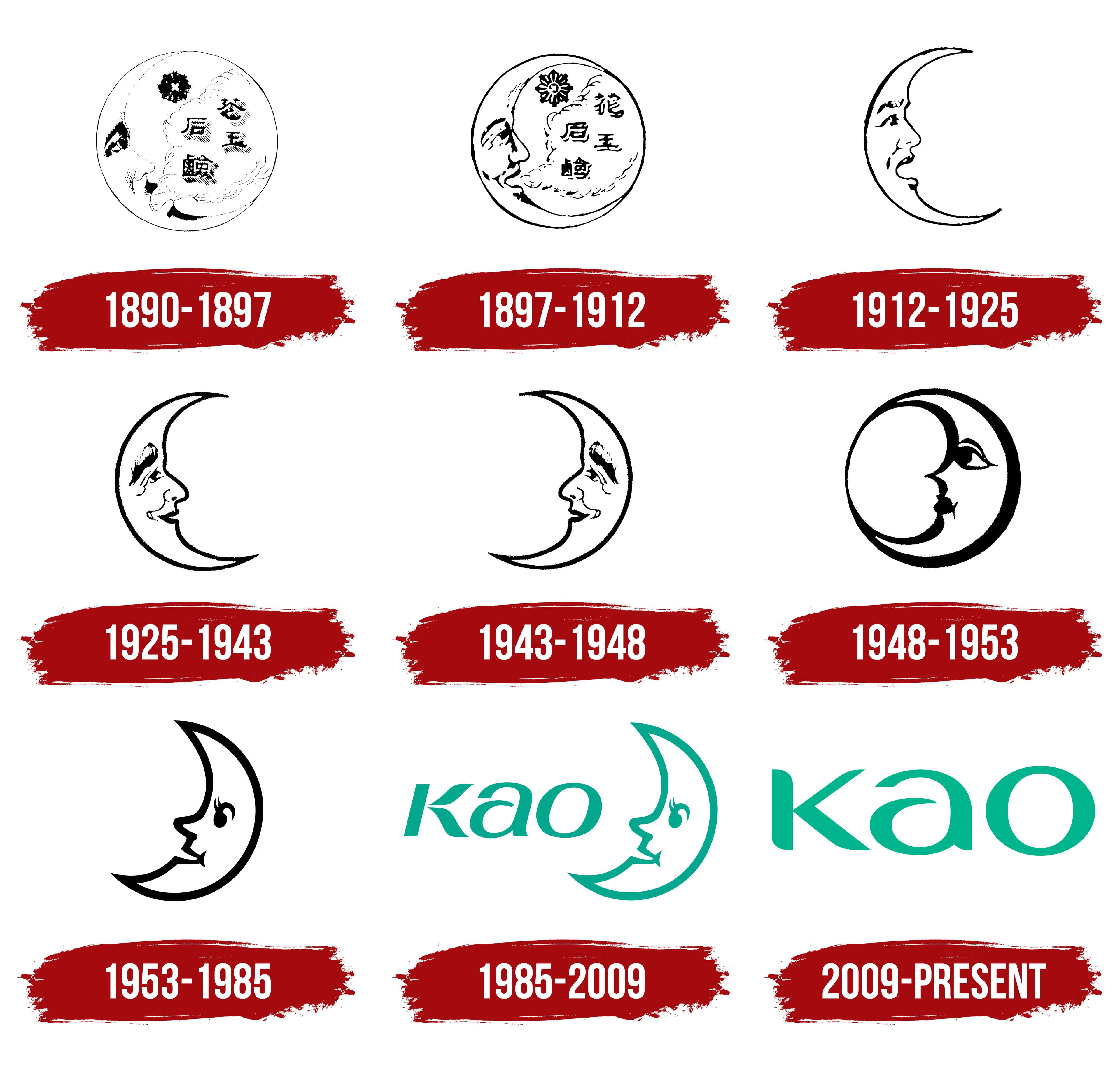
1890 – 1897
In 1890, Tomiro Nagase introduced Kao Sekken, an affordable Japanese toilet soap. In the late 19th century, Japan mostly imported high-quality facial cleansing products. They were expensive, while locally made soap often fell short in formulation. Nagase entered manufacturing through retail. In June 1887, he opened Nagase Shoten in Tokyo’s Nihonbashi district and sold Western sundries and household goods.
The name Kao linked the product to the familiar expression “kao-arai,” meaning facial cleansing. The sound “kao” matched the Japanese word 顔, meaning “face.” Nagase initially considered the spelling 香王, combining fragrance and king. By the time the soap launched, he had replaced it with 花王. The character 花 means “flower,” and 王 means “king,” giving the combination the meaning “king of flowers.” This spelling was considered favorable for future sales in China and easy to read, while preserving the phonetic connection to the product’s purpose. The soap’s name later became the company’s name.
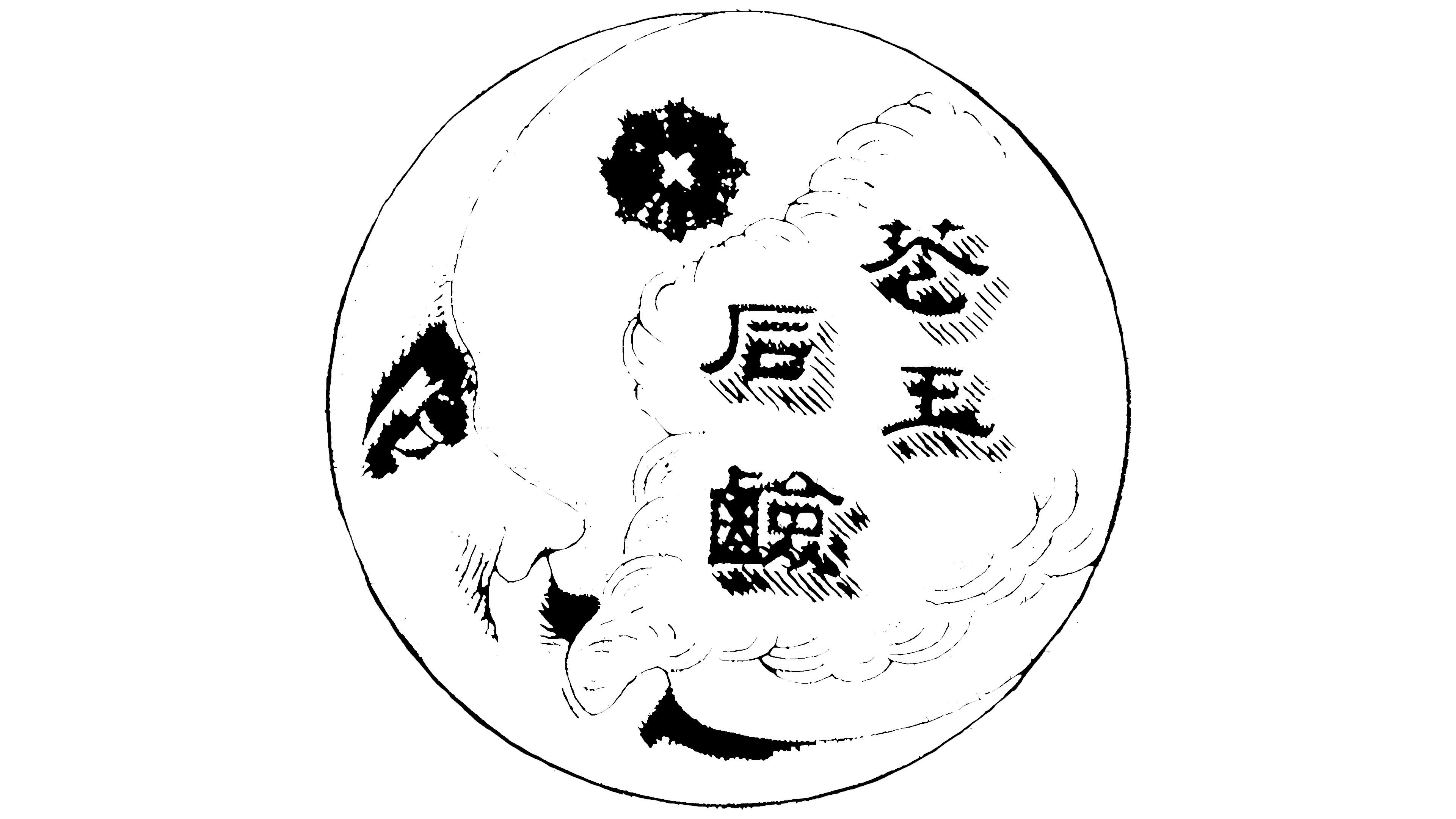
Nagase devised the emblem in 1890, inspired by moon-and-star images on imported pencils sold in his store. The moon symbolized beauty and purity. The detailed product-label illustration was intended to present the Japanese soap as a high-quality product comparable in standing to imported toiletries.
The left side of the circular design featured a moon with a male face turned to the right. The eye, eyebrow, nose, lips, mustache, and chin were rendered in anatomical detail. The profile resembled a European gentleman. A swirling cloud rose from the mouth, filling the center and right side of the circle. Above it, and above the lettering, was a floral design resembling a star or chrysanthemum.
The 4 characters 花王石鹸, meaning “Kao soap,” were arranged vertically on the cloud. The large calligraphic forms with thick strokes followed traditional print design. Diagonal hatching covered part of the lettering and cloud. Lines on the face and along the moon’s contour created depth. The entire emblem was rendered in black.
Kao Sekken was sold in paulownia wood boxes. The soap came with analysis results and expert recommendations supporting its quality claims. The packaging complemented the product’s identity, while information about its composition helped customers evaluate the new Japanese product.
1897 – 1912
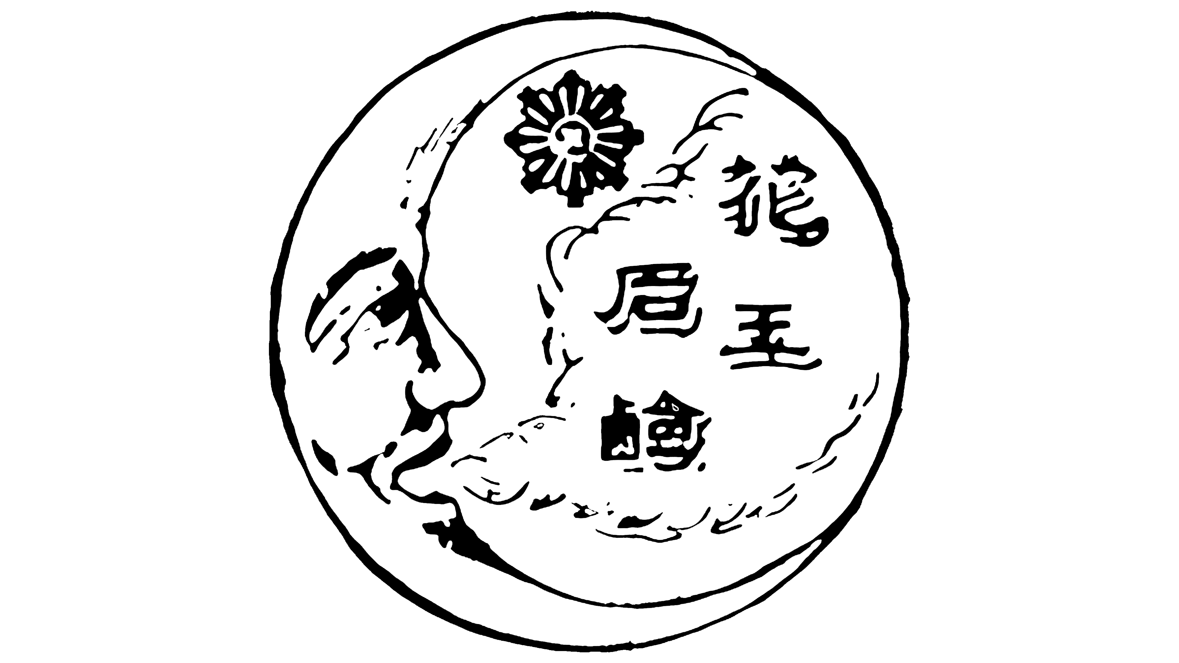
In 1897, Kao redesigned the emblem for packaging and printed materials. The face, cloud with lettering, and star-like flower remained within the circular arrangement. The update changed the head’s position, the contours, and small details of the illustration.
The facial features were softened, and the profile became more upright. The previous tilt from the lower left to the upper right shifted to a more horizontal left-to-right orientation. The head still fit within the circle and remained connected to the other parts of the image.
Kao thickened the outlines, and the flower’s shape became more regular. Kao removed diagonal hatching from the characters, distinguishing the lettering from the cloud’s lines. Reducing the fine strokes made the emblem easier to reproduce in print.
1912 – 1925

In 1912, Kao turned the moon with a human face into a standalone emblem. The cloud, characters, and floral rosette were removed from the previous arrangement. The design was now based on a crescent moon with a male profile, combining the crescent’s outline with detailed facial features.
The crescent’s upper tip extended upward, while the lower tip curved to the right. The face followed the inner edge. The crescent’s contour flowed into the forehead, nose, lips, and chin, forming a shared silhouette.
The facial features were drawn in black lines. A thick, arched eyebrow appeared above an eye with a defined upper eyelid. The nose had a sharp bend, and the mustache maintained the masculine appearance. Slightly parted lips formed a smile, while shading beneath the lower lip added depth to the face.
1925 – 1943

In 1925, Kao was increasing soap production at a new facility in Tokyo. The establishment of Kao Sekken Kabushiki Kaisha Nagase Shokai coincided with an update to the moon emblem. The human profile received a welcoming smile, and the crescent’s contour became smoother.
A large white cutout inside left a slender crescent. A face looking right followed its inner edge. The lines of the nose, lips, and chin flowed into the moon’s outline, joining the 2 parts in a single silhouette.
A raised eyebrow and closed eye complemented the smiling mouth. Heavy black strokes depicted the eyelid, cheekbones, corners of the mouth, and shadows. The outer outline was made slightly thicker than the facial lines. This weight difference separated the profile’s details from the crescent’s smooth arc while retaining the single-color treatment.
1943 – 1948

In 1943, Kao reversed the moon profile, linking the emblem to growth. The previous orientation had been linked to a waning moon. After the update, the crescent was interpreted as a waxing moon approaching fullness. This interpretation was considered favorable for the company.
The 1925 drawing served as the basis. The face was turned to the left, placing the crescent’s arc on the right. The image was tilted slightly, retaining its male features and slender crescent shape. The revision primarily changed the profile’s direction while preserving its existing drawing.
During the same period, Kao was unifying its product branding around the moon emblem. Previously, some products had used a combination of the moon and a star. The standalone crescent was now becoming the company’s shared symbol.
1948 – 1953
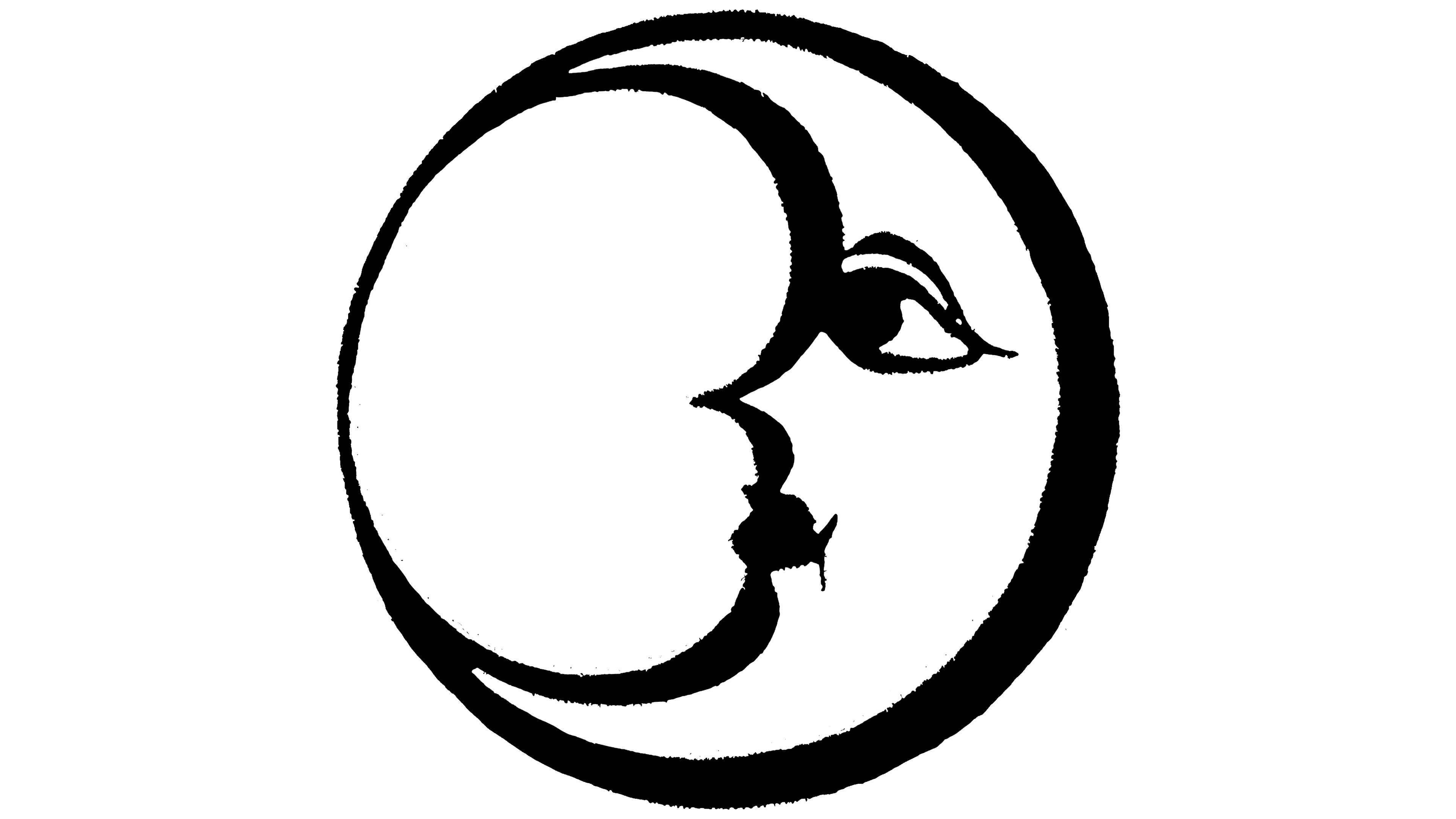
In 1948, Kao enclosed the moon emblem in a circle. The crescent’s upper and lower tips were connected, creating a strong outer contour. The thicker border helped the image stand out on packaging and in print advertisements.
The moon occupied the right side of the circle, and its inner edge flowed into a human profile. The face took on feminine features, reduced to a few lines. The projecting forehead, nose, lips, and chin formed a smooth curve connected to the crescent’s contour. The eye retained its almond shape, defined eyelid, and narrow pupil. A curved eyebrow appeared above it.
Facial strokes of varying widths complemented the thick black circular outline. Together, they resembled brushwork. The profile shows slight variations in the product because the period’s reproduction guidelines allowed different treatments.
1953 – 1985

Kao’s 1953 moon emblem emerged during work on the puppet film The Story of the Moon for Kao Sekken. In the early 1950s, Taizo Kawajiri, head of Japan’s Puk puppet theater, made a plaster moon profile for the film. A drawing created while preparing the titles later became the basis for the logo. The creator received 5,000 yen for the work. The Kao Museum preserved the plaster model.
In the 1953 version, the face acquired childlike features. A small smile and a curl near the cheek gave it a friendly appearance. The forehead, nose, lips, and chin formed a smooth profile along the moon’s inner edge. A few curved lines replaced the detailed rendering.
The outer outline was made even, closing the crescent’s contour. A compact rounded stroke that followed the curve of the upper eyelid represented a closed eye. A short arc indicated a smiling mouth. Reducing the number of lines preserved the facial features within the overall moon silhouette.
The primary color changed from black to a reddish-orange called vermilion orange. The warm coloring complemented the profile’s soft contours. Black reproductions used the same shape and internal lines. The 1953 design served as the foundation for subsequent versions of Kao’s moon emblem for several decades.
1985 – 2009
By 1985, Kao was producing detergents, cosmetics, hygiene products, and industrial chemicals. The reference to soap in its name represented only part of its product range. On October 1, 1985, Kao Soap Co., Ltd. was renamed Kao Corporation. Along with the new name, the company introduced a green identity, associating it with freshness and business development.
A logo with the Latin-letter “kao” on the left and the moon emblem on the right was prepared for international use. The name received custom lowercase lettering with a rightward slant and uniform stroke weight. The short word and crescent were arranged horizontally. The wordmark represented the group’s name, while the moon profile continued its previous identity.
The emblem retained its 1953 form. Orange was replaced with a green shade close to turquoise, which was also applied to the “kao” letters. For the Japanese market, the characters 花王 appeared beside the moon. The shared image and color united the 2 versions of the name in a single system.
2009 – today
In 2009, Kao updated its identity to present the group under a shared name internationally. The Latin-letter “kao” became the corporate logo. Kao retained the green-moon version for its consumer and chemical businesses in Japan and other Asian countries. The standalone wordmark represented the group as a whole, while the name-and-moon combination accompanied products.
The 3 lowercase letters received large, rounded forms and uniform stroke weight. The sans-serif lettering gave the short name a softer appearance, while lowercase reduced its formality. The turquoise-green coloring continued the previous identity and preserved Kao’s primary color.
Beginning in October 2021, Kao extended the wordmark to all divisions. On packaging for Japanese and Asian consumer goods, as well as chemical products, it replaced the name-and-moon combination. The green lowercase “kao” became the shared international wordmark.
The moon remained a separate company image. Kao Moon was associated with beauty, purity, and closeness to people, society, and the planet. The smiling crescent represented watching over life and offering a light of hope. In corporate materials, an arc sometimes appeared beside the wordmark, recalling an unbroken horizon and the Earth. The primary product logo consisted of the name.