 TRD Logo PNG
The TRD logo demonstrates an unbreakable connection to racing. It represents the tuning division of one of the world’s most renowned automakers. The emblem reflects the capability of its vehicles to navigate the sharpest turns with effortless, steel-like composure.
Toyota Racing Development grew from the automaker’s first motorsport projects in the late 1950s. In 1957, the company entered the Round Australia Rally, gaining early experience in long-distance competition. In 1966, its racing work led to the creation of Toyota Sports Corner, or TOSCO. This unit built sports components for customers and prepared racing cars for factory-related programs.
In 1976, TRD was formally established and took over the role previously handled by TOSCO. Its early work focused on Japanese rally events and touring car championships, where engineers tested engines, chassis setups, suspension parts, and other performance components. In 1979, the division began selling high-performance parts for customer vehicles, bringing technology from racing programs to road-car upgrades.
During the 1980s, TRD became known outside Japan through the World Rally Championship (WRC), where it handled development and preparation of rally cars. In 1993, an American branch was created to produce performance parts for the U.S. market. Through the 1990s and 2000s, the division worked across Le Mans, Super GT, NASCAR, and Formula 1, including engine development for the factory F1 team before the program ended in 2009.
In the 2010s, TRD expanded into parts for trucks, SUVs, compact cars, and GR models. In 2011, it supported stock-car teams with updated V8 engines and aerodynamic packages. In 2013, a Hilux prepared by the division finished second overall in the Dakar Rally. Later projects included Pro off-road parts in 2015, involvement with the TS050 hybrid endurance car, a new Camry Cup model in 2019, electrified racing systems from 2020, GR performance parts in 2022, and EV-focused components in 2024.
Meaning and History
What is TRD?
It is Toyota’s in-house division for tuning, performance, and racing. It specializes in designing and developing parts and accessories for Toyota vehicles, including engines, suspension systems, exhaust systems, brakes, and aerodynamic components. The company supports Toyota’s motorsports activities by providing expert support to racing teams in various competitions worldwide. In addition, it offers special models and performance packages, such as TRD Pro, TRD Off-Road, and TRD Sport, featuring upgraded components and unique design elements to enhance performance and the driving experience.
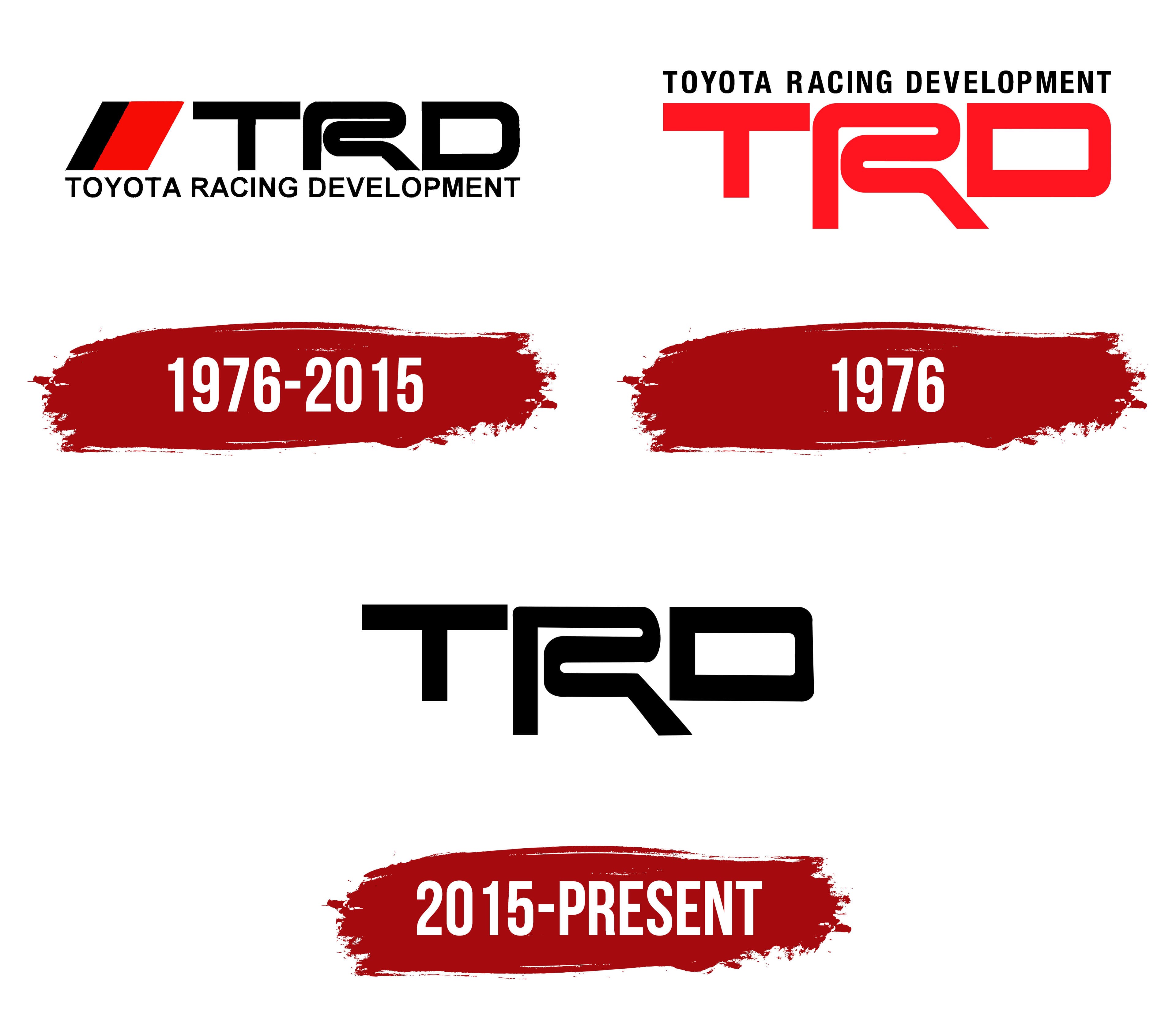
1976 – 2015
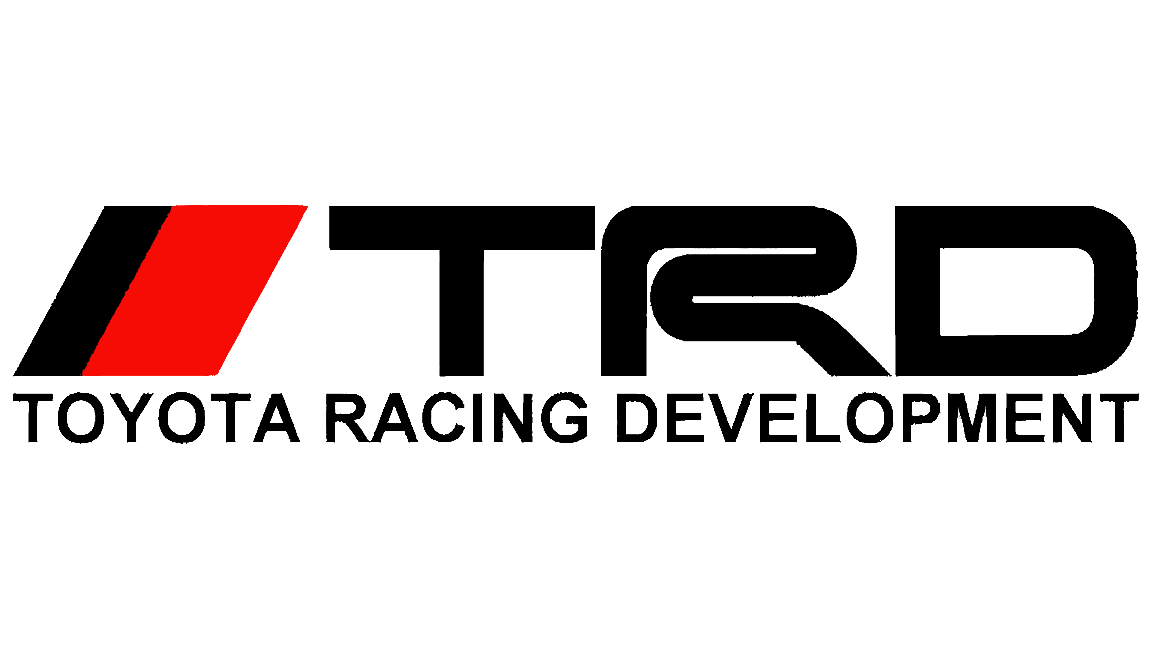
The TRD emblem from this period has a multi-component structure that includes the company’s short and full name and graphic symbol. Each element is placed separately, without touching one another, but together, they form a harmonious image in which every detail holds a distinct place.
The lower area features the phrase “Toyota Racing Development,” which also serves as a base for the abbreviation. To fit the long phrase within the compact size of the abbreviated name, the designers reduced its size by using a smaller font. The letters are straight and strictly vertical, without serifs, composed of clear, thin strokes. The glyphs appear slightly compressed from the top due to the massive abbreviation hovering above. However, there’s no feeling of cramped space, as the wide inner letter spacing ensures excellent legibility.
The top row contains the abbreviated form “TRD.” Unlike the lower text, it is large and resembles a hand-drawn element with custom graphic symbols. This is evident in the stylized “R,” which resembles a winding racetrack. In contrast, the neighboring letters are characterized by restraint, precision, and simplicity. They have no curves or rounded edges, designed in a geometric style with perfectly straight lines and sharp angles.
The combination of standard and unique glyphs conveys that the tuning center adheres to all technical regulations while incorporating creativity to deliver results that delight clients. Supporting this idea, next to the abbreviation is the brand symbol, a parallelogram divided into two color sections:
- A narrow stripe is colored black.
- A wide band is rendered in vibrant red.
This combination conveys determination, focus, and drive through its contrasting palette. The upper projecting corner points to the right as if racing forward, infusing the emblem with energy and dynamic movement. Speed is the primary expression of the TRD logo. The bold uppercase letters signify the company’s high capabilities and ambitious plans for the future.
1976
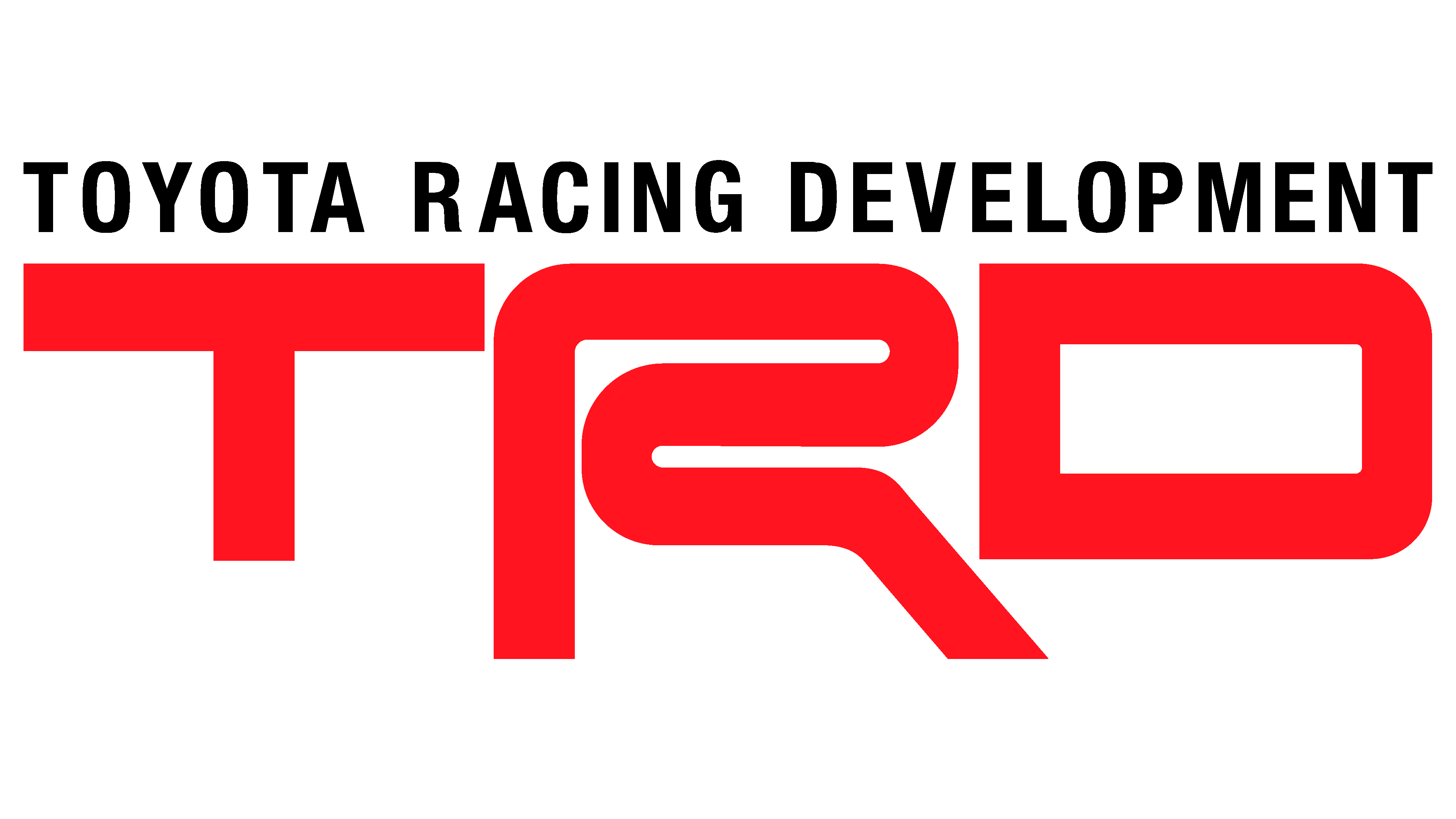
The stylized “R” remains the central element of the logo. It has retained its curved shape, still resembling a racetrack with sharp turns. The tuning center aims to convey that the vehicles they upgrade can handle even the sharpest corners. Thus, the winding letter expresses the brand’s concept easily, subtly, and effectively.
The three large glyphs are in uppercase. They lack serifs but have ample spacing, ensuring excellent legibility. To enhance contrast and increase vibrancy, the abbreviation is rendered in red. This choice is more striking than standard black, as it draws attention and instills a sense of positivity in customers. Additionally, red symbolizes leadership, intensity, and peak emotions.
The full name has been moved from the second line to the first: it is no longer the base for the upper text but now serves as its symbolic “roof.” Under the careful supervision of Toyota Racing Development, vehicles gain a unique look and superior technical characteristics. The name is written in uppercase with perfectly straight letters. There are no serifs, ensuring readability from any distance. The bold glyphs lend the text a solid, authoritative appearance.
The color scheme has changed. As observed, the red has become a few shades lighter, making scarlet the emblem’s dominant color. It is at the beginning of the color palette’s gradation, opening the spectrum of red shades. Scarlet symbolizes good fortune, resourcefulness, and vivid positive experiences, perfectly aligning with TRD’s brand ideology. It also represents the blood pumping through the arteries in sync with the “heart” of a race car.
2015 – today
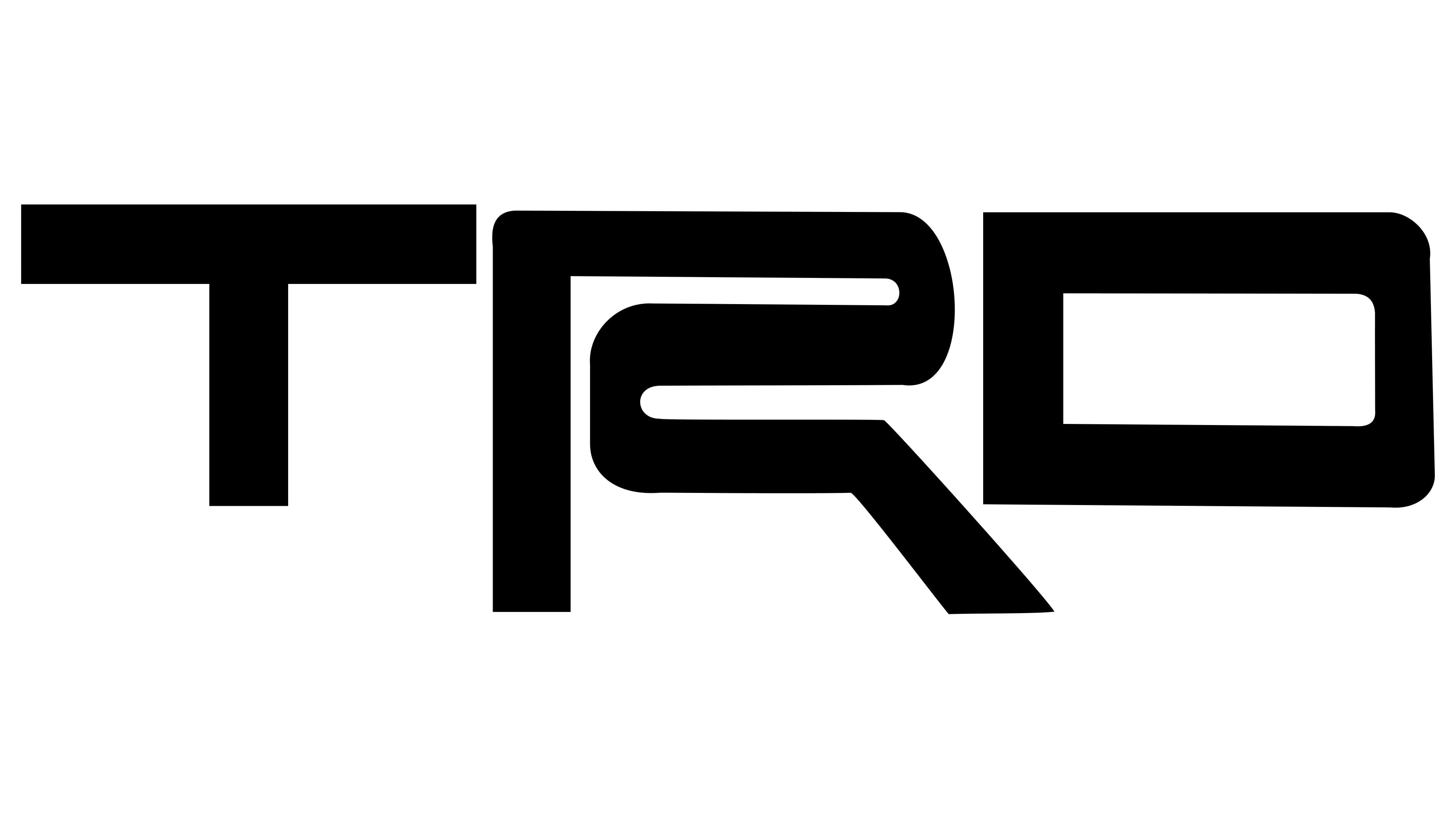
With each iteration, the TRD logo becomes increasingly simplified. Only the short name remains this time, with an integrated racing track represented by the capital “R.” Now, the designers have brought it to the forefront, significantly increasing its size. At the same time, they made the lines slightly thinner and reduced the curve in the upper-left corner.
The two adjacent letters have also been “slimmed down” a bit, making the top bar of the “T” appear excessively long and disproportionate to the vertical stroke. In contrast, the “D” looks balanced, resembling a car’s windshield. At the same time, it looks like a widened “O,” with the only difference being the two non-rounded corners on the left. This approach draws attention to the “racing track” symbol, emphasizing its significance.
As a result of the redesign, the thematic symbolism has a powerful visual impact on the target consumer segment. The numerous curves on the large glyph and its unique shape evoke the desired association with the drive to be the first to finish, heightened energy, a powerful surge, dynamism, and determination. The distinctive quirkiness of the “R” makes the logo highly recognizable and perfectly aligned with the brand’s concept.
The choice of color reinforces the idea of swift movement, precision, strictness, and adherence to technical standards. This time, black was chosen as a refined, practical, and versatile color that harmonizes with any background. Paired with the bold abbreviation, it complements the technical theme perfectly. Interestingly, black comes across as innovative in this case without any romance or intensity.