 Tsingtao Beer Logo PNG
Beer production involves preparing ingredients, fermenting, bottling, and distributing the beverage to domestic and international markets. These products are part of everyday meals and leisure activities. The Tsingtao Beer logo is associated with a Chinese brewing company that produces beer and exports it to various countries.
British and German entrepreneurs founded Tsingtao Brewery on August 15, 1903, in Qingdao, then under German administration. It produced beer in accordance with German beer purity standards. The brewery drew water from the mountain springs of Laoshan. The company released its first beer in December 1904. The company soon gained international recognition.
After World War I, the enterprise came under Japanese control and was managed by Dai-Nippon Brewery. In 1945, the brewery returned to Chinese ownership. Since 1949, the state has owned it. In 1954, the company received export rights for its products. By 1963, the company’s production process had been adopted as a national quality standard.
In 1972, Tsingtao beer entered the U.S. market and became one of China’s first export brands. In 1993, the company became the first mainland Chinese enterprise to list shares on the Hong Kong and Shanghai stock exchanges. The offering raised 889 million Hong Kong dollars and attracted strong investor interest.
Since the late 1990s, international partners have invested in the company. These included Anheuser-Busch, Asahi, and later Fosun International. In 2017, Fosun became the company’s second-largest shareholder.
Since 2010, Tsingtao has expanded its brewery network across China. The company has increased its share of the premium beer market. In 2022, revenue reached 29.7 billion yuan, and profit amounted to 4.95 billion yuan.
The company acquired Jimo Huangjiu Factory for 665 million yuan. This purchase added the traditional Chinese drink huangjiu to its portfolio. Revenue grew 22 percent, and profit rose 17 percent. These results confirmed Tsingtao’s position as one of China’s leading beer producers.
Meaning and History
What is Tsingtao Beer?
Founded by German settlers as Germania-Brauerei, it is China’s largest beer producer and operates under the Reinheitsgebot purity law. After nationalization and privatization in the 1990s, it was listed on the Hong Kong Stock Exchange. Anheuser-Busch owns 27 percent of the shares. The recipe uses German raw materials and malt from Australia, France, and Canada. The company sponsored the Beijing Olympics and organizes Asia’s largest beer festival.
1971 – 1994
Tsingtao’s early beer emblems drew on the coastal city of Qingdao, which gave the brand its name. German and British entrepreneurs founded the brewery there in 1903, during German rule. The spelling Tsingtao preserves an older romanization of the city’s name. The modern form is Qingdao. The characters 青岛 mean “green island,” while 青岛啤酒 means “Qingdao beer.” Images of local landmarks and the sea reflected the brand’s origins.
The lighthouse on Xiaoqingdao Island first appeared on the labels. Later, Huilan Pavilion, at the southern end of Zhanqiao Pier, became the main architectural motif. Its two-tiered silhouette, with an octagonal base, a lower gallery, and upturned roof edges, appeared above bands of water. The recognizable location tied the beer to Qingdao without needing additional explanation in the lettering.
In 1962, artist Zhang Weizhen and three other specialists redesigned the label for a Shandong foreign trade organization. The team created four options, with the pier and pavilion remaining the main motif in the approved design. Red and green referred to the city’s tiled roofs and greenery, while gold framed the outer edge. Their design established the combination of Qingdao architecture and colors used in later versions of the brand.
A wordmark version without the pavilion also existed. Large orange-red Tsingtao lettering appeared on a pale golden-yellow rectangle, with a capital “T” followed by lowercase letters. Broad strokes, serifs, and irregular pointed terminals defined the name’s appearance. Beneath it, “An International Beer” appeared in the same color. Its letters were smaller and thinner, using a serif style resembling Caslon Antique. The lower line expressed the beer’s international positioning while keeping the brand name dominant.
1994 – 2017
From 1994 to 2017, Tsingtao used a stacked logo with a medallion, a red ribbon, and the Chinese name. In 2004, the company revised it to present a consistent brand image in China and abroad. The Latin-alphabet TSINGTAO lettering grew larger, white ears of grain around the border became gold, and the red rim took on a pinkish-red shade. Green remained in backgrounds and supporting design elements.
A circular medallion occupied the upper portion of the logo. Against a blue background that transitioned from light at the top to dark at the bottom, a white, symmetrical pavilion stood with three tiers and a pointed roof. Several rows of thin white waves ran beneath it. Two golden ears of grain curved along the rim, while a double outline and highlights gave the circle depth. The blue field represented a globe, symbolizing Tsingtao’s international presence. The grain and water referred to the quality of the ingredients.
Beneath the medallion was a red ribbon with rounded ends and double outlines along its upper and lower edges. Large white serif TSINGTAO letters had a gold outline and a dark shadow. A smaller BEER line appeared beneath them in upright white sans-serif letters with wide spacing. Large 青島啤酒 characters completed the design, with heavy strokes and black outlines. The name retained the traditional form of 島. Outlines, shadows, and blue gradients brought the lettering and medallion together in a dimensional design.
2017 – today
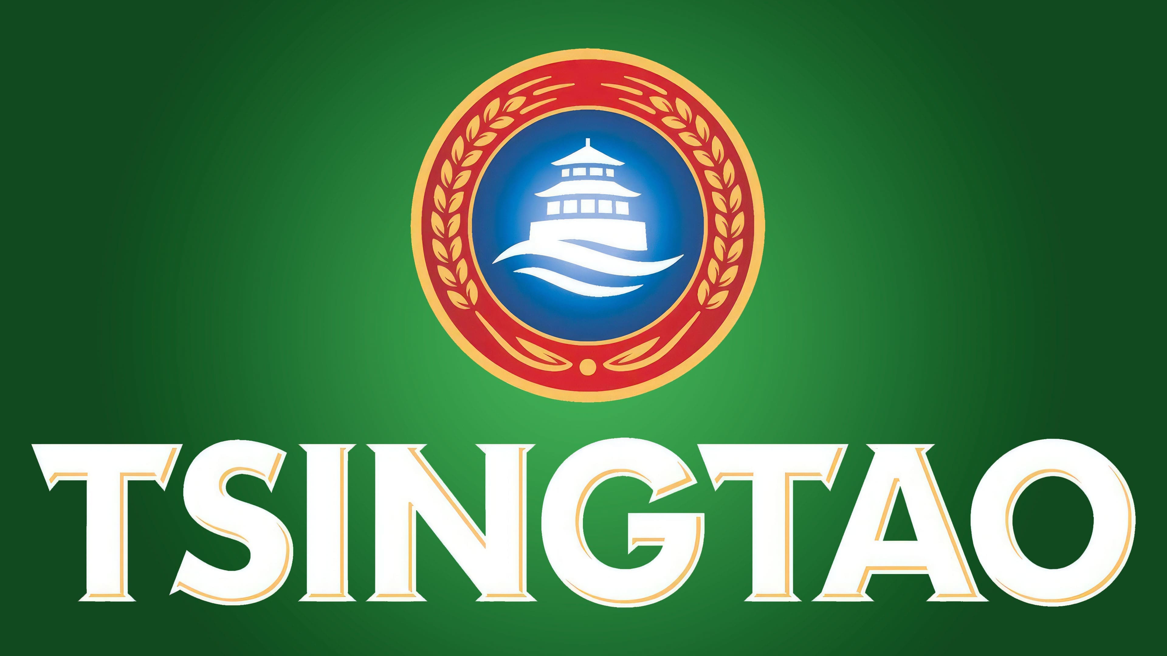
In 2014, Tsingtao introduced an updated emblem alongside its Classic 1903 beer. Company President Huang Kexing linked the changes to a desire to give the brand a contemporary appearance for younger and international audiences. International agency network Dragon Rouge worked on the brand system update. The pavilion medallion remained, but its drawing and placement relative to the name changed.
In the version on a dark green rectangular background that becomes lighter toward the center, the circular symbol appears above TSINGTAO. The red ribbon behind the letters was removed, giving the name a separate line. Heavy white capitals retained their serifs and fine gold detailing. The ends of the “T” crossbar point downward, while the “A” has a sharp apex. Rounded “S,” “G,” and “O” letters alternate with the straight lines of the “I” and “N.”
Within the medallion’s blue center, the white pavilion became simpler while retaining its window openings and two-tiered roof with symmetrical curves. Two large white waves replaced the many thin water lines beneath the building. The red ring and paired golden ears of grain, pointing upward, remained around the outside. Yellow edging, red details, highlights, and shadows preserve the frame’s depth. The familiar pavilion still represents Qingdao, while the Latin-alphabet name beneath it takes up more space in the design.