 Ball Corporation Logo PNG
Aluminum beverage packaging is used for soda, beer, and other products that require airtightness and consistent performance. Cans are produced through precise processes and controls at every stage, since the contents’ safety depends on them. The Ball Corporation logo represents a company that manufactures large-volume metal packaging for the food and beverage industry.
Ball Corporation began operations in 1880. Brothers Frank and Edmund Ball invested $200 to produce tin cans. By 1886, the company, known as Ball Brothers, had begun producing glass containers. Over time, it became one of the largest jar manufacturers in the United States.
In 1922, the company was officially named Ball Brothers Company. During World War II, the company redirected production to military needs. This helped strengthen the company’s engineering and technological capabilities.
In 1956, the company created the Ball Aerospace division. It developed missile guidance systems and built NASA’s Orbiting Solar Observatory. In 1969, the company changed its name to Ball Corporation. By 1972, its shares began trading on the stock market.
In the 1990s, the company expanded. In 1993, Ball acquired Heekin Can. In 1996, it sold its glass production business. After that, the company focused on manufacturing metal packaging. In 1998, the company moved its headquarters to Broomfield, Colorado.
In 2006, Ball strengthened its position in the aerosol products market. During this period, it acquired U.S. Can. In 2009, the Ball Aerospace division helped launch the Kepler telescope. That same year, the company acquired plants from AB InBev and became a leading supplier of aluminum packaging.
In 2015, the company announced its intention to acquire Rexam, a British company. The deal was valued at $ 6.9 billion. After the merger was completed in 2016, the company became the world’s largest aluminum can manufacturer.
In 2019, the company introduced a lightweight aluminum cup called the Ball Aluminum Cup. In 2020, the Denver sports arena, the Pepsi Center, was renamed Ball Arena. In 2024, BAE Systems completed the acquisition of Ball Aerospace. The deal was valued at $ 5.55 billion.
Meaning and History
What is Ball Corporation?
An American corporation from Broomfield, Colorado, and the world’s largest producer of aluminum beverage cans, manufacturing more than 112 billion units annually for Coca-Cola, PepsiCo, and AB InBev. Its structure includes Ball Aerospace, which works with NASA and the U.S. Air Force. The Ball brothers founded the company, starting with wooden-and-glass Mason jars and later expanding into aluminum packaging and aerospace. It operates more than 100 plants in the Americas, Europe, and Asia, producing cans and aerosol containers.
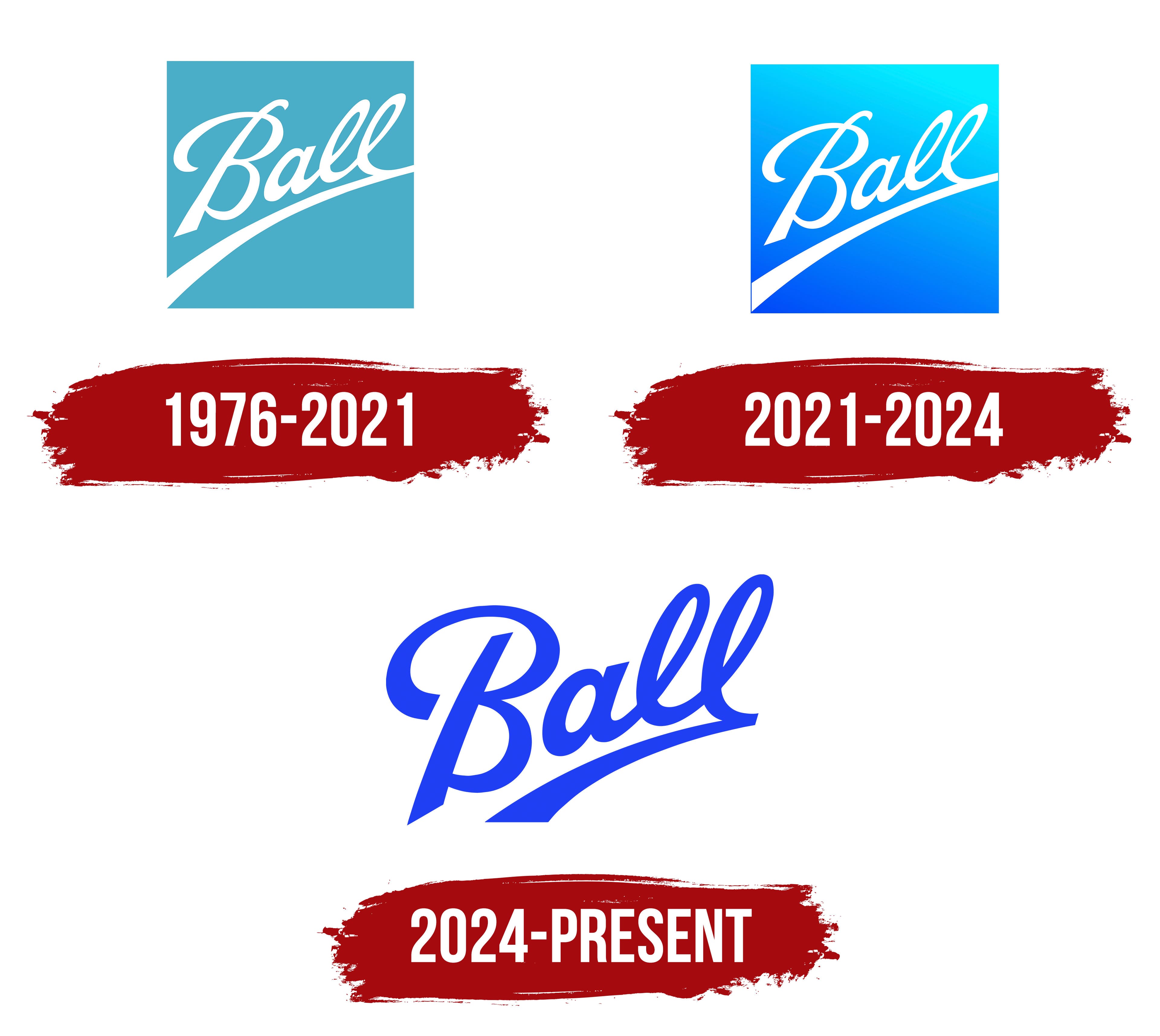
1976 – 2021
Ball’s history began in 1880. Frank and Edmund Ball borrowed $200 from their uncle, George Harvey Ball, and purchased the Wooden Jacket Can Company in Buffalo. The factory produced metal containers enclosed in wooden jackets. Their brothers William, Lucius, and George later joined the business, and the family company moved into glass container production.
The company became Ball Brothers Manufacturing Company in 1886. Production later moved to Muncie, Indiana. The company adopted the name Ball Brothers Company in 1922 and shortened it to Ball Corporation in 1969. The company was named after its founders. Its resemblance to the English word “ball” was coincidental.
The earliest products made in Buffalo carried an interwoven BBGMC monogram. The abbreviation stood for Ball Brothers Glass Manufacturing Company. The company began producing jars bearing the mark in 1884. The handwritten word “Ball” later appeared on the company’s glass containers and became the basis of its corporate emblem.
The signature changed many times during the late 19th and first half of the 20th centuries. Different periods featured upright printed letters, handwritten versions, loops in the uppercase “B,” various letter connections, and lower swashes. The Minnetrista archive places the period of frequent revisions within a stage lasting until 1962. Differences in the lettering help collectors date Ball jars.
By the 1970s, Ball had expanded beyond home canning containers. After adopting the Ball Corporation name, the company began producing aluminum beverage cans and developing an aerospace division. In 1976, the historic signature received a new corporate treatment with the white Ball name on a light blue field.
The lettering imitated cursive handwriting, with connected letters. The large uppercase “B” had a prominent upper loop and an extended lower stroke. The lowercase “a” and 2 “l” letters flowed into one another in a continuous line. The light blue field had straight edges and served as a background for the white signature.
A broad white swash passed beneath the name. The line began at the lower-left corner of the blue field, curved beneath Ball, and rose toward the right. Its end extended beyond the right edge of the background. The underline continued from the final “l,” joining the entire signature into a unified form.
The background color recalled Ball Blue, a shade associated with the company’s vintage glass jars. The white lettering stood out against the light blue field. It preserved the 5 Brothers’ family name within the corporation’s identity. The logo remained in use from 1976 to 2021, covering the growth of the company’s packaging and aerospace businesses.
2021 – 2024
The next Ball logo retained the family signature while redesigning the surrounding space. The white handwritten name remained inside a square frame. A multicolor transition replaced the solid light blue background.
Bright turquoise filled the upper area. It shifted into rich blue below and gradually darkened toward the bottom edge. The boundary between the colors ran diagonally, distinguishing the background from a standard vertical gradient.
Lighter sections appeared across the surface at an angle. They divided the turquoise and blue areas and gave the square field depth. The upper portion remained bright, while the lower section provided a dark base for the white Ball name.
The lettering retained its previous form. The connected white letters, large “B,” and lower swash stayed in their established positions. The redesign focused on the background, turning the light blue square into a turquoise-and-blue block with a diagonal color transition and highlighted edges.
2024 – today
After selling its aerospace division, Ball removed the square frame and returned to a freestanding version of its historic signature. The transaction was completed in February 2024, and the group focused its operations on aluminum packaging. The new identity accompanied the change in business profile and represented the company through a single handwritten name.
Mrs&Mr developed the identity system with Kate Wadia and Daniel Wadia. Designer Ellis Green published project materials. The team retained the Ball wordmark and removed it from the former gradient square. The primary logo consisted solely of the Ball name.
The lettering received a vivid electric blue color. It appeared against various backgrounds, using the open outer contour of the letters and swash. A white version with the same form was used on dark surfaces.
The word retained its handwritten cursive style. The large uppercase “B” had a rounded upper loop, while a continuous line connected the lowercase letters. The baseline rose diagonally toward the right. The contours were slightly tightened to prepare it for reproduction at small sizes.
An arched swash connected to the final letter passed beneath the word. The line began broadly on the left and gradually narrowed toward the right. In the 2024 version, the curve ended beneath the final “l” and stayed within the wordmark’s width.
After the transition to the open format, the “B” loop, connected lowercase letters, and lower curve formed the complete emblem. Electric blue replaced the turquoise-to-dark-blue gradient, while the historic lettering became the foundation of the corporate logo.