


 Corus Entertainment Logo PNG
The logo of Corus Entertainment looks balanced yet modern, reflecting the company’s dynamic and active role in digital technology. The emblem symbolizes stability, underscoring the company’s dedication to growth and global expansion. The logo’s color scheme symbolizes the media holding’s wide reach, hinting at the variety of directions and platforms the company operates across. Every element of the emblem highlights the rapid growth and confident steps the corporation is taking toward a global presence and dominance in the information space.
Corus Entertainment was established on September 1, 1999, after Shaw Communications separated its broadcasting assets into an independent company to comply with Canadian media ownership rules. The new business launched with major television and radio properties, including YTV, Treehouse TV, and CMT Canada. In 2000, it expanded through the acquisitions of Power Broadcasting Inc. and animation studio Nelvana, followed by additional Quebec radio stations in 2001 and the launch of W Network.
Growth continued throughout the 2000s. Movie Central debuted in 2002, strengthening the company’s pay television business. In 2005, Corus acquired SCREAM and introduced Cosmopolitan TV through a partnership with Cosmopolitan. Two years later, it sold its stake in TQS Inc. and launched VIVA. At the same time, 2010 brought the acquisition of W Network and several specialty channels from Canwest.
In 2012, Corus partnered with Disney-ABC Television Group to launch the Canadian version of ABC Family. A year later, it gained full ownership of Teletoon Canada Inc., adding Teletoon and Cartoon Network Canada to its portfolio. The company reached another milestone in 2016 when it acquired Shaw Media for CAD 2.65 billion, bringing Global Television Network and 19 specialty channels under its control.
Corus reshaped its business in 2018 by selling its French-language television and radio assets in Quebec to Cogeco. In 2019, it launched StackTV through Amazon Prime Video Channels as streaming became a larger part of the media market. From 2020 through 2023, the company expanded its digital services, podcasts, streaming productions, and original programming while maintaining its position as one of Canada’s largest media companies.
Meaning and History
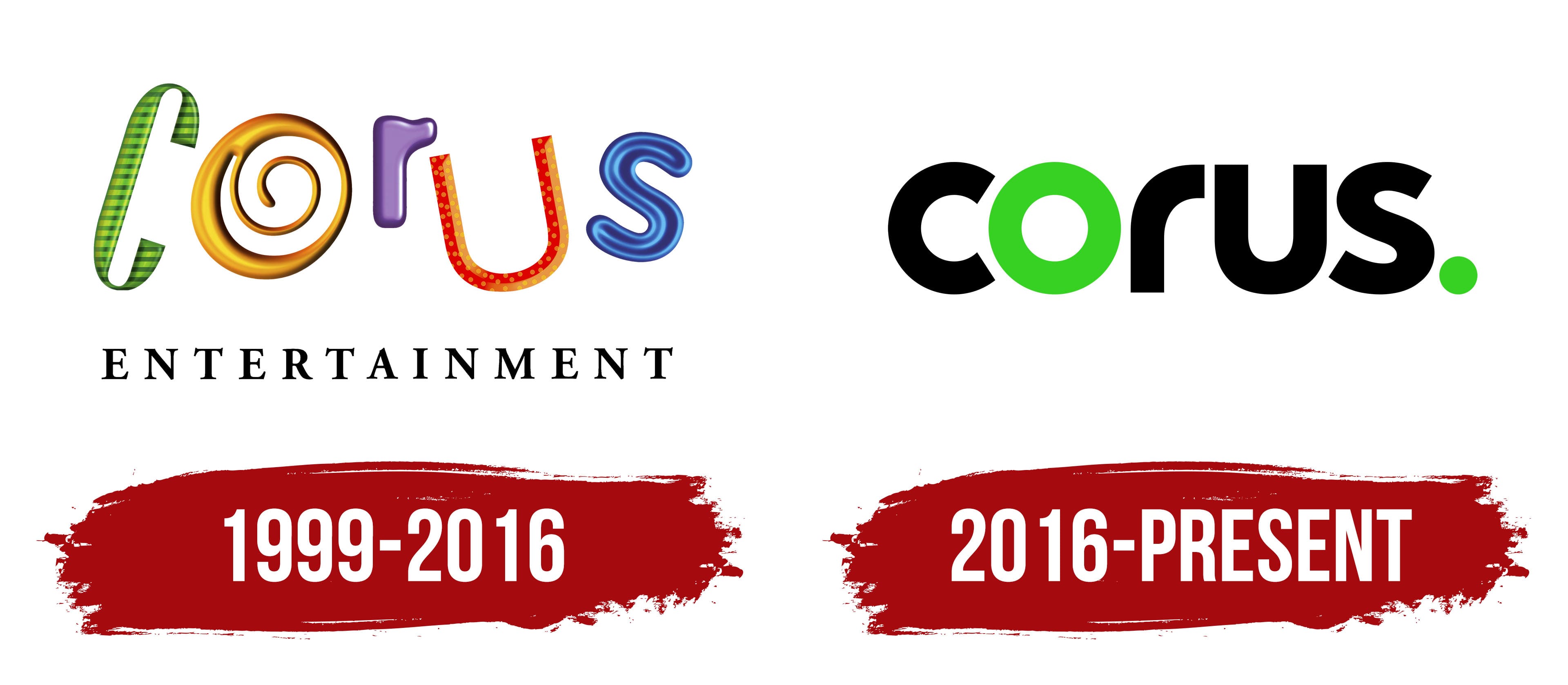
What is Corus Entertainment?
This Canadian media organization creates a wide range of content for multiple platforms. This media giant caters to a diverse audience, ranging from children to adults, through its radio stations, television networks, and online platforms. As the parent company of the well-known animation studio Nelvana and popular networks YTV and Teletoon, it has a strong presence in the children’s entertainment market. The company is recognized for producing high-quality, diverse content across a variety of genres and topics, including educational and entertainment programming.
1999 – 2016
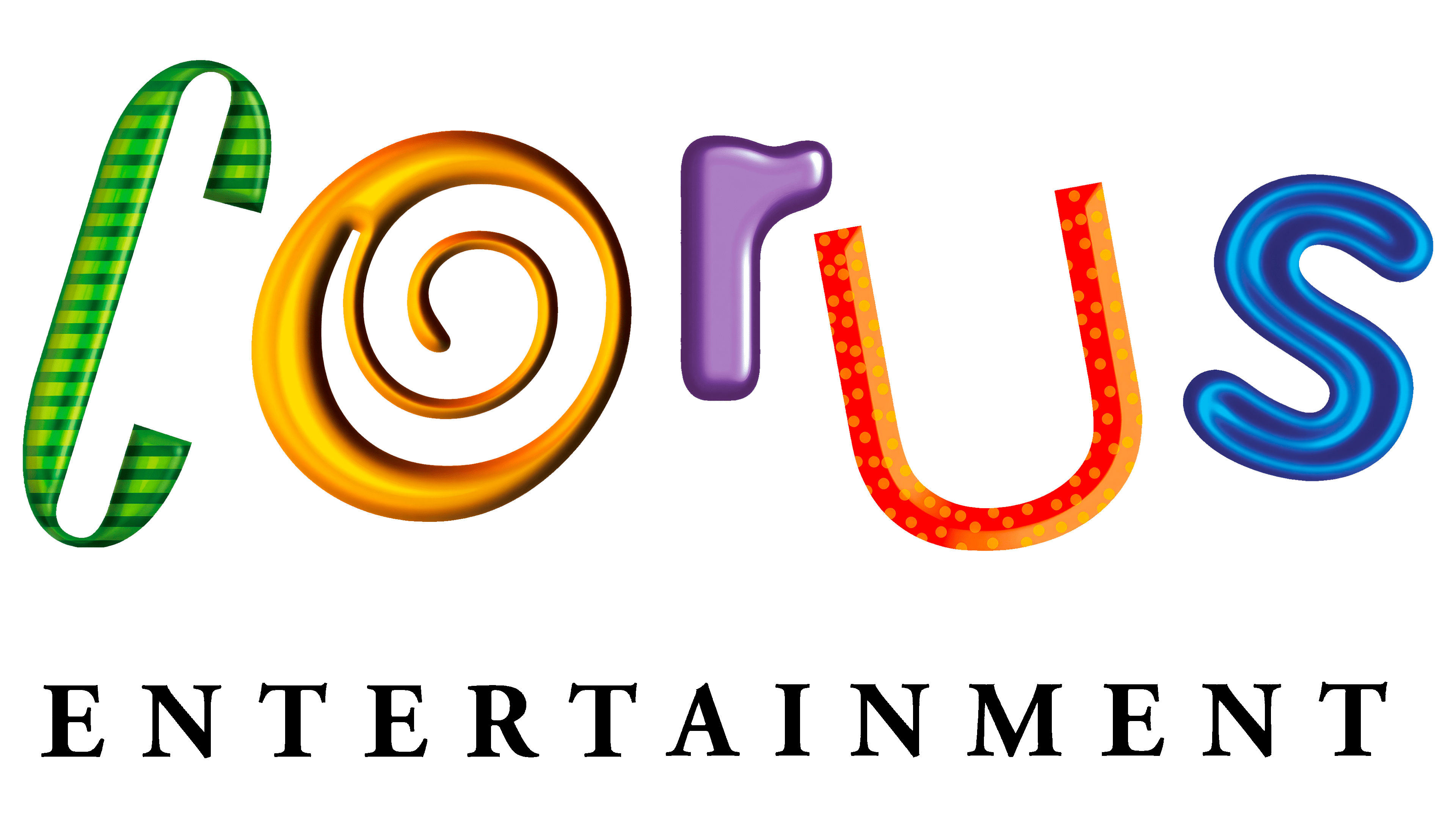
The emblem of the Corus Entertainment holding company is designed as a bright, lively name, where each letter can be seen as a unique character with its own personality. Each letter stands out with its color and structure:
- C resembles a ribbon in a green checkered pattern, evoking associations with flexibility and lightness.
- O is twisted into a spiral, like cream or polish, symbolizing smoothness and constant development.
- R is voluminous and pearlescent, with a purple tint, emphasizing its significance and beauty.
- U is designed in orange-red tones. Its middle groove looks studded with LEDs, adding dynamism and modernity.
- S has a dark blue color with a neon core and glowing outlines, conveying a sense of innovation and progress.
The roots of the company’s name play on the word “core,” highlighting that Corus has become the core of the Shaw family’s media assets. The diversity of the letters reflects the convergence of various media formats, including radio, television, and print publications, which cover the entire country of Canada.
Children’s programming receives particular attention, which has become especially important since Nelvana’s acquisition. The vibrant letters of the logo emphasize the company’s focus on a young audience and creativity in content.
The clear black “Entertainment” inscription beneath the main logo separates the entertainment and creative programs from the company’s serious, professional approach to managing and organizing its entire media structure.
2016 – today
The updated logo, which appeared after the reorganization and acquisition of Canwest Global’s assets, now looks more confident and solid. Smooth lines, devoid of unnecessary details, emphasize its technological aspect and modernity. The logo symbolizes a new level for the holding, which now operates a major television network and the wireless provider Wind Mobile. The design conveys a futuristic yet balanced image, reflecting the company’s expanded influence in the media space.
The dot at the end of the name is not accidental; it symbolizes completeness and finality. This suggests that viewers don’t need to switch to other channels, as Corus covers all necessary sources of information. The holding owns television, newspapers, radio stations, and internet platforms, providing a full range of news and entertainment for all audience categories.
The letter “O” and the dot, executed in light green, resemble a target. This element emphasizes the precision and professionalism with which the holding’s programs cover key events and reveal the essence of the news. The green hue, borrowed from the former Canwest Global emblem, symbolizes the company’s growth and expansion.