 Dolby Logo PNG
Sound and images in film, music, and games are processed with technologies that enhance perceptual quality and add detail. Movie theaters, home electronics, and digital services use audio systems and video standards. The Dolby logo is associated with a company that develops sound and image processing technologies used in the entertainment and electronics industries.
Engineer Ray Dolby founded Dolby Laboratories in 1965. He graduated from Stanford and Cambridge and developed a noise-reduction system for magnetic recording. As early as 1966, Decca Records used the Dolby A-Type technology. It established a new standard of clean sound in professional studios.
In 1968, the company moved to San Francisco. At the time, it established a technology-licensing business model. In 1970, the Dolby B-Type system appeared, making compact cassettes suitable for high-quality recording.
Since 1971, the company has entered the film industry. The movie “A Clockwork Orange” was the first project to use Dolby sound. In 1974, Dolby introduced the Stereo system. A breakthrough came with the use of the technology in the 1977 film “Star War77.
In the 1980s, Dolby introduced the C-Type and SR systems. They provided a high-quality analog recording. In 1992, the company entered the digital era by introducing Dolby Digital technology. It debuted in the movie “Batman Returns.” By 1995, this format had become the DVD standard.
In the 2000s, Dolby expanded its presence in digital sound. The Dolby Digital Plus technology was introduced and became a mainstay in home theaters. In 2012, the company presented Dolby Atmos, which created a three-dimensional sound effect. In 2014, Dolby launched Dolby Vision, which provided an extended dynamic range for images.
Since 2016, Dolby technologies have become the standard for streaming platforms such as Netflix, Apple, and Disney+. In 2019, Apple integrated Dolby Vision and Dolby Atmos into its devices. In 2021, Dolby introduced Dolby Atmos Music.
In recent years, the company has been investing in artificial intelligence and virtual reality. It is developing solutions for new audio and video content formats. In 2024, Dolby introduced its technologies in premium electric-vehicle audio systems.
The company remains a global leader in sound and image technology and continues to set industry standards.
Meaning and History
What is Dolby?
An American company from San Francisco, founded by Ray Dolby, is in the United Kingdom. It develops and licenses audio and visual technologies, collaborating with electronics manufacturers, film studios, and streaming services. The first product was the Type A noise reduction system, followed by Dolby Stereo, Dolby Digital, and Dolby Atmos, which delivers three-dimensional sound. The video segment includes the HDR format Dolby Vision, used by Netflix and Apple TV. The Dolby Cinema concept, with the Atmos system, is implemented in theaters, including the Dolby Theatre, where the Oscar ceremony takes place.
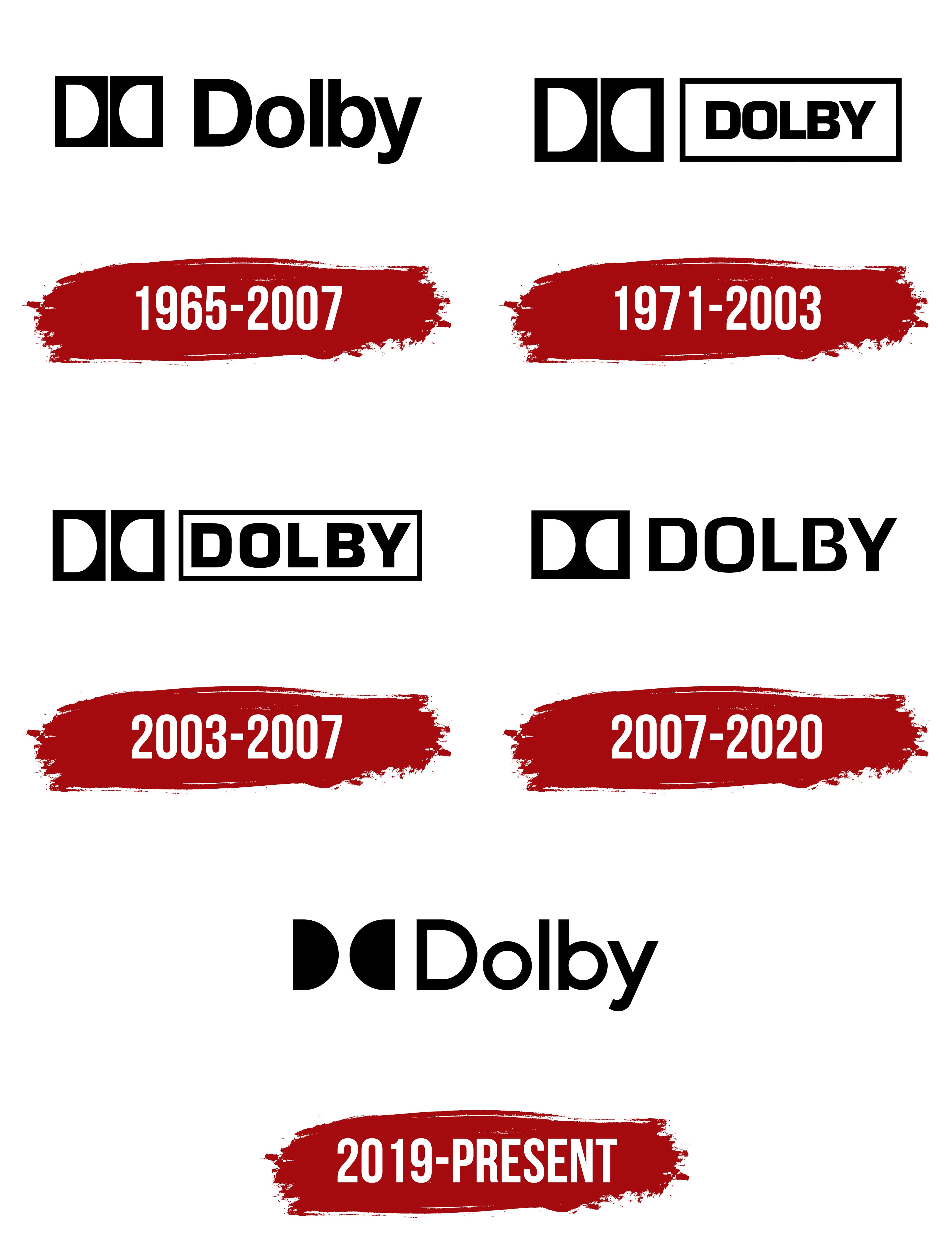
1965 – 2007
Ray Dolby’s surname became the name of a technology displayed on studio equipment, soundtracks, and movie credits. The licensed system required a compact mark that could work at different sizes. The result was the double-D emblem made from 2 opposing letters and connected with the principles of audio processing.
Dolby Laboratories began operating in London in 1965. Ray Dolby had previously worked on videotape recording systems at Ampex, graduated from Stanford University, and earned a PhD in physics from Cambridge. The company received its founder’s surname. Its first commercial development was the professional Dolby A-Type noise reduction system, released in 1966. Recording studios, including Decca Records, adopted the technology.
The early logo dates to 1965–2007. Dolby corporate archivist Roberto Landázuri dated the introduction of the double-D to approximately 1967 or 1968. According to his research, a small advertising studio in Surrey, England, created the emblem.
The idea emerged during a conversation between the designer and Ray Dolby about sound passing through a processing system. The engineer described the input as a funnel and the output as an inverted funnel. The 2 opposing forms became the foundation of the letter-based emblem. The studio prepared 3 concepts, and Ray Dolby selected one.
The double-D consisted of 2 identical vertical black blocks. The left block contained a white uppercase “D” with its rounded side facing right. The second block repeated the letter in reverse. The semicircular white openings faced each other, while a narrow strip separated the blocks.
The block edges formed the letters’ outer sides, allowing the characters to emerge as white cutouts within the black fields. The mirrored symmetry represented the audio signal’s input and output, as Ray Dolby described. The compact form worked across professional equipment, consumer electronics, and materials using licensed technologies.
The Dolby name appeared on the right with an uppercase “D” followed by lowercase letters. The wordmark used Helvetica Medium. The sans-serif typeface had heavy strokes, rounded curves, and tight spacing. Its construction resembled modified versions of Helvetica Rounded and Gotham. Black connected the name with the double-D blocks.
The emblem and founder’s surname served as both a corporate identifier and a licensing mark. On equipment and studio materials, they indicated the use of Dolby technology. For viewers and listeners, the logo became associated with sound processing in devices, recordings, and films. Dolby Laboratories later registered the Dolby name and double-D as trademarks. The early version received minor adjustments through 2007, while its fundamental construction remained intact until the major 2020 transition.
1971 – 2003
Dolby introduced a logo on December 19, 1971, that placed DOLBY inside a shared frame with the double-D. The extended horizontal version was intended for film, equipment, and audio media. Uppercase lettering and a unified border set it apart from the earlier composition featuring the Dolby surname.
The double-D emblem appeared on the left and consisted of 2 black blocks separated by a narrow white strip. The first contained a white “D” with its rounded section facing right. The second block held a mirrored version of the letter. Their inner sides faced one another. The paired construction represented an audio signal entering the processing system and emerging after noise reduction.
DOLBY appeared on the right inside a long black frame. The medium-weight outline surrounded the name and matched the height of the double-D blocks. Narrow white margins separated the letters from the edges. The emblem and name shared a single horizontal alignment, creating an extended composition in 2 sections.
The name used uppercase Eurostile Bold. The heavy sans-serif typeface featured geometric contours, consistent stroke thickness, and tight spacing. Its letters resembled Eurostile Bold Extended and Impact. Uppercase lettering gave the name enough visual weight to balance the black blocks on the left.
Dolby technology was used during the production of Stanley Kubrick’s A Clockwork Orange in 1971. The noise reduction system helped prepare premixes and masters. Guinness World Records identifies it as the first film with Dolby sound. The release prints used a conventional optical soundtrack, while Dolby technology participated in the production process.
The logo remained in use from 1971 to 2003 as Dolby expanded from professional recording into cinema and consumer electronics. The mark appeared on film stock, cassette decks, VCRs, record players, and home audio equipment. The horizontal format worked across equipment panels, packaging, credits, and product housings.
The licensing model turned the logo into confirmation that a product had been approved for the Dolby system. Device and media manufacturers received permission to display the mark after meeting program requirements. For customers, the double-D indicated licensed sound processing technology. For manufacturers, it confirmed production according to established specifications.
During the 1980s and 1990s, the double-D appeared beside Dolby Stereo, Dolby Surround, and Dolby Digital. The shared emblem connected several Dolby systems, while the additional words identified their functions. The framed DOLBY version remained in use throughout the film industry and on licensed electronics until the 2003 update.
2003 – 2007
The updated Dolby logo first appeared in theaters at the premiere of Finding Nemo. Introduced on May 30, 2003, it remained in use until 2007. The framed construction stayed, while the letter sizes, spacing, and double-D proportions changed.
Two identical black blocks formed the emblem on the left. The first contained a white “D” with its rounded side facing right. The second held a mirrored version. A narrow white gap separated the blocks, while the opposing letters represented the incoming and processed audio signals.
The double-D’s construction and black-and-white coloring remained unchanged. The space between the blocks increased slightly, widening the dividing strip. Equal block heights preserved the compact paired construction.
The uppercase word DOLBY appeared on the right inside a long frame. Compared with the 1971 version, the text module became more compact, while the letters occupied a larger portion of its interior. Letter spacing increased slightly without losing the dense line and heavy sans-serif style.
The name used Eurostile Bold. The uppercase characters had geometric contours, heavy strokes, and even edges. The enlarged wordmark matched the double-D’s weight, while the frame brought the 5 letters together in a separate horizontal module. The larger letters left narrower white margins around the text.
The emblem and name appeared on one line. Their similar heights united the double-D and DOLBY into an elongated composition. The black-and-white version worked across movie credits, equipment housings, packaging, and licensed technology markings on surfaces of different colors.
From 2003 to 2007, the logo appeared in theaters and on consumer electronics. It accompanied Dolby technologies in films and home devices while serving as a licensing mark. Its presence indicated the use of a Dolby system and the manufacturer’s compliance with program requirements.
The framed version continued to appear in episodes of the animated television series Family Guy after its primary use ended. The 2003 edition retained the foundation of the 1971 logo and revised only the proportions, spacing, and wordmark size.
2007 – 2020
Dolby introduced an updated logo on November 5, 2007, when it first appeared with the film Beowulf. Turner Duckworth developed the identity through a project conducted in 2007 and 2008. The double-D remained, the name moved to an open background, and the proportions shifted horizontally.
Turner Duckworth aimed to communicate Dolby’s connection with sound and its expanding field of operations. By then, the company’s work covered various technologies for the entertainment industry. The new image retained the brand’s historical foundation while presenting Dolby as a systems developer extending far beyond noise reduction and audio processing.
The double-D underwent the largest change. Earlier versions placed the mirrored letters in 2 separate black blocks divided by a white strip. The 2007 version combined both sections within one elongated black shape. Inside were 2 white “D” letters with their rounded sides facing each other.
The left letter faced right, while the right repeated it in reverse. The white semicircular openings created a symmetrical pair inside the shared field. The unified form made the double-D read as one complete emblem while retaining the concept of an audio signal passing through the Dolby system.
DOLBY appeared on the right against an open background. The frame used since 1971 was removed. The name became larger relative to the emblem, while the letters became narrower and were spaced wider. The revised arrangement made it easier to combine the corporate name with the names of individual technologies.
The wordmark used Monda Bold. Its uppercase sans-serif letters had heavy, consistently thick strokes, straight verticals, and geometric curves. Narrow proportions kept the name compact, while expanded spacing separated the characters. Black connected the wordmark with the double-D block.
The black-and-white color scheme worked across credits, equipment, packaging, discs, and digital materials. The standard version appeared on light surfaces, while a reversed version with the same structure appeared on dark backgrounds.
The 2007 composition became the basis of the Dolby Digital, Dolby Audio, Dolby Atmos, and Dolby Vision marks. The technology name appeared beside the double-D and DOLBY wordmark. The consistent emblem united the company’s systems and helped audiences connect its audio and video technologies with one licensing program.
The transition to the new version occurred gradually. Some partner marks retained the previous identity into the 2010s. The 2007 logo continued to appear in end credits, on the back of home media packages, and on discs after the next version was introduced in 2019.
The main transition was completed by mid-2020. Some international publishers retained the previous version longer, while Dolby Newsroom used it until 2022. The extended replacement period reflected the large number of licensed products, hardware platforms, films, and technology systems.
2019 – today
In 2019, the 2 opposing “D” forms were freed from the frame that had surrounded them for several decades. The updated version was introduced on September 25 with an announcement about Dolby Atmos support in Amazon products. It became the primary corporate logo on November 15. The redesign launched a new communications program for audiences interested in film, music, and gaming.
Senior designer Nina Luong described the project as an extensive identity redesign. Dolby was moving from its role as a technology partner for other companies toward becoming a consumer brand in the entertainment industry. The new system covered corporate communications, Dolby Atmos, Dolby Vision, and other products while preserving a connection with the double-D from the late 1960s.
Dolby’s internal team developed the project. Peter Michaelian, Najwa Aboselham, Brooke Stewart, Nina Luong, and Jakub Siwak contributed. Lien Nguyen directed creative production, while Todd Pendleton led marketing. Lien Nguyen and Andrew Durano are credited as the logo designers. The team developed the corporate brand, icon set, typography, print and digital materials, and animation principles.
The double-D received the primary redesign. Its black background disappeared, leaving 2 mirrored forms on an open field. The left section resembled a semicircle open to the right. The right repeated it in reverse. Their flat sides faced outward, while the rounded edges met toward the center. A narrow white gap separated the figures vertically.
Earlier versions created the letters as white cutouts inside black blocks. The 2019 edition turned them into independent black silhouettes. Their symmetry continued the original concept of an input and processed output signal introduced in the late 1960s. The reduced number of lines worked well in screen interfaces, animation, and product markings.
The Dolby name appeared on the right. Its initial “D” was uppercase, followed by lowercase letters. The sans-serif wordmark became thinner than Turner Duckworth’s 2007 version. The letters had moderate stroke weight, rounded curves, and open spacing. Its proportions resembled Avenir, Circular, and Gotham. Black united the wordmark with the double-D in a horizontal composition.
The 2 “D” forms received an additional function within the new system. Studio A|D calls them “Dolby windows.” The semicircular forms framed images, videos, and scenes from movies, music, and games. The historical emblem became a device for the brand’s printed and digital materials.
The pair of windows divided image fragments, joined frames, and created animated transitions. The double-D became part of Dolby’s corporate communications and expanded beyond licensing marks. Its paired structure retained a connection with earlier versions of the emblem.
Implementation occurred in stages. Earlier Dolby Audio, Dolby Vision, and Dolby Atmos marks remained on products and home releases during the transition. The updated double-D later appeared in the corporate logo and technology marks, uniting them under one shared form.