Hobby Lobby logo, symbolic of a retail chain celebrated for its array of creative supplies, paradoxically exhibits a surprisingly mundane design. This emblem, which manifests as quite standard, is derived from conventional store signage and is broadly employed across various mediums, including digital platforms.
Hobby Lobby: Brand overview
Hobby Lobby is an American company founded in 1972. It is one of the largest retail chains in the USA and sells goods for various types of art. The Company is headquartered in Oklahoma but has offices in all states today. Over 40,000 people work for the organization, and its estimated revenue is US$5 billion.
In 1970, David Green took a leap of faith in Oklahoma City with just $600 and a vision. He started from his garage by making picture frames. This modest beginning was the seed that grew into Hobby Lobby, now a major name in the arts and crafts retail world.
Just two years later, in 1972, Green opened the very first Hobby Lobby store. It was a small 300-square-foot space, but it marked the start of something big. Over the next decade, Hobby Lobby expanded across Oklahoma and then to neighboring states, growing to seven stores by 1982.
The Green family’s strong Christian beliefs deeply influenced Hobby Lobby’s operations. They committed to biblical principles like closing on Sundays, giving much of their earnings to charity, and not selling products against their faith.
Through the 1990s and 2000s, Hobby Lobby’s growth skyrocketed across the United States. Its large stores offered a vast selection of supplies for crafts, art, textiles, florals, and seasonal decorations, carving a unique space in retail.
By the late 2000s, the chain had over 400 stores nationwide. In 2014, Hobby Lobby made headlines with a Supreme Court case about healthcare and contraceptives. The court sided with Hobby Lobby, highlighting the company’s right to operate based on its religious beliefs.
Today, Hobby Lobby operates over 900 stores in the U.S., still guided by the Green family. It’s not just a business; it’s a family mission rooted in Christian values, involved in philanthropy like Bible distribution and refugee aid.
From its humble start to becoming a leader in the crafting industry, Hobby Lobby’s story is one of faith, family, and entrepreneurship. Despite facing controversies, it remains a go-to place for crafters, artists, and anyone looking to decorate their space, proving the enduring power of its founding principles.
Meaning and History
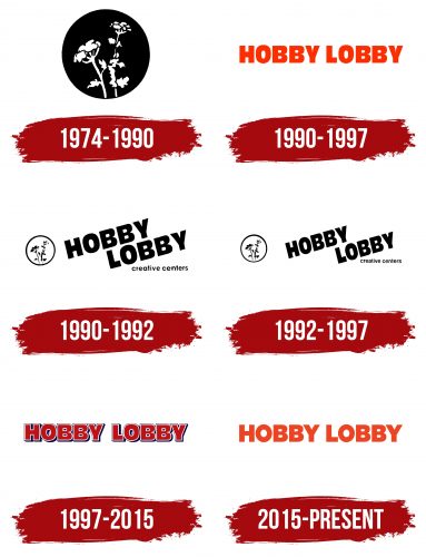
Visual brand recognition is high: Hobby Lobby has over 10 million customers annually. At all stages of the company’s development, the company mainly had a logo—a verbal inscription without additional elements—but there were periods when there was also a symbol. Many customers do not know about this symbol, as they only remember the company’s last two emblems. The company’s global symbolism has always been concise, minimalistic, and easy to remember.
What is Hobby Lobby?
This American retail chain has become a haven for artists, crafters, and DIY enthusiasts. Owned by a family with strong Christian beliefs, this retail chain has made a significant mark in the arts and crafts community. It offers a vast array of art supplies and crafting materials, inviting Americans to explore, create, and celebrate their artistic projects. Shoppers can find everything from basic crafting tools to complex art supplies all in one place.
1974 – 1990
Hobby Lobby started in 1974 and grew steadily until 1990 when they introduced their first logo. The black and white logo symbolizes a draft or an unfinished piece, showing that while Hobby Lobby provides tools and materials, the final creation relies on the customer’s skills and imagination. This highlights the importance of a personal touch in crafting unique items.
The logo’s round shape resembles an embroidery hoop, symbolizing completeness and allowing everyone to express their creativity. The logo’s center is an image of a natural field flower, like chamomile or yarrow, adding a natural element. This reflects the slow and blooming process of natural growth and crafting, emphasizing development and improvement. The flower depicted as a photo negative suggests that crafts mirror the real world.
The logo underscores that creativity offers joy, relaxation, and aesthetic pleasure. Given Hobby Lobby’s founder’s Christian beliefs and commitment to operating by Biblical principles, the logo’s connection to nature supports the brand’s values.
1990 – 1997
In 1990, as a new decade began, the company revamped its visual identity, which had become a signature across all its franchises. The aim was to introduce a brighter, more memorable look aligned well with the company’s values and mission.
The updated logo features large letters in a vibrant orange color, chosen for its associations with energy and warmth. This color conveys optimism and a commitment to customer satisfaction. Orange grabs attention and evokes a sense of warmth, reflecting the spirit of communication and creativity in each store. The large letters welcome visitors, creating a comforting and friendly atmosphere. This design intends to make customers feel like they are part of a caring family, where each product is crafted with love.
Each item in the stores carries positive emotions and is a piece of the creator’s soul, thanks to which gifts become not objects but symbols of special meaning and warmth. The size of the logo’s elements emphasizes the company’s ambitious expansion plans, highlighting its success and global presence.
1990 – 1992
After the company’s founder passed away, it underwent major changes, including redesigning its brand to reflect its evolving philosophy and modern realities. The new logo is modern and dynamic, representing a continuation of the founder’s legacy and a commitment to growth.
The logo now features a circular emblem in lighter, welcoming shades, signaling the company’s openness to new ideas and effort to stay current. The company name appears in large, clear black letters on two levels, angled to suggest upward movement, symbolizing rapid growth and dedication to high ideals inspired by faith.
Below the main logo, a new tagline identifies the company as a creative hub. This marks a shift in design and mission, aiming to unlock and foster customers’ creative potential. The company offers a variety of products for self-expression and project realization. This rebranding positions the company as a source of inspiration and creativity for every customer, extending beyond merely selling hobby supplies.
1992 – 1997
In 1992, the company updated its logo, beginning a new stage in its evolution. The new creative director, the founder’s daughter, spearheaded the changes. This marked a leadership transition to the next generation and brought new design and business ideas.
The new director’s initial test involved redesigning the logo, and this period involved exploring different designs to accurately represent the era and the company’s ambitions and values. The changes, though minor, made the logo more appealing to customers and partners.
An important update was reducing the company name in the logo. This change was meaningful as it reflected a shift in leadership and reassessed the company’s role in the market. By making the name smaller, the company moved away from its prior franchise model towards a more personalized and creative approach to business.
1997 – 2015
Another logo redesign took place in 1997. The presented version has existed for 18 years, and many people still associate it with Hobby Lobby. The color palette became even more concise, as only dark red was used. All letters in the word were now capitalized. The logo had a double white and blue outline, which created a sense of volume in the image. There was practically no space between the symbols, so the feeling of unity of all elements was created.
2015 – today
The last redesign took place in 2015. Now, the verbal inscription is presented in two lines. Interestingly, the second word of the name, “Lobby,” is slightly to the right than the first. The logo has been changed to orange. Also, a classic font was used, but with super-bold lines in sans-serif letters. Sometimes, an additional inscription, “Super Savings. Super Selection!” is used.
Font and Colors
In general, the company did not try to surprise the target audience with an unusual font for a word inscription. Classic bold sans-serif was used in letters with rounded corners. Only the thickness of the lines and the style of writing individual letters changed.
The Hobby Lobby logo features a simple, bold, sans-serif font that is modern and easy to read. The font, likely custom-designed or adapted specifically for the brand, is not publicly named.
Each letter in the logo is large, ensuring the store’s name is visible even from a distance. The bold style of the font adds strength and visual impact, which is crucial for brand recognition.
The spacing between the letters is uniform, enhancing the logo’s readability. This font choice in the logo helps highlight the name and improve brand recall.
Each stage featured a unique color palette that stood out from the other options. The first and last variations were dominated by orange, replaced by dark red from 1981 to 2015. Pleasant colors attract the attention of Hobby Lobby’s potential customers. Therefore, we can say that this choice is justified because, in this way, the inscription can be placed on any surface.
The logo’s bright orange color evokes warmth, energy, and creativity. This color suits hobbies and crafts well, emphasizing Hobby Lobby’s joy of creativity and self-expression. The vibrant color makes the logo more appealing and recognizable, ensuring it stands out among other brands.
The chosen font and color reinforce the company’s image as a place where everyone can find something for their hobbies and creativity, aiding in easy brand identification by consumers.
FAQ
What do I need to know about Hobby Lobby?
Hobby Lobby stands out in the retail sector as a major destination for arts, crafts, and home decor, boasting nearly 700 stores across the U.S. It offers an impressive variety of over 75,000 products, from craft supplies and picture frames to fabrics and seasonal decorations, catering to artists, hobbyists, and anyone eager to add a personal touch to their home.
Its significant role in the retail market has not gone unnoticed, with Forbes and Fortune recognizing Hobby Lobby as among America’s largest private companies. This recognition reflects its broad impact and success in the arts and crafts domain.
One of Hobby Lobby’s key strengths is its solid financial standing, operating without long-term debt. This is quite an achievement for a company of scale and grants it the flexibility to make bold business moves and grow sustainably. This approach demonstrates careful financial planning and a cautious strategy toward expansion, ensuring the company’s longevity and stability through economic ups and downs.
Beyond its business accomplishments, Hobby Lobby is known for its commitment to Christian principles, which influence its corporate policies and public actions. This includes closing on Sundays for employees to have family and worship time and standing firm on religious beliefs in legal matters, such as its Supreme Court win over health insurance coverage for contraceptives. Hobby Lobby’s blend of business success, ethical operations, and firm stance on faith-related issues marks it as a unique and influential player in the retail industry.
What is Hobby Lobby known for?
Hobby Lobby stands out as a top destination for arts and crafts, offering various products for various creative and home decor projects. Although the store’s roots are in arts and crafts supplies, it also caters to various other interests. Shoppers can find everything from traditional crafting materials to supplies for hobbies, picture framing, and jewelry making.
The store is a treasure trove for fabric lovers, offering a selection perfect for fashion and home decor. Those planning a wedding or a party will find a wealth of floral supplies and decorations to make any event special. Hobby Lobby also offers a vast selection of cards, party ware, and baskets for those looking to add a personal touch to their gifts.
For those interested in creating wearable art, Hobby Lobby provides the materials needed to customize clothing and accessories. The home décor section is equally rich, offering items to personalize living spaces. Moreover, the store is well-prepared for seasonal and holiday decorating, with special sections for Christmas, Halloween, Easter, and more, ensuring customers have everything they need to celebrate in style.
Hobby Lobby’s broad range of products, coupled with a commitment to quality, has made it a favorite among those who cherish creativity and personal expression.
What is Hobby Lobby’s policy?
Hobby Lobby offers a straightforward and customer-focused return policy to ensure you’re always satisfied with your purchases. If you’re unhappy with something you’ve bought, you have 90 days from the date of purchase to return it. Here’s how it works:
- Exchange: You can exchange any item for another if you find something more suitable.
- Store Credit: If you’re undecided about what you want in return, opt for store credit. This allows you to choose something else later on without any immediate pressure.
- Refund: If you prefer a refund, Hobby Lobby will return the amount to your original payment method. For credit card purchases, the refund will go back to the card you used.
If you paid by check, you’ll need to wait ten days for a refund to give the check time to clear. This helps prevent fraud. If waiting isn’t your preference, you can receive merchandise credit immediately.
This return policy underscores Hobby Lobby’s dedication to ensuring you’re content with your purchases. It offers various options to accommodate your needs. Remember to keep your receipt, as you’ll need it for any returns or exchanges.
What is Hobby Lobby’s vision statement?
Hobby Lobby’s vision is built on two main goals: ensuring customers have a great selection and value and caring for its employees and their families. They strive to offer various products for crafting, decorating, and hobbies at good prices, aiming to provide a fulfilling shopping experience. This focus on customers helps make Hobby Lobby a top choice for those interested in arts and crafts.
The company strongly emphasizes the health and growth of its employees and their families. Hobby Lobby works to create a positive work environment and establish policies that help individuals grow and support families. This approach reflects the company’s values of community, integrity, and personal development, showing that Hobby Lobby sees its success as linked to the well-being of its employees.
Overall, Hobby Lobby’s vision statement presents a comprehensive view of its business, balancing financial achievements with a commitment to social responsibility. Hobby Lobby aims to positively affect everyone involved with the brand by focusing on customers and employees.
