


 RTL Logo PNG
Media formats include news, entertainment programs, and digital content distributed via television and online platforms. These services shape information flow and are part of everyday life. The RTL logo is associated with a media company that produces and distributes television and digital content in Europe.
The broadcasting company Radio Télévisioun Lëtzebuerg launched the German-language channel RTL Plus on January 2, 1984. The first programs were aired on a limited schedule. The signal was transmitted via a terrestrial antenna. In 1985, satellite broadcasting began. By 1986, the main shareholders were Compagnie Luxembourgeoise de Télédiffusion, Bertelsmann, and the newspaper Westdeutsche Allgemeine Zeitung.
In 1987, RTL Plus increased its airtime and launched the morning program “Guten Morgen Deutschland.” In January 1988, the headquarters moved to Cologne. There, the channel began developing its own production. Since December 1991, it has been broadcasting 24 hours a day. On October 31, 1992, the channel was renamed RTL Television.
By 1993, the channel led German television ratings. It held first place until 1997, then regained it in 1999, 2001, 2002, and 2003. In 2006, RTL remained the leader among viewers aged 14 to 49. It remained the country’s main commercial television channel.
Since the 1990s, RTL has created several popular programs. Among them are “RTL aktuell” (1988), “Stern TV” (1990), “Alarm für Cobra 11” (1996), “Wer wird Millionär?” (1999), “Deutschland sucht den Superstar” (2002), “Ich bin ein Star – Holt mich hier raus!” (2004), “Bauer sucht Frau” (2005), and “Let’s Dance” (2006).
In the 2010s, RTL developed a network of thematic channels. It included RTL Crime, RTL Living, RTL Passion, and GEO Television. In 2016, RTLplus was launched. In 2021, RTL renamed the streaming platform TVNow RTL+.
In 2022–2023, RTL Group strengthened its digital segment. In December 2023, the company partnered with Sky and brought Formula 1 and Bundesliga broadcasts back to free television.
In June 2025, RTL Group announced it would acquire Sky Deutschland. This created Germany’s largest media platform with more than 11 million subscribers. That same year, the company sold RTL Nederland to the DPG Media group and extended its agreement with Deutsche Telekom until 2030.
Meaning and History
What is RTL?
It is a large German media group within an international holding headquartered in Luxembourg and Cologne, controlled by the Bertelsmann corporation. Its portfolio includes the TV channels RTL, VOX, ntv, Nitro, RTLup, and Toggo, plus the streaming platform RTL+ and a studio that produces films and TV programs. Its main areas of activity include television broadcasting; producing series, shows, news, and sports programs; and developing digital services. The Ad Alliance advertising network enables content monetization and broad audience reach.
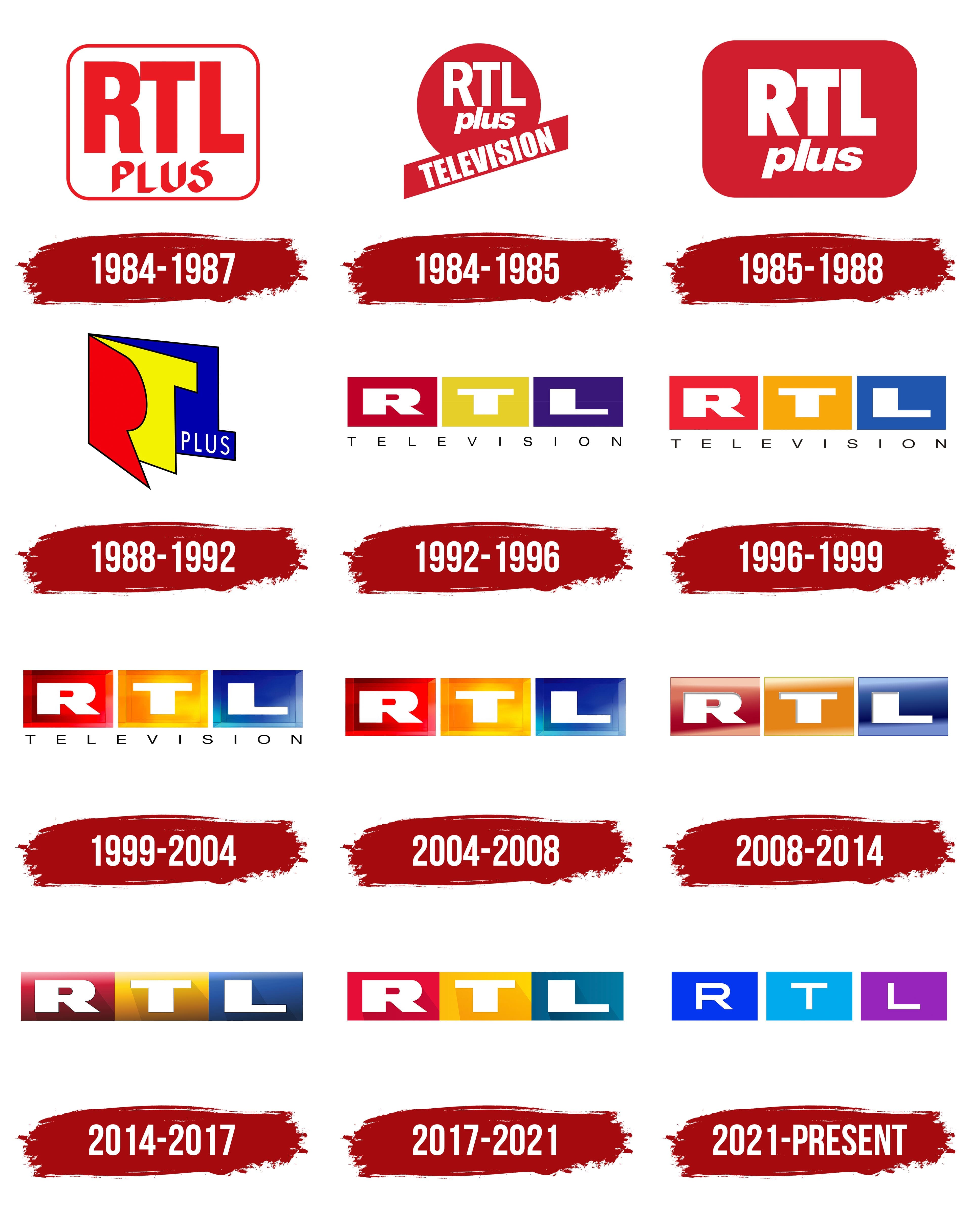
1984 – 1987
RTL Plus’s first logos linked the new German television channel to the German-language RTL radio service, which listeners already knew. RTL stands for Radio Télévision Luxembourg, meaning “Radio Television Luxembourg,” while “Plus” signaled the expansion from radio into television. Channel head Helmut Thoma described the project as the radio service audiences knew, with pictures added. Broadcasting began on January 2, 1984. The channel was established by Luxembourg’s Compagnie Luxembourgeoise de Télédiffusion and UFA, part of Bertelsmann. The programs were broadcast in German for a German audience, but the broadcasts originated in Luxembourg.
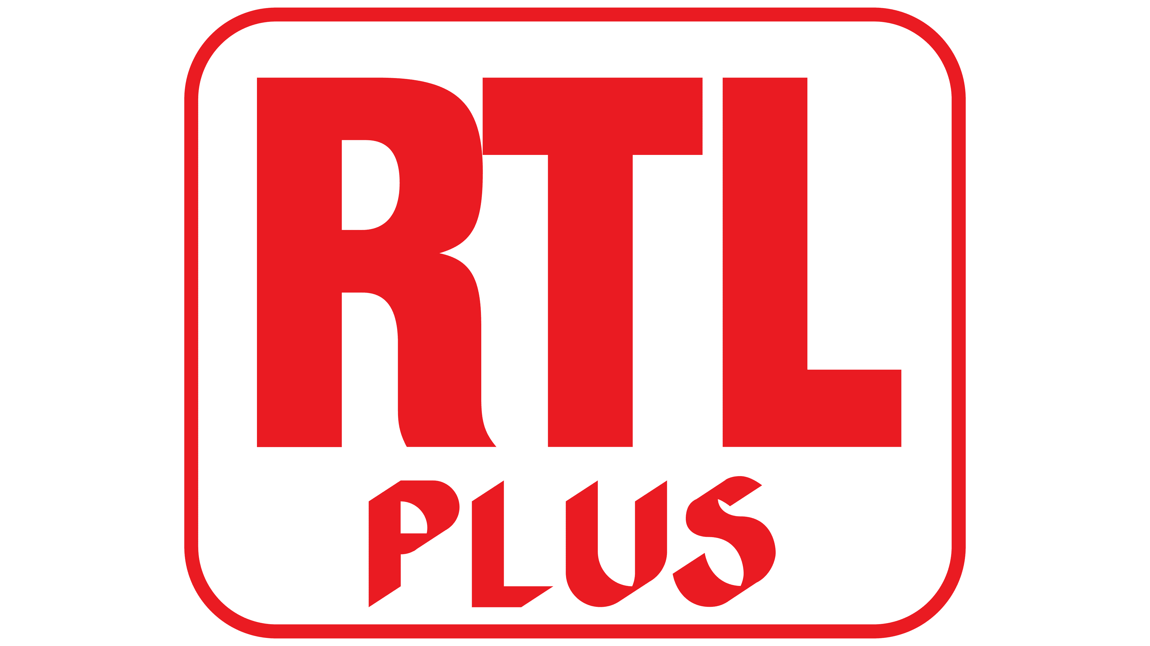
RTL Plus prepared two logos for its two broadcast platforms at launch. The rectangular version placed the name inside a rounded frame. The outline and letters were bright red, while the interior remained white. The abbreviation “RTL” occupied nearly the entire upper portion. Its lettering came from earlier RTL logos. Tall capital letters “R,” “T,” and “L” stood close together. Their sans-serif forms, heavy vertical strokes, and equal height gave the upper line a weighty, rectangular appearance.
“PLUS” appeared below the abbreviation in a different style. The lower line used decorative capitals with sharp cuts, angular outlines, and slanted sections. The contrast between the two styles distinguished the added portion of the name from the inherited RTL identity. An on-screen version appeared against a dark background with a glowing frame edge. The rectangular logo was used from January 2, 1984, through December 31, 1987.
The second launch version was a red circle. Inside were uppercase “RTL” letters, with lowercase “plus” beneath them. A roughly rectangular panel carrying “TELEVISION” sat at the bottom of the circle. This circular design was used only briefly.
1984 – 1985
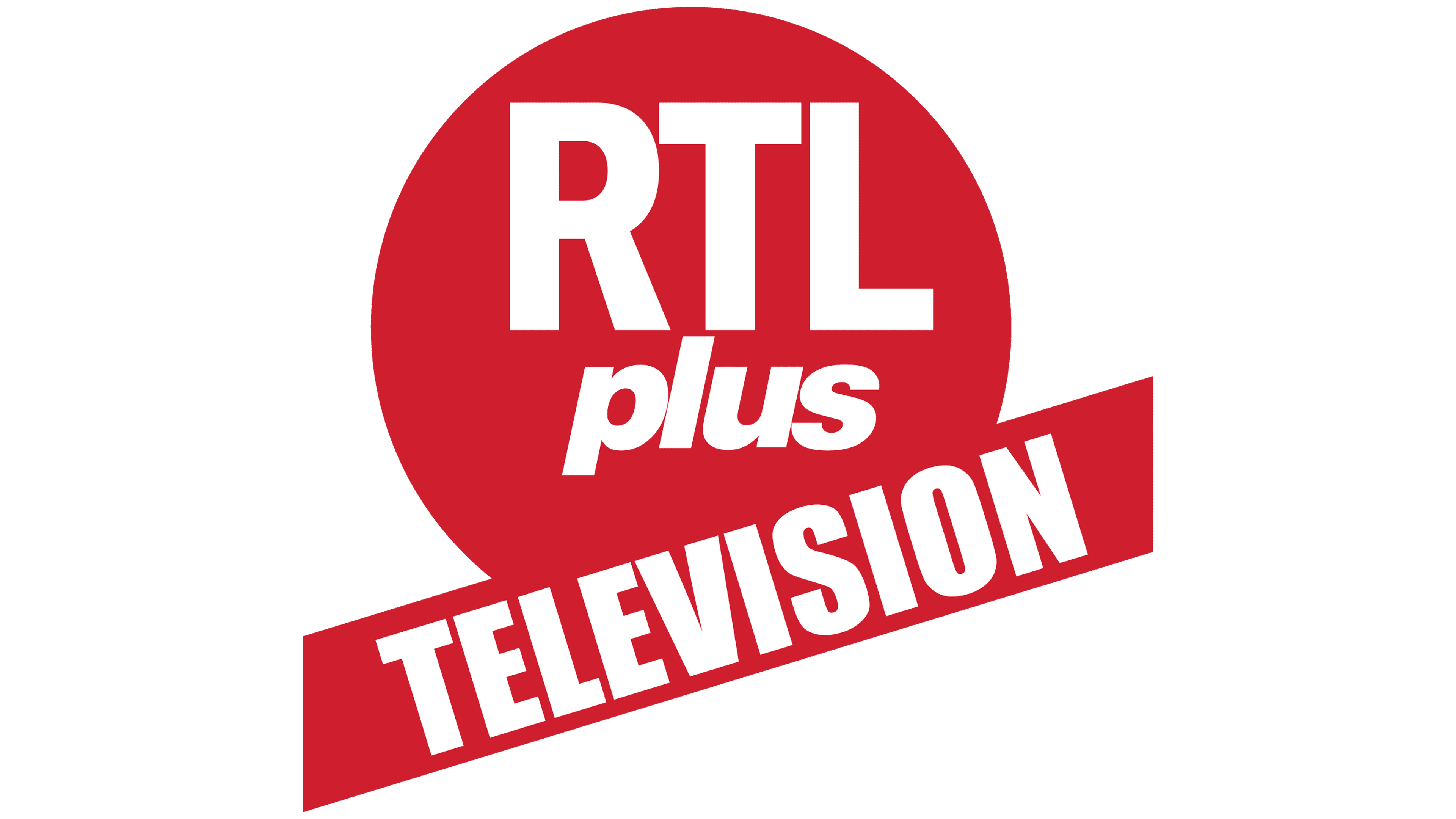
The circular RTL Plus emblem served as an alternative to the channel’s first logo in 1984 and 1985. Both versions were used simultaneously. After retiring the circular version, the channel continued using the original design. During launch preparations, the channel borrowed CLT’s name and emblem to cut design costs.
The circular version featured a red disk with two lines of white text. The upper line featured a large “RTL” abbreviation in heavy sans-serif capitals. Uniform strokes and tight spacing made the lettering compact. Beneath it, lowercase “plus” slanted to the right. Its rounded forms and lighter weight contrasted with the upper line’s formal outlines.
A red rectangular panel crossed the lower portion of the disk, rising from left to right and extending beyond the circle. White capitals spelling “TELEVISION” appeared on it. The lettering was a smaller version of the style used for “RTL.” It followed the panel’s angle, placing the television descriptor diagonally beneath the two parts of the name.
1985 – 1988
In 1985, the alternative RTL Plus logo adopted a rounded rectangular background. It replaced the circle, and the diagonal “TELEVISION” panel was removed. The entire name now fit inside the red field on two lines. This version appeared alongside the original 1984 logo, with both used until 1988.
Large white “RTL” letters occupied the upper line. The bold sans-serif style combined straight lines with heavy strokes. The abbreviation remained uppercase and larger than the lower portion of the name. White lowercase “plus” sat beneath it with a slight rightward slant. Its rounded contours and flowing italic curves distinguished it from the heavy letters above.
A solid red field provided a shared background for both lines. Rounded corners framed the name, replacing the earlier circle and projecting band with a single rectangular shape. The colors, large abbreviation, and italic “plus” connected the updated emblem to its circular predecessor.
1988 – 1992
RTL Plus’s move to Cologne in 1988 coincided with an identity update and a reassessment of the channel’s role. The year began with an exclusive New Year’s interview on January 1 and a programming relaunch. The channel took over several programs from competitor Sat.1 and began positioning itself as a general-interest broadcaster. In May, a new logo with three-dimensional, multicolored letters appeared on screen.
Studio Cerise created a dimensional abbreviation with a red “R,” yellow “T,” and blue “L.” The letters fanned out like an open book. Perspective placed them on three planes. The red “R” projected forward, the yellow “T” occupied the middle, and the blue “L” completed the structure at the back. White “PLUS” lettering appeared on its projecting right-hand section. Sharp edges and angular forms reflected the channel’s intent to move away from public broadcasters’ restrained identities. Design director Manfred Becker later recalled that the aim was to give the emblem a prickly, even slightly uncomfortable appearance.
On/Off Productions also worked on the on-air identity. It focused on the channel’s overall atmosphere rather than the content of individual programs. On air, the logo was usually transparent, with outlines separating the letters. For several months in 1988, they used a colored version in which the letters met along the edges of their colored surfaces. They removed the word “plus” from the logo sometime between 1988 and 1992.
An experimental animated version inspired by Wassily Kandinsky’s work appeared in 1990. A red rectangular solid, a blue sphere, and a yellow prism replaced the letters. Early broadcasts included the channel name, but later versions showed only the shapes. The red, yellow, and blue combination maintained the connection to RTL. This short-lived experiment sat between Cerise’s dimensional abbreviation and the slater rectangular-block identity.
1992 – 1996
RTL’s name and logo changed in 1992 to reflect its ambition to move beyond being a television offshoot of a radio station. Programming director Marc Conrad wanted to present the channel as a full-fledged television network and spent about a year discussing a name change with the parent company. On October 31, 1992, RTLplus became RTL Television. Promotional materials used the shortened name RTL.
The logo changed along with the name. Conrad wanted to replace the complex fan-shaped structure, and Los Angeles studio Novocom received the commission. American networks CBS and ABC served as a reference. Viewers were expected to recognize the channel through the three letters “RTL,” which needed a more practical arrangement than the previous emblem’s spatial construction.
Novocom placed white capital letters “R,” “T,” and “L” in a row, each inside a separate colored rectangle. A red block containing “R” came first, followed by a yellow block with “T” and a blue block with “L.” The original rectangles had 4:3 proportions. An elongated horizontal arrangement replaced the dimensional letters fanning outward. The previous colors remained, moving from the letters to their backgrounds.
“TELEVISION” appeared beneath the three blocks. Thin black capitals stood far apart. Their stroke weight and spacing contrasted with the logo’s substantial colored upper portion. The lower line conveyed the channel’s full name, while the upper row contained its abbreviation.
Novocom designed and animated the new logo and on-air identity. Frank Gari and Danny Baker of Gari Media Group composed the music for the ident variations.
1996 – 1999
The next RTL Television logo update changed the colors of the three rectangular blocks. Bright red replaced the burgundy-red background, yellow shifted to yellow-orange, and deep blue replaced dark purple.
The flat design retained its existing structure. White “R,” “T,” and “L” letters remained inside horizontally arranged rectangles, with “TELEVISION” beneath them. The block shapes, lettering, and placement of both rows stayed unchanged.
1999 – 2004
RTL’s move to a dimensional identity changed the colored rectangles’ appearance while preserving the logo’s three-part structure. Beveled edges, highlights, and shaded areas made the blocks resemble transparent colored plates. The borders occupied part of each rectangle’s interior, while the white RTL letters appeared to sit on the front surface.
The left block became red, with soft transitions between light and shadow along its edges. The middle block took on a bright orange tone with an inner glow. The right block remained blue, shifting toward blue-turquoise along its lower edge. Color variations added depth to the beveled faces. The revisions were limited to the backgrounds’ texture, shades, and lighting. The rest of the logo kept its previous appearance and placement.
2004 – 2008
For the channel’s 20th anniversary in early 2004, RTL removed “TELEVISION” from the logo. Dropping the lower line accompanied the move to the shorter RTL name and the introduction of “Mein RTL,” meaning “My RTL.” RTL Creation, led by Michael Hayek, handled the update. For Novocom, the logo and related on-air package were its final work on the channel’s identity before the company closed in 2008.
Three colored blocks in a horizontal row remained the emblem’s basis. White capitals “R,” “T,” and “L” sat inside them. With the descriptor removed, the abbreviation became the logo’s only text. Dimensional edges, highlights, and gradients still suggested colored plates. The red block on the left had soft shifts of light and shadow around its edges. The middle block was bright orange with an inner glow. The blue block on the right shifted toward blue-turquoise at the bottom. A “Liquid Light” effect was added to the on-air identity, with light transitions connecting individual idents.
2008 – 2014
RTL Creation continued refining the dimensional logo while maintaining continuity with the channel’s previous identity. The new version aired on August 31, 2008. The channel aimed to give the emblem a contemporary appearance through a gradual brand refresh. Most changes affected the colored blocks’ surfaces and borders.
Three equal rectangles still formed a horizontal row containing the white capital letters “R,” “T,” and “L.” The dimensional borders became narrower, and the surfaces became smoother. Fine shadows beneath the letters separated them from their colored backgrounds. At the same time, soft gradients, highlights, and reflections kept the finish glossy.
In the left rectangle, burgundy at the bottom transitioned through red to pale pink at the top behind the “R.” The orange background behind the “T” lightened to pale yellow along the upper edge. In the right block, blue at the top shifted to light blue below the “L.” The varied lighting preserved the blocks’ depth, even as their edges became less substantial.
2014 – 2017
On August 28, 2014, RTL’s three colored logo blocks were joined into a continuous horizontal strip. RTL Creation handled the update, with Ulli Schumacher directing the design work. The team aimed to reduce decorative detail. The handwritten “Mein,” meaning “my,” was removed, and the rectangles were brought together to form a single background with three equal-width sections.
The white capitals “R,” “T,” and “L” retained their sans-serif forms, straight lines, and blunt corners. The letters moved closer together. Long diagonal shadows extended sharply down and to the right. These dark, translucent shadows combined with the background’s soft gloss, making the letters appear raised above the surface.
The left section became cherry red, transitioning from burgundy along the bottom to a lighter tone at the top. In the middle, yellow at the top passed through orange into bronze at the bottom. The right section combined blue and light blue, darker below and lighter above. The light upper edges created consistent illumination across the three sections. The on-air identity introduced the “RTL-Stripe,” repeating the channel’s three colors.
In July 2015, “Willkommen zuhause,” meaning “Welcome home,” joined the “Mein RTL” tagline. Its launch was supported by RTL’s largest advertising campaign in 20 years. The phrase had already been used in the early 2000s, when it was written “Willkommen zu Hause,” with a space between “zu” and “Hause.”
2017 – 2021
RTL updated its logo for the start of the television season on September 1, 2017, brightening its three colors. The channel hoped to increase audience interest in its presentation. The basic structure remained, with changes focused on the rectangular blocks’ fills and the shadows beneath the white letters.
Flat color fields replaced the glossy gradients. The left section became red, the middle yellow, and the right blue-turquoise. Large white “R,” “T,” and “L” letters with thick strokes remained against them. Subtle shadows gave the lettering a slight sense of depth, while the backgrounds became flat. The rest of the logo retained its previous appearance.
The corner-of-screen emblem and musical jingle remained unchanged. “Willkommen zuhause,” or “Welcome home,” continued to feature in the idents, while “Mein RTL,” or “My RTL,” appeared occasionally. Sister news channel n-tv also rebranded on the day RTL launched its refreshed identity.
2021 – today
RTL’s 2021 logo update accompanied the unification of television, streaming, audio, and corporate operations under the shared RTL United brand. The project formed part of a comprehensive restructuring of RTL Deutschland Media Group. The identity was presented on June 14 at Screenforce Days and to employees in Cologne, with the television channel adopting it on September 15. RTL Deutschland’s team worked with AKQA on the project. Frederik Geisler led the creative work, and Lucas Aritz was among the designers. Tine Knies contributed to the identity guidelines and the new type family.
Three rectangles containing white capitals “R,” “T,” and “L” maintained the connection to the previous emblem. The equally sized blocks adopted 16:9 proportions and sat in a horizontal row with light gaps between them. The letters became thinner while retaining their horizontally extended proportions. The gaps divided the former continuous strip into three separate backgrounds.
The main change involved color. A range of combinations based on the image or subject matter replaced the fixed red, yellow, and blue scheme. One version pairs a bright blue “R” block with a cyan “T” block and a purple “L” block. The cyan approaches a neon shade, while the purple leans toward magenta. The changing combinations were intended to express the diversity of RTL’s people, stories, and content.
A generator was created to produce the color variations. It extracts dominant colors from an image and adjusts their brightness, helping coordinate the logo with individual pieces of content. The three rectangles, their arrangement, and the white abbreviation remain fixed, while the background colors change with the material.
The RTL United type family, developed by atipo and Arillatype.Studio, became the typographic foundation of the refreshed brand. Basier was used in the early development stage, followed by a custom typeface that combines neo-grotesque and geometric features. Separate styles were created for channel and division names. In 2022, RTL United received an iF award in typography and a Red Dot Best of the Best award.