


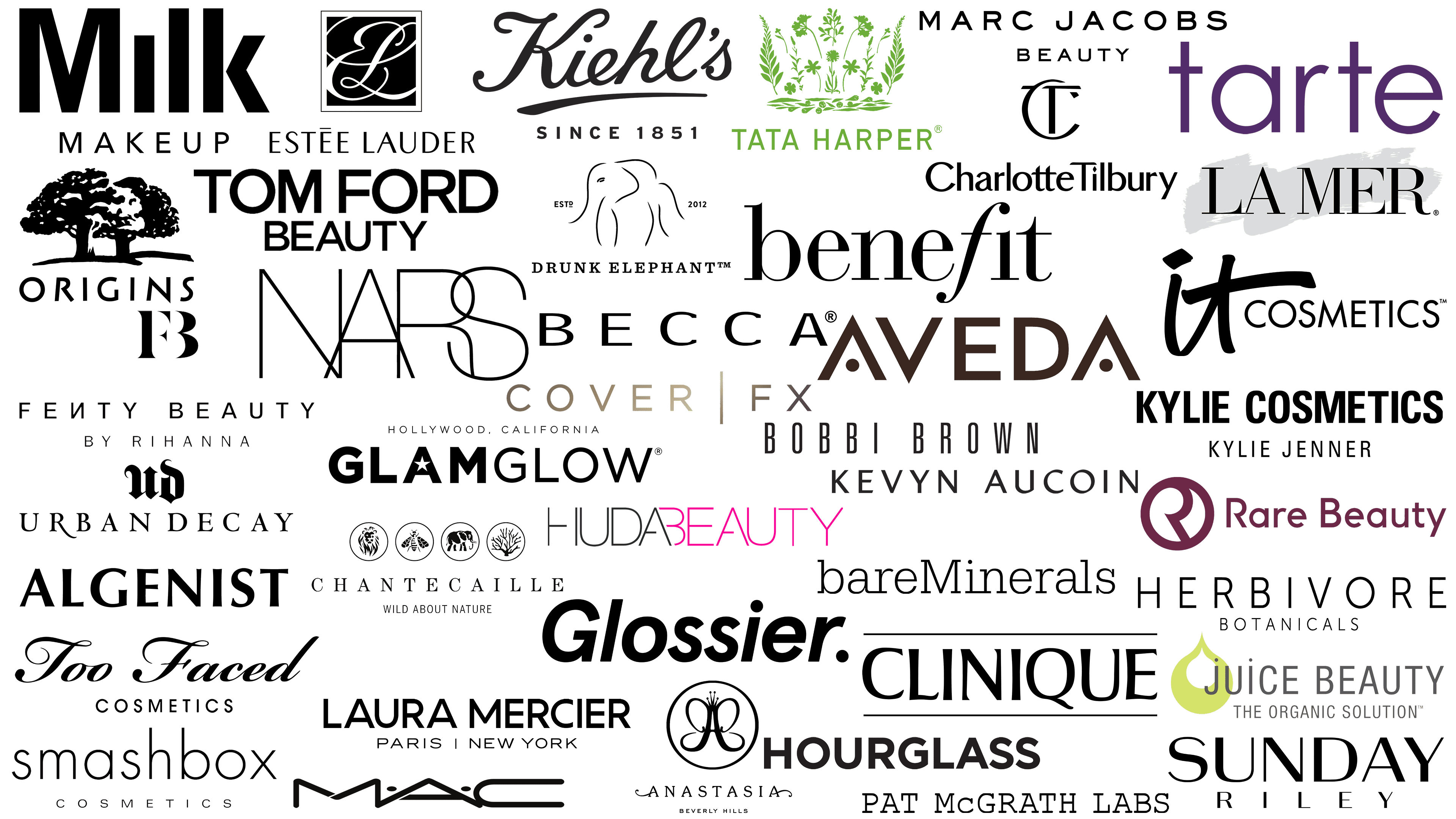
Beauty is the eternal dream and constant goal of millions worldwide. The US cosmetics industry is a trendsetter, with American brands consistently offering fresh and unique products to consumers each year. Store shelves are filled with bright packaging and appealing names, but only a few brands achieve significant popularity.
Today, cosmetic quality is determined by ingredients or manufacturers’ promises. The brand’s visual identity, encompassing its logo, packaging design, and advertising style, also plays a crucial role.
Companies use graphic language to convey their core ideas to consumers. For some, this is about rigor and minimalism; for others, it’s about playfulness and ease; for yet others, it’s about elegance and classic style. In cosmetics, symbols are as important as ingredients, helping brands secure their place in consumers’ hearts.
This article will examine the logos of the most popular American cosmetic brands. Let’s discover why certain brands are cherished among Americans and what stories their emblems convey.
Algenist
![]()
The American brand entered the cosmetics market, emphasizing a scientific approach to product development. The company’s key discovery was alguronic acid, derived from deep-sea algae. Thanks to this ingredient, the brand gained a reputation for its products, which boast pronounced anti-aging and regenerative properties. Algenist has become popular among fans of innovative skincare solutions.
Algenist’s visual identity reflects the brand’s ambition: its logo features uppercase letters in a strict, pointed font. The letters appear solid due to contrasting line thicknesses and restrained geometry, conveying the scientific character of the brand’s cosmetics.
Aveda
![]()
The American brand Aveda is recognized for its use of natural ingredients and its commitment to environmentally responsible practices. The brand transitioned to plant-based formulas, rejecting animal-derived ingredients. It implemented a unique supply-chain tracking system via the Wholechain platform, which allows customers to trace products from plant cultivation to store shelves. The company also participates in carbon-neutral programs and environmental preservation initiatives.
The brand’s visual style is simultaneously minimalistic and expressive. The Aveda logo uses large letters in a geometric font. Two letters “A,” whose horizontal bars have been replaced by distinctive dots, balance strict forms and softer details, emphasizing the brand’s purity.
BareMinerals
![]()
The story of BareMinerals began with a small shop in California, founded by Diane Kendal, not Diane Richardson. The brand was among the first to combine makeup and skincare properties, emphasizing the use of natural minerals. Today, BareMinerals is a leading brand in the mineral cosmetics segment, renowned for its quality and skincare products.
The logo design is modest. The name is presented in a simple typewriter-like font, featuring a single capital letter “M.” The remaining lowercase letters convey a sense of lightness and naturalness, reflecting the brand’s core concept of minimal artificiality and maximum natural beauty.
Bobbi Brown
![]()
Created by the renowned makeup artist Bobbi Brown, it is famed for its cosmetics, which are appreciated for their versatility. Products include foundations, mascaras, concealers, eyeshadows, blushes, and lipsticks, offering a range to satisfy any fashionista’s whims. Collections frequently update with the seasons or special dates. The brand features iconic products that secured its success, alongside luxury lines for special occasions that regularly introduce new items.
The logo conveys the brand’s character with geometric letters and a clean sans-serif font. The spacing between “Bobbi” and “Brown” is widened, giving a feeling of lightness. The design communicates a commitment to elegant simplicity, helping the brand stand out in the beauty industry.
Charlotte Tilbury
![]()
The Charlotte Tilbury brand owes its popularity to its founder, a renowned makeup artist trusted by Hollywood stars including Jennifer Lopez and Penélope Cruz. Products are crafted with the highest-quality ingredients and feature formulas that deliver long-lasting makeup results. The brand’s line includes foundations, powders, lipsticks, and eyeshadows that have received industry awards.
Charlotte Tilbury’s logo emphasizes luxury with a “CT” monogram, where the letters intersect and complement each other with smooth, flowing lines. The main text features soft shapes and elegant details, with slightly expanded letter edges enhancing a premium feel. The composition appears refined, aligning with the brand’s high standards of beauty.
Drunk Elephant
![]()
The American brand Drunk Elephant positions itself as a protector of skin from harmful substances, creating cosmetics that maintain natural balance. The products exclude silicones, essential oils, alcohols, and other ingredients that may be undesirable for sensitive skin. The brand received backing from the Japanese Shiseido corporation, affirming its strong market position.
Drunk Elephant’s logo is a simplified elephant silhouette, with contours formed by thin, graceful lines that create a soft, refined shape. The brand’s name is presented in an elegant serif font, adding a touch of sophistication to the composition. The symbol’s minimalism reflects the brand’s philosophy of purity and simplicity in formulas and packaging.
Fenty Beauty
![]()
Fenty Beauty was founded by singer Rihanna and fashion house LVMH, reshaping the cosmetics market. The brand has become a symbol of inclusivity, offering a wide range of shades for all skin types.
The brand’s style blends simplicity and elegance. The logo includes a neat “FB” monogram formed from capital letters with slender curves and serifs. The primary name appears in an elongated sans-serif font, highlighted by an unusual mirrored letter “N.” Completing the composition is a concise phrase, “By Rihanna,” emphasizing the founder’s personality.
Huda Beauty
![]()
Huda Beauty was created by blogger Huda Kattan, who initially launched false eyelashes and gradually became a sensation in the beauty market. The brand’s popularity rose dramatically, with its products now sold in prestigious stores and recognized as some of the most in-demand globally.
The brand’s visual style is vibrant and engaging. The name is rendered in an ultra-thin, modern font with smooth letter transitions, in striking pink and black. The letters “A” are partially truncated, forming distinctive geometric shapes that enhance brand recognition among fashion enthusiasts.
Juice Beauty
![]()
Juice Beauty was founded by Karen Behnke, who dedicated her life to health and beauty. The brand gained fame for its use of eco-friendly ingredients and holds the authoritative USDA Organic certification. All product ingredients are sourced from farmers, and strict animal welfare policies are confirmed by PETA and Leaping Bunny certifications.
The Juice Beauty logo combines text and symbol to create a fresh, light image. The brand name uses a delicate, airy sans-serif font with elegant dots over the letters “j” and “i.” The company symbol is a double green drop, symbolizing the natural character of the cosmetics and their connection with nature.
Kiehl’s
![]()
The American brand Kiehl’s began as a small pharmacy in New York, gradually earning customer trust through its unique approach to customer service. The company’s assortment includes skincare, body care, and hair care products formulated with botanical ingredients. Their popularity is based not on marketing but on attention to each customer’s needs. Products come in simple jars and tubes, emphasizing the brand’s traditional image.
The Kiehl’s emblem resembles a personal signature executed in an elegant calligraphic font with smooth underlining. The black color and writing style have remained unchanged since the brand’s inception. The logo stands out because the name resembles an autograph, as if left by an old friend, thereby maintaining a warm connection.
La Mer
![]()
La Mer’s history began with researcher Max Huber’s fascination with the power of marine ingredients. After thousands of experiments, he created the iconic Crème de la Mer, the brand’s signature product. Celebrities favor the brand’s products for their unique formula, which is filled with the power of the ocean. High quality and luxury have made their cosmetics iconic among premium brands.
The La Mer logo design appears sophisticated due to the combination of a classic serif font and a subtle, gray-green brushstroke in the background. The simplicity of lines and the strict contours of the letters create an atmosphere of exclusivity. The logo avoids flashy elements, conveying understated confidence and reliance on product quality.
Origins
![]()
The American brand Origins gained recognition for combining natural ingredients with modern innovations. Estée Lauder launches its products, adheres to strict environmental standards, and refuses to test on animals. Its products appeal to consumers who prefer natural self-care methods and believe in nature’s power.
Visually, Origins is represented by two powerful tree crowns, boldly outlined in black. The tree symbolism reflects the brand’s idea of harmony with nature. The font is simple and confident, with a slight slant to the lines that emphasizes the brand’s natural origin and calm character.
Sunday Riley
![]()
Sunday Riley earned its reputation through bold formulations containing active ingredients and scientifically proven components. The brand’s founder actively participates in product formulation, ensuring the products avoid artificial additives, parabens, mineral oils, and fragrances. The brand’s packaging is recyclable. It advocates for environmental protection and regularly plants trees to support the ecology.
The Sunday Riley logo is executed in a classic monochrome style. The brand name is set in two lines, using a sans-serif font with refined letterforms. The upper word is larger and more prominent, while the lower word “Riley” appears in a smaller, lighter font, creating a pleasant visual contrast.
Tata Harper
![]()
Tata Harper earned the nickname “Queen of Green” for using plant-based ingredients in skincare products. The brand’s products have exceptionally pure compositions, featuring dozens of herbs and flowers in each jar. Cosmetic enthusiasts appreciate the freshness and lively character of the products. The brand is popular among celebrities who prioritize skincare and appearance.
Tata Harper’s visual style reflects its plant-based ingredients. The logo features a vivid green color scheme, uses uppercase letters in a strict geometric sans-serif font, and is accompanied by an illustration of herbs, flowers, and leaves. The image is meticulously detailed, evoking a light, fresh sensation and a sense of closeness to nature.
Too Faced
![]()
The cosmetics brand Too Faced was founded by Jerrod Blandino and Jeremy Johnson, inspired by the makeup industry and the idea of expressing oneself through images. The brand is known for its vibrant palette and unconventional product design. It cares for animals, does not test products on them, and uses only synthetic brushes.
The Too Faced logo reflects the brand’s femininity. The upper part is crafted in cursive handwriting, featuring impressive swirls that emphasize refinement and elegance. The lower word “Cosmetics” contrasts with the top word, which is written in a simple, modern sans-serif font.
Estée Lauder
![]()
The American brand Estée Lauder originated as a family business and has since become a leader in premium cosmetics. The brand is recognized for its perfume collections, skincare products, and makeup, which are distinguished by unique formulations and sophisticated packaging. The products are in demand among those interested in makeup and skincare, who value consistent quality and elegant packaging.
Estée Lauder’s emblem stands out with an elegant intertwining of the initials “E” and “L” within a frame. The smooth letter lines create a sense of refinement. The bottom inscription uses a neat font, supporting the prestigious image. The symbol’s appearance has remained unchanged for decades, confirming adherence to tradition.
Chantecaille
![]()
The cosmetics brand Chantecaille was born of a passion for nature and environmental stewardship. The company’s founder, Sylvie Chantecaille, built the business on the principles of sustainability. Cosmetic formulas are created with natural ingredients, combining advanced developments and the power of plants. The products are cruelty-free, and some proceeds support the protection of rare animal species and the restoration of natural resources.
The Chantecaille logo reflects the brand’s deep connection with nature. Visually, this is represented by four round symbols depicting animals and plants that need protection. The slogan “Wild About Nature” communicates the brand’s mission. The black classic serif font emphasizes sophistication.
Clinique
![]()
Clinique was among the first brands to approach cosmetics through dermatological research. Developed in collaboration with medical professionals, the brand prioritizes product safety, hypoallergenic properties, and ease of use. The cosmetics are based on scientific methods confirmed by clinical testing.
Clinique’s logo reflects the brand’s character through clean shapes and precise graphics. The name is written in bold letters enclosed by strict horizontal lines at the top and bottom. The design emphasizes the visual connection to skincare and dermatology. The logo looks professional, conveying a serious approach to skincare.
NARS
![]()
Created by makeup artist François Nars, the NARS brand established its presence in the cosmetics world through vibrant shades and daring solutions. The brand’s professional cosmetics are famous for durability, intense colors, and expressive product names, winning over fashion and beauty enthusiasts. The company is unafraid of experiments, resulting in diverse and bold palettes.
The NARS logo reflects its creative side. Letters connect through thin lines, intersecting each other and forming an unusual graphic play. The font has an artistic look, creating a dynamic brand image. The simplicity of the color palette amplifies the original design’s effect, conveying the brand’s vivid individuality.
GlamGlow
![]()
GlamGlow’s history is deeply rooted in the Hollywood atmosphere. The brand gained fame for its express masks, which refresh the skin before important events. It gained recognition among celebrities due to the quick results and noticeable effects of its products. Initially created by founders for actors and celebrity clients, it gained broad popularity beyond the film industry.
The GlamGlow logo is built on contrasts. A clear font combines with a star symbol replacing the letter “A.” The inscription “Hollywood, California” heightens the sense of fame. The composition gives an impression of energy and exclusivity, conveying the luxurious Hollywood lifestyle.
Becca
![]()
The Becca brand gained recognition for its luminous textures, becoming a leader in makeup that focuses on skin illumination. The brand’s founder, makeup artist Rebecca Morrice Williams, aimed to create cosmetics that reveal the skin’s inner glow. The brand offers products suitable for a wide range of skin tones.
The Becca logo is minimalist, supporting the brand’s overall aesthetic. It’s simple, uppercase lettering emphasizes the clarity and practicality of the products. The absence of additional details conveys reliability and a clear product-focused approach, emphasizing content over external packaging.
Tarte Cosmetics
![]()
The American brand Tarte Cosmetics was founded by Maureen Kelly, who decided to create cosmetics using natural ingredients, with a focus on health and the environment. The company produces cruelty-free vegan cosmetics. Its products are known for their natural origins and packaging featuring fantastic, nature-inspired imagery.
Tarte’s logo features a purplish color palette, emphasizing the brand’s playful character. The name comprises neat lowercase letters in a simple, friendly font. The design choice reflects the brand’s vibrancy and resonates with an audience sharing the value of eco-friendly beauty.
Anastasia Beverly Hills
![]()
Anastasia Soare, founder of Anastasia Beverly Hills, created a brand renowned for its professional approach to eyebrow care. Over time, the brand expanded into a full range of decorative cosmetics. It is considered a symbol of mastery and perfection in the beauty industry, winning recognition from makeup artists and enthusiasts.
The brand’s logo features an original monogram in the form of the letter “A,” stylized as a butterfly with a crown, enclosed within a circle. Elegance is complemented by the name “Anastasia,” presented in a font with beautiful swirls, accompanied by the more formal “Beverly Hills” inscription below. The design showcases the brand’s sophisticated character and its esteemed position in the beauty industry.
Smashbox Cosmetics
![]()
Brothers Dean and Davis Factor, heirs to the renowned Max Factor legacy, founded Smashbox Cosmetics in their Los Angeles photography studio. The brand was intended for professional makeup artists working in challenging photo shoots. Smashbox cosmetics hold up reliably under studio lighting and are popular among those who value reliability and results.
The Smashbox logo design is simultaneously minimalist and expressive. The primary part of the name is in lowercase letters, set in a thin, smooth sans-serif font, which lends the brand a sense of ease and openness. Beneath it, the word “COSMETICS” is presented in uppercase letters in an even thinner font, adding a professional touch.
Hourglass
![]()
Carisa Janes created Hourglass as a brand with a progressive approach to beauty, one that is oriented toward both luxury and humanity. The company aims to combine advanced scientific developments with environmental care, offering cosmetics with nurturing ingredients in stylish packaging. Hourglass is renowned for its distinctive product textures and exceptional durability, appealing to those who value reliability and effectiveness.
The brand’s visual appearance is minimalist. The name is presented in a large black sans-serif font, emphasizing modernity. The lettering is straight and neat, reflecting the products’ technological aspect and the brand’s prestige.
Urban Decay
![]()
Established by Sandy Lerner and her partners, Urban Decay gained a reputation as a daring innovator. The brand is renowned for its vibrant palettes and bold lipstick shades, offering cosmetics that cater to those seeking individuality and self-expression through makeup. Urban Decay is chosen for bold colors and stylish product design.
The logo combines two contrasting elements. The upper part consists of the letters “UD,” stylized in Gothic script, creating an atmosphere of mystery. The full name below is set in a classic serif font, adding harmony and emphasizing the cosmetics’ professional quality.
MAC Cosmetics
![]()
Canadians Frank Toskan and Frank Angelo co-founded MAC Cosmetics and gained fame in the professional makeup industry. The brand is renowned for its diverse range of shades. It participates in numerous social projects, focusing on equality and diversity in the beauty industry.
MAC’s brand symbol is recognizable due to its unique style. The name is written with smooth, elongated letters that feature an unusual placement of dots between them, emphasizing exclusivity. The design showcases the brand’s boldness and creativity, emphasizing diversity and professionalism.
Herbivore Botanicals
![]()
Founded by Julia Wills and Alexander Kummerow, Herbivore Botanicals became popular for its natural, plant-based ingredients. The brand’s products contain no synthetic additives, offering a natural skincare experience. The brand emphasizes transparency and natural formulations in its skincare products.
The Herbivore Botanicals logo is executed in a simple sans-serif font. The upper part of the name is larger, while the lower part is thinner and neater. The restrained symbol design reflects the brand’s focus on natural origins and the purity of its formulations.
Tom Ford Beauty
![]()
The Tom Ford Beauty cosmetics line evolved from the designer’s fashion brand. The collections feature vibrant shades and textures, reflecting the founder’s ambition and style. Products are characterized by dense, long-lasting textures and striking packaging that highlight the brand’s high status.
Tom Ford Beauty’s symbolism appears prestigious, written in a large, strict font. Below the designer’s name is the lighter word “Beauty,” adding balance. The logo’s minimalism confirms the brand’s premium positioning.
IT Cosmetics
![]()
The American brand IT Cosmetics combines decorative and skincare components. The brand’s products target skin concerns, making it popular among consumers who appreciate functionality. Cosmetics are developed by dermatologists, increasing trust in the products.
The IT Cosmetics emblem looks dynamic due to the combination of the handwritten “IT” and the brand name’s neat font. The symbol appears positive due to its relaxed, stylish look. The contrast between handwritten and printed text highlights the brand’s modernity and openness, oriented towards users’ real needs.
Pat McGrath Labs
![]()
The founder of Pat McGrath Labs, makeup artist Pat McGrath, successfully translated her backstage beauty vision onto store shelves. The brand is renowned for its decorative cosmetics, featuring bold palettes and textures that inspire experimentation and creativity. Its highly pigmented products and product lines are released in small batches, increasing exclusivity and the desire to try new items.
The Pat McGrath Labs logo is minimalistic and straightforward. The name is executed in a strict, typewriter-style font. The design conveys a sense of innovation combined with sophistication. The font lines express a refined style, distinguishing the brand from others.
Benefit Cosmetics
![]()
The American brand Benefit Cosmetics was founded by sisters Jean and Jane Ford, whose sense of humor became part of the brand’s concept. The brand’s products, particularly those for brows and lashes, gained popularity due to their unconventional packaging and witty names. The packaging style evokes a retro aesthetic, highlighting the brand’s playful nature.
The Benefit Cosmetics logo reflects the brand’s playful and flirtatious nature. The soft curves of the letters and the elongated “f,” which descends below the baseline, add a feminine touch to the design. The elegant, thin-lined font conveys the company’s approachable and carefree attitude towards beauty and care.
Milk Makeup
![]()
The New York-based brand Milk Makeup is recognized for its cruelty-free cosmetics, which prioritize versatility and convenience. The brand produces sticks, cream blushes, and highlighters for quick makeup application in urban conditions. Products are easy to apply and match the lifestyle of city dwellers.
The Milk Makeup logo emphasizes simplicity. The geometric font, with its straight lines and large letters, supports the brand’s concept of simplicity. The written brand name reflects the company’s core principle: maximum comfort and product functionality.
Laura Mercier
![]()
Laura Mercier established itself as a benchmark for refined, understated style in the industry. The founder, French makeup artist Laura Mercier, gained renown for her expertise in creating natural-looking makeup. Products stand out for their textures and natural color palettes, making them popular among fans of subtle makeup.
The logo presents the brand name in a strictly styled font, supplemented by the names of two cities, Paris and New York. The lines and contrast between letter thickness emphasize the brand’s professionalism and elegance.
Glossier
![]()
Glossier emerged as a natural continuation of the Into The Gloss blog, founded by Emily Weiss. The brand offers simple skincare and makeup products, emphasizing natural beauty and ease of use.
Glossier’s corporate identity features a bright italicized font with smooth lines and a friendly letter style. The logo includes a period, reinforcing the brand’s perception as approachable and relatable to everyday life.
Kylie Cosmetics
![]()
Kylie Cosmetics attracted attention as Kylie Jenner’s vivid project in the beauty industry. The brand gained recognition with Lip Kits, lipsticks, and other products that create expressive makeup. Products feature a wide color palette catering to diverse tastes.
The visual identity of Kylie Cosmetics is memorable due to its stylish, thin handwritten font. Elongated letters with graceful lines convey the brand’s fashionable character. The composition’s fresh rhythm and the lines’ simplicity highlight the individuality of the identity.
Cover FX
![]()
Cover FX began by creating cosmetics with pure, safe ingredients for all skin types. The brand focuses on shades and textures, offering consumers individual product choices. A rich palette and gentle formulas have attracted fans who appreciate quality skincare and makeup.
The visual appearance consists of strict, uniform uppercase letters, separated by a vertical line between words. The logo’s color scheme, featuring a smooth gradient in warm tones, complements the image and emphasizes the brand’s high-quality products.
Rare Beauty
![]()
Founded by singer Selena Gomez, Rare Beauty creates cosmetics that inspire consumers to accept themselves as they are. The brand is known for initiatives supporting mental health through the Rare Impact Fund. This is part of the company’s mission, in which a portion of profits is allocated to programs that support people. The brand’s products emphasize natural beauty, avoiding imposed beauty standards.
In Rare Beauty’s logo, simplicity and originality blend seamlessly. The name is written in a thin font, and on the left is a circular symbol containing an unusually slanted “R.” The deep purple color emphasizes the brand’s emotional warmth. The design complements the company’s image of honesty and openness.
BareMinerals
![]()
The American brand BareMinerals popularized mineral cosmetics, providing an alternative to traditional makeup. The brand’s products are free from harsh chemical components. Consumers choose these cosmetics for their natural ingredients and the improvement of their skin with regular use.
The restrained BareMinerals logo is built on the contrast of lowercase and uppercase letters. The name is written continuously, with letter emphasis highlighting clarity and product accessibility. Simplicity in design symbolizes the company’s confidence in the effectiveness and skin benefits of its products.
Kevyn Aucoin
![]()
Kevyn Aucoin is a professional cosmetics brand founded by the renowned makeup artist of the same name. The makeup maestro drew inspiration from his clients’ individual facial features, developing sculpting techniques tailored to their unique characteristics. The cosmetics are designed to create expressive looks using lines and light to highlight the best facial features.
Kevyn Aucoin’s emblem appears minimalist and prestigious, consisting of the makeup artist’s first and last names in uppercase letters. The bold lettering conveys the brand’s strictness and professional focus. The logo reflects the company’s prestige and the high standards of its products.
Marc Jacobs Beauty
![]()
Marc Jacobs Beauty was created by renowned fashion designer Marc Jacobs, whose style is evident in vibrant shades and unexpected texture combinations. The brand’s products feature rich colors, bold solutions, and long-lasting formulas. The makeup collections unlock customers’ creativity and inspire experimentation with their look.
The Marc Jacobs Beauty logo appears neat and stylish. The name is written in large letters, with the word “Beauty” placed below, emphasizing the decorative focus of the products. The emblem is executed in a font that enhances the brand’s high-status impression. Minimalism in the design complements the brand’s stylish packaging.
Conclusion
Behind each beautiful emblem lies a story of people, their ambitions, and ideas. The US beauty industry has combined scientific achievements, natural ingredients, and stylish design in its products, making brands appealing to consumers.
Some companies emphasize eco-friendliness and natural ingredients, while others highlight professionalism and advanced technologies. Each emblem serves as a small brand story, informing consumers about what they are getting when choosing products bearing that symbol. Logos reflect the diversity of American cosmetics manufacturers and their shared understanding of the importance of a company’s image in customers’ eyes.