 Molson Coors Logo PNG
Brewing involves preparing raw materials, fermenting, and bottling beverages, then distributing them to stores, bars, and restaurants. People enjoy these products during leisure time and social gatherings, creating steady demand across many countries. The Molson Coors logo is associated with a company that produces beer and manages a portfolio of brands in North America and Europe.
Molson Coors’ history began in 1786, when John Molson opened a brewery in Montreal. His enterprise became Canada’s first major beer producer. It gained popularity among consumers. In 1959, Molson introduced the Canadian brand, which over time became a national symbol.
In 1873, Adolph Coors founded a brewery in Golden, Colorado. Pure water from the Rocky Mountains ensured the beverages’ high quality. During Prohibition, the company survived by switching to non-alcoholic products. In 1978, the Coors Light brand became one of the most popular beers in the United States.
A separate line in history is connected with Frederick Miller. In 1855, he founded Miller Brewing Company in Milwaukee and used unique German yeast that gave his beer its characteristic taste.
On February 9, 2005, Molson and Coors merged. As a result, Molson Coors Brewing Company was created with offices in Denver and Montreal. In 2012, the company acquired StarBev for 2.65 billion euros, strengthening its position in Europe.
In 2016, Molson Coors completed the acquisition of MillerCoors for $12 billion. After that, it became the world’s third-largest beer producer.
Since 2020, the company has been known as Molson Coors Beverage Company. It has been developing business lines related to producing non-alcoholic beverages. In 2024, the company completed the modernization of the Golden Brewery as part of the G150 project.
The company announced the restructuring of its U.S. division and a 9% reduction in its administrative staff. It continues its course toward diversification and brand strengthening, adapting to challenging market conditions.
Meaning and History
What is Molson Coors?
A Canadian-American brewing corporation with offices in Chicago and Montreal, it was formed after the merger and acquisition of Miller Brewing Company for $12 billion. It ranks third worldwide and manages the brands Coors Light, Miller Lite, Molson Canadian, Blue Moon, Carling, and Staropramen. The founding families retain control through Class A shares, while institutional investors, including Vanguard Group, which holds about a 10 percent stake, own the rest. Production is divided into North American and European operations.
2005 – 2020
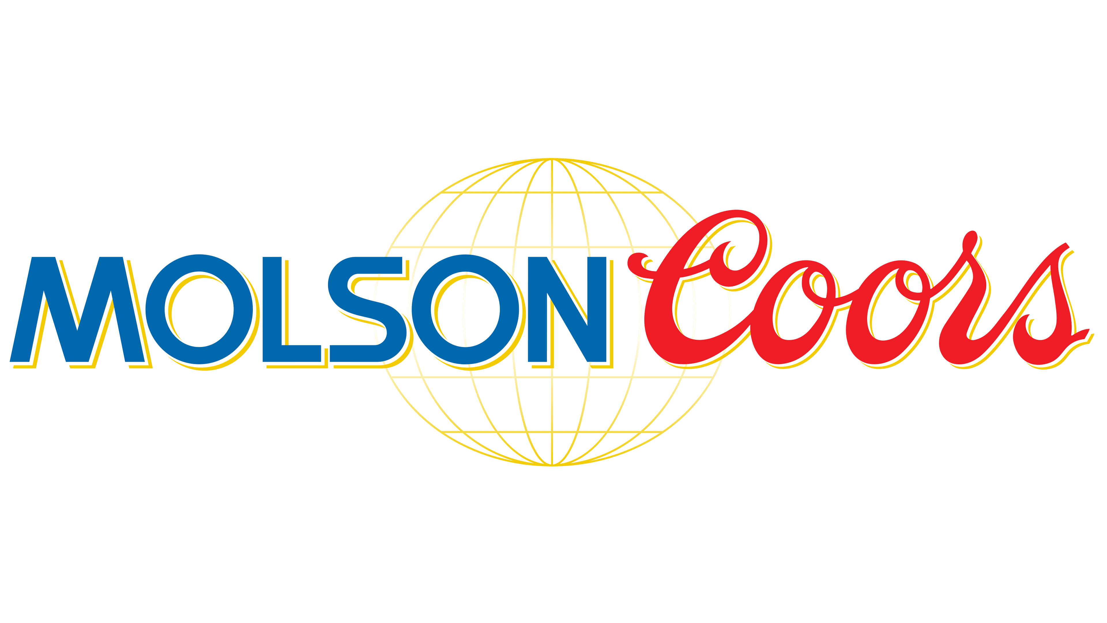
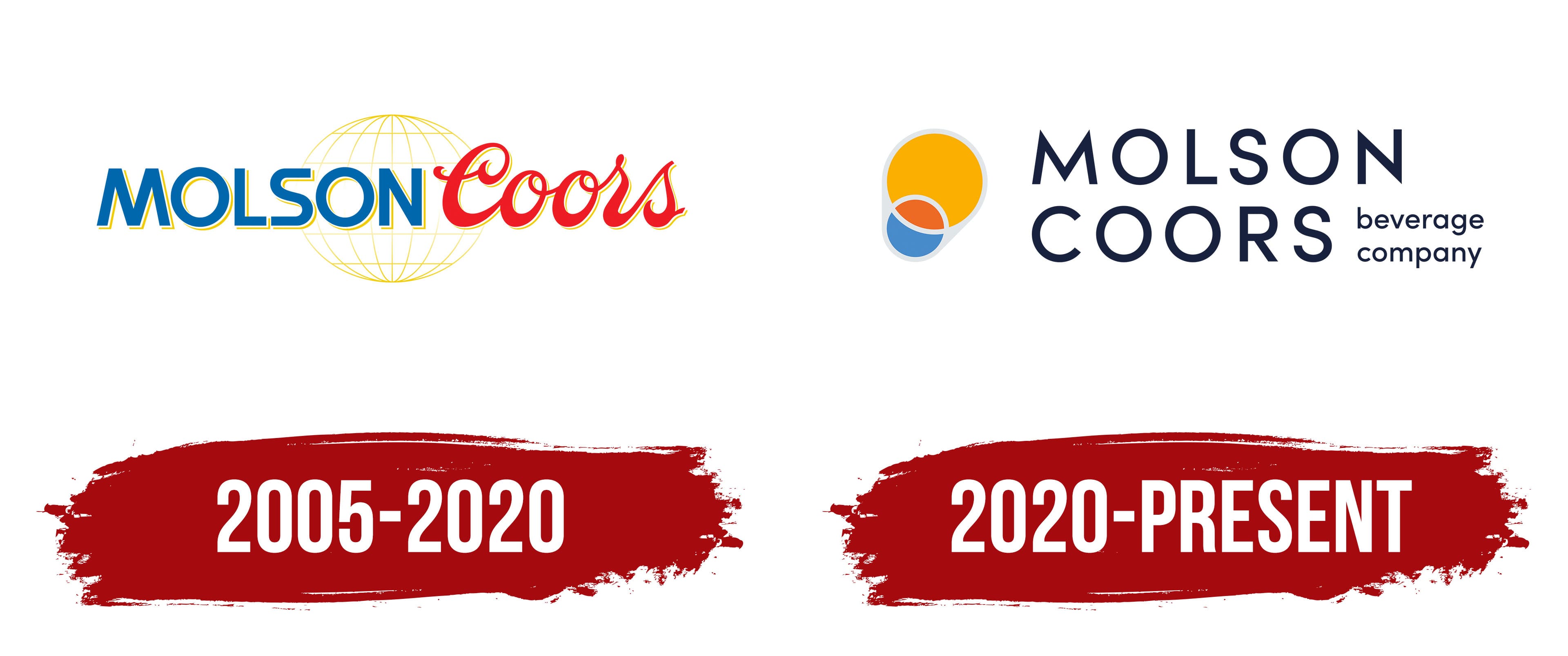
Molson Coors was created in 2005 through the merger of two family-owned brewing companies from Canada and the United States. The combined name retained the founders’ surnames, and the first corporate logo combined their familiar lettering styles. The blue uppercase word “MOLSON” appeared beside the red handwritten “Coors” name against a gold globe grid.
The Canadian history began in 1786. English immigrant John Molson opened a brewery on the bank of the St. Lawrence River in Montreal and named it after his family. The Molson family’s connection with the company continued for seven generations. The American brewery was founded in 1873, when German immigrants Adolph Coors and Jacob Schueler established the Golden Brewery in Golden, Colorado. Coors purchased his partner’s interest in 1880. After gaining complete control of the business, the brewery and its products received the Coors name.
Molson Inc. and Adolph Coors Company announced a planned merger on July 22, 2004. The transaction was completed on February 9, 2005, and the combined organization began operating as Molson Coors Brewing Company. The two surnames represented equal standing for the Canadian and American sides, while “Brewing Company” identified the company’s brewing specialization. The combined group retained historic brands, businesses, and family connections.
The first corporate emblem was used from 2005 until the 2020 update. The two surnames appeared side by side, connected through the shared design. “MOLSON” was set in blue uppercase sans-serif letters. Heavy strokes, upright lettering, and geometric forms distinguished the first part from the calligraphic “Coors” name. A thin gold-yellow line ran along the right and lower edges of the letters. It resembled an offset shadow and gave the wordmark a slight sense of depth.
“Coors” retained the style of the earlier product brand. A large initial “C” flowed into the lowercase letters of the red handwritten wordmark. The slant, smooth connections, and varied stroke widths resembled brush lettering. The gold outline repeated the shadow color around “MOLSON,” connecting the two lettering styles. The straight vertical strokes of the first surname appeared beside the curves and alternating thin and thick strokes of the second.
A gold globe grid appeared behind the names. Thin meridians and parallels formed a sphere in the middle of the composition. The wordmark covered its center, leaving portions of the grid visible above, below, and along the sides. The background remained visible through the spaces between the lines, giving the globe a translucent appearance. It increased the emblem’s height and, together with the gold detailing around the letters, united the two surnames within one corporate signature.
2020 – today
Molson Coors changed its corporate name in 2020 to reflect its expanded product range. The group was developing cider, flavored beverages, ready-to-drink cocktails, and alcohol-free products. “Beverage Company” replaced “Brewing Company” and covered a wider range of beverage categories. The updated logo retained both surnames and added a redesigned beer glass from the MillerCoors identity.
The American MillerCoors division was established in 2008 as a joint venture between Molson Coors and SABMiller. In 2016, Molson Coors acquired its partner’s remaining interest along with the international Miller portfolio. Further changes affected the group’s structure and corporate names. The company announced the reorganization on October 30, 2019. The legal name Molson Coors Beverage Company took effect on January 1, 2020. The company gradually removed the MillerCoors name from corporate use in the United States as it formed the shared Molson Coors North America and Molson Coors Europe organizations.
The company unveiled the new identity on February 12, 2020. Chicago agency Soulsight developed it. Sofia Colucci, vice president of innovation for North America, led the project. The team sought to preserve the heritage of both surnames, give them equal prominence, and represent the expanded product range. CEO Gavin Hattersley connected the transition from MillerCoors to Molson Coors with bringing employees together under one brand.
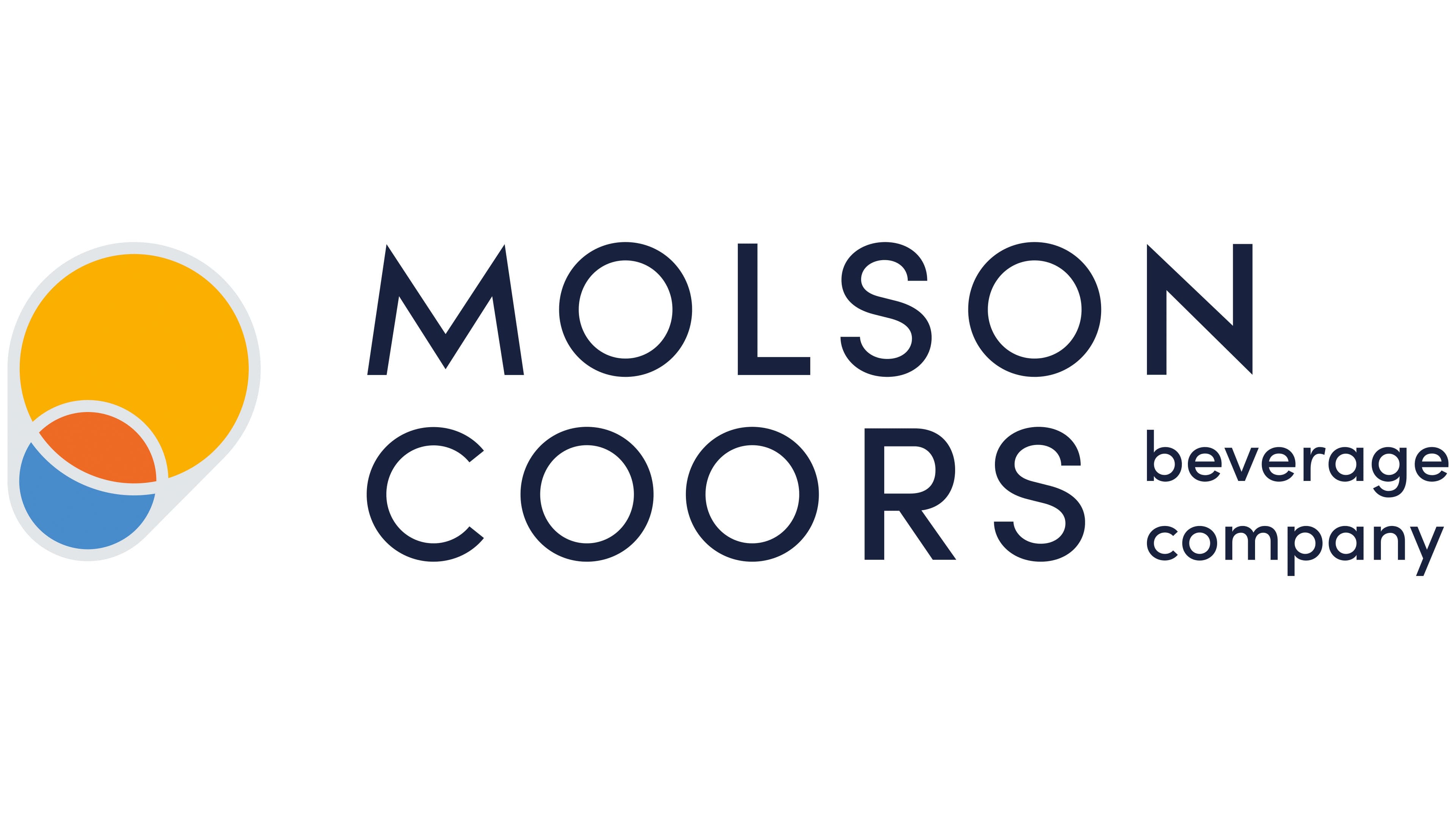
In the logo, the word “MOLSON” appears above “COORS.” Both surnames are set in matching dark blue uppercase letters based on Sofia Pro Medium. The geometric sans-serif typeface combines even strokes with rounded forms and uniform line widths. The two lines are similar in width, height, and weight. The previously different upright Molson lettering and red Coors script received the same letter design. The composition became flat, while the globe and gold detailing remained part of the previous logo.
A small “beverage company” descriptor appears to the right of “COORS.” It is divided into two lines and set in thin lowercase letters. Its small size makes the description secondary beside the large historic names. The word “beverage” refers to the company’s work across different drink categories.
Soulsight placed a multicolored “evolved pint glass” emblem on the left. It was based on the pint glass from the MillerCoors identity. The rounded gold-yellow area at the top resembles a filled glass. A small light blue shape intersects with it below, creating a red-orange section where the two overlap. White arcs separate the colored areas and outline a transparent glass. A thin light gray line marks the outer boundary.
The rounded forms resemble drops and bubbles of liquid, while the overall outline and white arcs preserve the image of a glass. The gold section represents beer and the brewing family’s nearly 250-year heritage. Orange and two shades of blue accompanied the expansion of the product range beyond beer. The MillerCoors motif linked the new emblem to the American division’s history.
The primary version combines dark blue lettering with gold, orange, and light blue sections in the emblem. Dark-background versions use light-colored letters while retaining the image’s colors. The name and the “beverage company” block are arranged the same way in both versions.