


 Opel Performance Center Logo PNG
The Opel Performance Center logo has become a symbol of the advanced technologies the company uses to produce its powerful vehicles. The stylish emblem reflects a commitment to innovation, quality, and reliability, which underpin the OPC concept.
Opel, then part of General Motors, created OPC in 1997 in Rüsselsheim, Germany, as a performance unit for faster versions of regular production cars. The small team of engineers and designers worked in a field already shaped by Mercedes-AMG and BMW M, with a focus on sportier road models and links to motorsport.
The first key project was the Astra G. In 1999, Astra OPC debuted with a 2.0-liter turbocharged engine producing 160 hp and a more aggressive body setup. In 2001, Zafira OPC brought the same idea to a family minivan, turning it into one of the fastest vehicles in its segment. In 2002, the Astra OPC X-Treme concept, based on a DTM racing car, showed how far the division could push the platform, although it remained a concept.
The lineup grew through the 2000s. Vectra OPC arrived in 2003 with a 3.2-liter V6 producing 255 hp, followed by the Meriva OPC in 2005, a compact minivan with high output for its class. In 2007, the Corsa OPC became a recognizable small hot hatch, while the Insignia OPC replaced the Vectra in 2008 with a 2.8-liter turbocharged V6, 325 hp, and all-wheel drive.
In 2009, OPC Race Camp connected the division with young driver development. In 2011, Astra OPC reached 280 hp, and Corsa OPC received new versions. After the 2017 takeover by PSA Group, later folded into Stellantis, the role of OPC changed. From 2018, the focus moved toward OPC Line packages, suspension tuning, and sport-themed versions of regular and electrified models.
Meaning and History
What is Opel Performance Center?
This is the high-performance division of the German automaker Opel, producing sporty and dynamic versions of the brand’s standard models. Powerful engines, improved suspension systems, and aggressive styling are the characteristics of the cars in this division that make them attractive to drivers seeking an exciting driving experience. Customers can further enhance their vehicles’ capabilities and personalize them with the range of modifications and accessories offered by the division. To provide superior handling, braking, and overall performance, the vehicles are designed and engineered to retain the convenience and comfort of Opel’s base models.
1997 – 2005

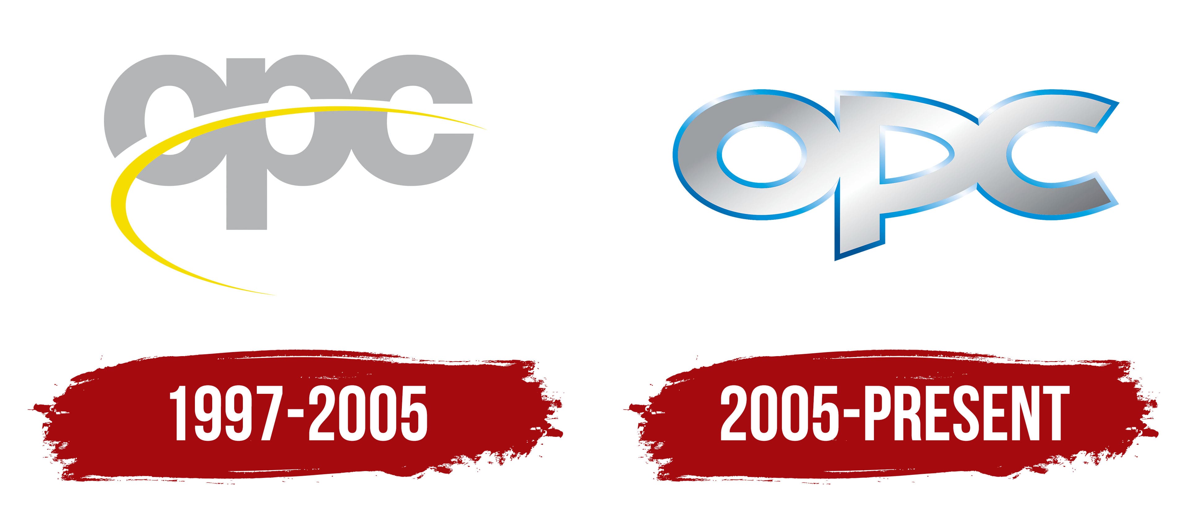
The original logo features the abbreviated name Opel Performance Center, presented concisely with a sans-serif font. The letters have contrasting designs, incorporating smooth curves and sharp edges.
- Rounded elements symbolize the vehicles’ aerodynamic properties, power, and speed.
- Sharp angles reflect precision and technological prowess, which are essential in automotive engineering.
The bold font, similar to Coolvetica Bold, demonstrates the brand’s strength and confidence. Designers used lowercase letters to make the emblem friendlier, as lowercase glyphs indicate OPC’s accessibility and customer orientation.
The letters blend to form a structure of three ovals and one vertical rectangle. The connected inscription creates a sense of unity, representing the company’s comprehensive approach to car development. A long, pointed, boomerang-shaped stripe divides the logo into two parts. This line adds dynamism to the logo, expressing two conceptual aspects:
- Opel Performance Center’s pursuit of progress and innovation
- The brand’s vehicles’ swift speed and agility.
The lower part of the stripe is yellow, and the upper part is white, contrasting with the gray letters. The restrained color palette embodies reliability and stability, characterizing OPC as a confident brand. The yellow line infuses the emblem with vibrant energy, evoking lightning-fast movement.
2005 – today
While developing the new logo, the company remained true to its traditions and retained the short “OPC” inscription. This version shares many similarities with the original, with all letters connected, signifying an integrated approach to car production. However, designers made several adjustments that affected the emblem’s visual perception, primarily to the font.
- Previously, the letters were vertical ovals; now, they are horizontal. This geometry gives the impression of the word racing forward like a powerful sports car.
- The “P” and “C” have sharp angles, adding aggressiveness and dynamism to the design. Diagonal cuts on the outer ends give them a futuristic look, aligning with the company’s concept of high-performance vehicles.
- The massive “C” resembles a horseshoe, a traditional symbol of luck and stability.
Silver is used instead of the usual light gray to create a volumetric effect. The linear gradient runs diagonally, transitioning smoothly from a light shade (center) to a dark one (edges), adding visual depth to the logo. The texture of the letters resembles polished or chrome-plated metal, fitting the automotive theme. The cold metallic sheen evokes a sense of strength and emphasizes the premium status of the Opel Performance Center.
The inscription features a thin outline shimmering in various shades of blue, creating a backlighting effect and giving the logo a three-dimensional appearance. Additionally, the blue stripe looks like a sharply honed edge, reflecting the brand’s “predatory” nature, with cars that dominate racing tracks.