


![]() FlipaClip Logo PNG
FlipaClip Logo PNG
The FlipaClip logo highlights the app’s creative yet simple approach to animation. Its graphic design symbolizes the tool’s accessibility and clarity, intended for a wide user audience.
FlipaClip was founded in 2010 in Miami by brothers Jonathan and Marcos Meson, establishing Visual Blasters LLC. Both had extensive backgrounds in technology and design. The idea emerged from a Samsung contest for the Galaxy Note. The first FlipaClip version debuted on Android in April 2012 and was praised for its simplicity.
In 2014, FlipaClip was pre-installed on 400,000 Fuhu tablets for kids, significantly expanding its user base. The iOS version launched in 2017 and gained popularity among teens who shared animations on platforms like YouTube and TikTok. Versions for Windows and macOS were released in 2018.
During the 2020 pandemic, FlipaClip gained popularity among educators and students. By 2025, downloads had exceeded 100 million, earning recognition from Google Play and making the app available on all major platforms. In 2024, the company successfully addressed a major data leak, thereby preserving audience trust and continuing its growth.
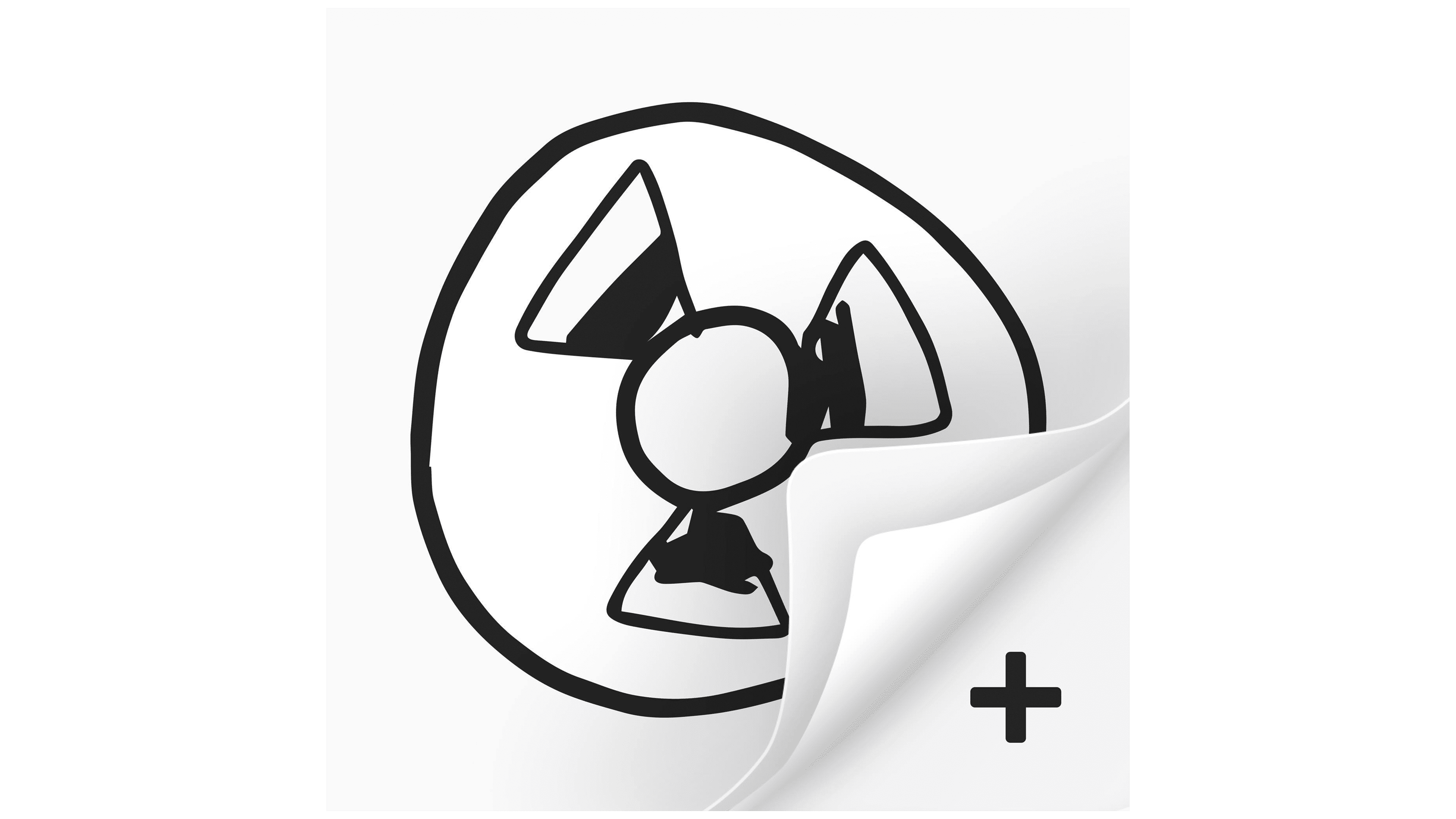
Meaning and History
![]()
What is FlipaClip?
It is a popular app for creating frame-by-frame animation on smartphones and tablets, replicating the traditional hand-drawn animation style. This allows users to produce cartoons and video clips. Key features include layers, adjustable frame rates, and sound integration.
2012 – 2016
![]()
The FlipaClip logo from 2012–2016 is from the early stage of the mobile application’s existence. Created by Visual Blasters LLC for frame-by-frame 2D animation, it accompanied the app at launch and during its initial rise in popularity among young audiences and amateur artists.
The logo design is based on a handwritten style reminiscent of comic book illustrations, sketches, or marker lettering. The word “FlipaClip” is written in a mix of uppercase and lowercase letters with soft, uneven lines, asymmetrical shapes, and the look of hand-drawn writing. This approach was chosen to convey the atmosphere of the creative process, sketching, and the ease of making animations on a mobile device.
The custom typeface evokes a hand-drawn sketch, with irregular outlines, smooth curves, and a lack of strict geometry, highlighting the brand’s informal, creative nature. The black color provides maximum contrast against the app’s white interface background.
Aesthetically, the logo design aligns with the app’s interface, featuring a white working canvas and tools that imitate pencil and ink strokes. This strengthens the brand’s association with animation and artistic techniques.
The logo was created in-house by the Visual Blasters team without outside agency involvement, as the project was a small startup with a minimal team.
It was with this visual style that FlipaClip first gained wide recognition in the Google Play and App Store marketplaces, began building its user community, and became a popular tool among beginner animators and bloggers creating videos and challenges for YouTube and social media.
2016 – today
![]()
The current FlipaClip logo is a continuation and development of the app’s early identity. It retains the overall hand-drawn concept but modifies the letter styling and visual accents to enhance digital adaptability and expressiveness.
The updated logo is based on a slightly modified yet similar custom typeface, in which each letter of “FlipaClip” is depicted in an unconventional, asymmetrical form reminiscent of marker sketches. The letters are vertically elongated, with varying proportions, uneven outlines, and visually dynamic lines that create an impression of lively, free movement and spontaneous creativity.
The letterforms have consistent stroke thickness and smoothly rounded corners, yet the overall shapes remain irregular and unstructured. The contours resemble artistic doodles, typically created during the animation sketching process. Letters lean in different directions, reinforcing the sense of freedom and a playful atmosphere.
The color palette is monochrome, using solid black as a universal base. Black was chosen to emphasize the tool’s clarity and neutrality, offering a space for the user’s expression without dictating a specific style.
The letter shapes do not replicate any existing font and were designed in-house by Visual Blasters LLC. They highlight the app’s individuality, setting it apart from competitors that use more technological and geometric typefaces.
Visually, this logo has become a key component of the app’s social media promotion, appearing in posts by popular creators on YouTube, Instagram, and TikTok. It emphasizes FlipaClip’s creative nature as an application for producing short-form animations, such as memes, sketches, and viral content.
Font and Colors
The typeface is a custom design in a handwritten lettering style with irregular lines and free-form shapes. The characters lack strict geometry and are fully asymmetrical, with shifting angles and varying stroke thickness, creating the effect of a live sketch made with a pen or marker. Among commercial fonts, it is most similar to AZ Dude and WhyFont.
The logo’s palette is minimalist, black on a white background. This straightforward monochrome approach ensures excellent legibility and visual neutrality, which are important for a platform focused on bright, colorful user-generated creativity.