


The dragon is an ancient, mythical creature that symbolizes power and mystery, existing only in legends and imagination. Almost every culture in the world has its interpretation of dragons: the fire-breathing monster of European folklore, the graceful celestial ruler of China, or the wise guardian of treasures in the East.
In myths, dragons are simultaneously associated with life and destruction, order and chaos, wisdom and the forces of nature. The image of the dragon is filled with mystique and ambition, making it a choice for brands and companies that emphasize character, power, and confidence. In logo design, the dragon becomes an expressive symbol that conveys a company’s personality.
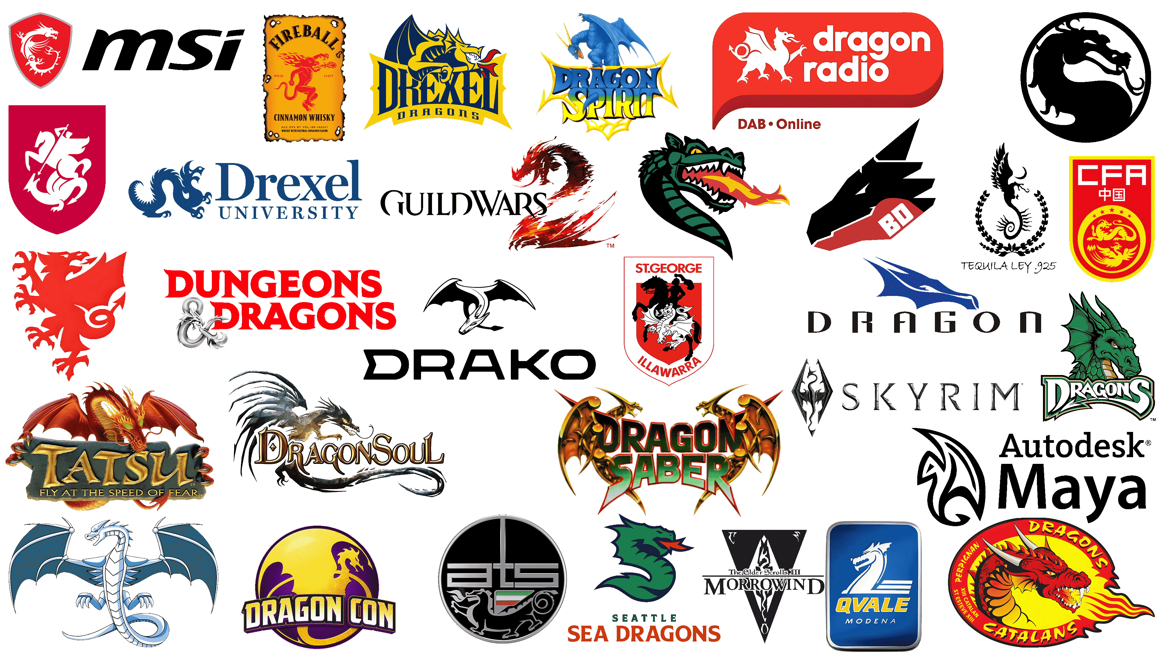
This article presents fascinating and vivid examples of famous logos featuring a dragon as the main character, capable of inspiring, impressing, and creating a legendary atmosphere around the brand.
Tatsu
![]()
The logo for Tatsu, an American amusement ride at Six Flags Magic Mountain, captivates viewers with a fiery, powerful dragon. The ride’s name originates in Japanese mythology, where “Tatsu” means “dragon.” This connection is reflected in the logo’s symbolism. The dragon wraps around a massive sign bearing the ride’s name, giving the impression of a creature guarding an ancient artifact or the gateway to a world of adventure.
The attraction is famous for its unique passenger arrangement, which simulates a dragon’s flight. Participants soar above the ground like legendary creatures, enhancing the emotional impact of the dragon symbol in the logo. The fiery hues hint at the speed and thrill visitors experience, while the dragon’s bright, glowing green eyes add mystery and intensity.
Dragon Radio
![]()
The Dragon Radio logo is energetic and positive, combining modern aesthetics with a historical symbol. The centerpiece is a white dragon depicted in classic Welsh style with one paw raised, wings spread wide, and tongue extended, suggesting openness to communication and lively interaction with the audience.
The dragon symbol pays homage to Welsh culture, where the red dragon has historically served as the national emblem, representing pride and unity. The company broadcasts on digital and online platforms, targeting listeners who enjoy a wide range of vibrant, diverse music. The radio station’s name is set in a simple, friendly font and placed next to the dragon’s silhouette, underscoring accessibility and a friendly tone for listeners. The logo features a speech bubble, symbolizing the station’s commitment to maintaining an ongoing dialogue and staying connected to its audience. Based on a rich red hue, the color scheme echoes the Welsh flag’s colors, creating a sense of brightness and emotion.
LLVM
![]()
The dragon featured in the LLVM logo is designed in shades of blue and white, evoking an icy, mythical creature with spread wings and a curved body. The graphic style resembles illustrations from legends and fairy tales, featuring majestic dragons that guard ancient secrets and knowledge. The brand’s acronym stands for Low-Level Virtual Machine, and the dragon on the logo symbolizes the software platform’s power and flexibility, designed to transform and optimize source code.
The dragon is associated with strength and intellectual superiority. In ancient cultures, dragons were considered guardians of wisdom and symbols of high status and authority. This may explain why a dragon, representing limitless potential and advanced capabilities, was chosen as the brand’s symbol for a brand connected with programming and complex technical tasks.
St. George Illawarra Dragons
![]()
The St. George Illawarra Dragons emblem combines classic heraldic imagery with the historical narrative of Saint George’s battle with the dragon. The dragon is depicted in white on the Australian rugby club’s logo, standing against a red background. A knight on horseback, rendered as a black silhouette, symbolizes Saint George. The confrontation between the dragon and the saint represents the qualities of struggle, power, and bravery associated with the team and the sport.
The team was formed by merging the St. George Dragons and Illawarra Steelers. The new logo retains the dragon symbol and features an image of Saint George, referencing the legend and highlighting the team’s strength and courage as they are prepared to face any challenge on the field. The red color represents the players’ passion and energy. White symbolizes the drive for victory and the purity of sportsmanship, while the rider’s black silhouette adds emotional intensity to the composition.
Football Association of Wales
![]()
For centuries, the red dragon has been recognized as a symbol of Welsh pride and strength, appearing on coats of arms and national flags. Its inclusion in the Football Association of Wales emblem continues this tradition, embodying the team’s power and fighting spirit.
The dragon on the association’s logo is depicted in heraldic style: the creature is shown in profile, with open wings and an extended tongue, symbolizing readiness for battle and sporting rivalry. Its red color makes the image vivid and confident.
Qvale
![]()
The Qvale Modena logo is memorable for its dynamic depiction of a dragon shaped like the number “2”. The stylized mythical creature represents the brand’s character and heritage, evoking the Italian passion for speed and automobiles.
The company was known for producing a single model, the Mangusta sports roadster, powered by a strong Ford V8 engine. The dragon image conveys the brand’s spirit: energy, speed, and exclusivity. The dragon’s head points forward, reflecting the company’s ambition to stand out in the automotive industry. The creature’s contours emphasize its dynamics, hinting at the sports-car qualities that enthusiasts of Italian design and American power appreciate. The blue background symbolizes trust and technological sophistication, while the yellow letters add brightness and emotional appeal.
MSI
![]()
The company has chosen the dragon to symbolize gaming power and technological reliability, integrating its image into its distinctive style. MSI’s logo features a white dragon in heraldic form placed on a red shield. The dragon, known to gamers worldwide as Lucky, has become the brand’s mascot, embodying the excitement and energy of gaming.
The dragon’s image reflects the competitive spirit the company promotes through its involvement in esports events and tournaments. Lucky the Dragon symbolizes luck, speed, and power, which are highly valued in the gaming and high-tech industries.
Dragon Saber
![]()
The Dragon Saber logo is executed in an aggressive, expressive style, reflecting the atmosphere of the classic Namco arcade video game from the late 1980s. A pair of fiery dragons on the emblem’s sides symbolizes the core gameplay mechanic, in which players control dragons battling numerous enemies. The dragons’ outlines are sharp and dynamic, emphasizing their combative nature and the danger they pose.
The emblem’s colors are vivid and saturated, with shades of red, yellow, and orange that evoke fire and energy. The central inscription is rendered in massive letters resembling metal saber blades, visually linking to the title, the game’s essence, and battles fought while riding dragons. The dragons in the logo serve as a direct visual reference to mythical creatures, granting players the strength and abilities to overcome obstacles in the virtual world.
Mortal Kombat
![]()
The famous Mortal Kombat logo, a silhouette of a dragon enclosed in a circle, originated with one of the game’s creators, John Tobias. Inspired by mythology and Eastern martial arts, he aimed to create an image that conveyed the game’s brutality and mystical atmosphere. Thus appeared the dragon, reminiscent of traditional Chinese representations of the creature, symbolizing power and authority.
The game gained notoriety for its intense combat scenes and distinctive narrative style, which seamlessly blended violence and fantasy elements. In the logo, the dragon symbolizes the tournament in which characters fight to save their worlds, underscoring the event’s mystical nature. Over many years, the dragon emblem has attained iconic status, becoming recognizable even beyond the gaming industry. The emblem emphasizes the mysterious atmosphere, tension, and confrontation characteristic of the game’s universe, elevating the franchise beyond mere gaming.
Drexel University
![]()
The Drexel University logo is designed in a classical academic style, combining tradition with the institution’s prestigious, rich history. The central image, a dragon drawn in a restrained and dignified manner, has been the university’s symbol since the early 20th century. The dragon is depicted with a curved neck and graceful body lines, reflecting a balance of seriousness and elegance.
The dragon on the coat of arms symbolizes intellectual strength and wisdom, representing a significant part of the university’s identity. According to university legend, founder Anthony Drexel believed the dragon embodied the power of knowledge and progress, so he chose it as the institution’s emblem. The logo’s textual elements are strict: the university’s name is set in a clear serif font, emphasizing seriousness and academic prestige. The color scheme, with its calm, confident shades of blue, harmoniously complements the overall style.
Chinese Football Association
![]()
The Chinese Football Association logo is a vivid example of how ancient symbols integrate into a modern country’s sporting culture. A dragon figure is at the center of the emblem, depicted in a distinctly Chinese style: an elongated body, curved lines, and an expressive, dynamic pose. In Chinese culture, the dragon represents power, wisdom, and prosperity, serving as a national symbol associated with victory and success.
A unique aspect of the emblem is the combination of the dragon with another significant Chinese symbol, the phoenix. In Chinese mythology, the dragon and phoenix form a pair representing the balance of Yin and Yang, harmony, and the unity of opposites. The phoenix on the emblem is depicted with widespread wings, emphasizing energy and inspiration. The red-and-yellow color scheme corresponds to China’s national colors. Above the figures are five stars, which reference the Chinese flag and symbolize national unity. The abbreviation “CFA” and the Chinese characters are rendered in a clear, precise font, neatly integrated into the upper part of the shield.
Guild Wars
![]()
The Guild Wars 2 logo features a fiery dragon rendered with expressive, dynamic brushstrokes in shades of red and black. The image of the creature intertwines with the numeral “2,” signifying the sequel to the popular gaming franchise released by ArenaNet in 2012.
Dragons have always been central figures in the Guild Wars universe, symbolizing powerful forces of destruction and creation, and continue to influence the game’s storyline. The entire game narrative revolves around ancient dragons, and the logo effectively conveys the atmosphere of confrontation between players and the mythical creatures taking over the continent of Tyria. The logo’s style supports the spirit of the game universe, blending magic and martial arts. The title is rendered in a strict serif font, contrasting with the vivid dragon image. The brushstroke techniques used in the dragon’s depiction convey the energy and dynamism characteristic of gameplay and the numerous battles in the storyline.
Fireball
![]()
The Fireball logo centers on a vivid, fiery dragon in blazing red, highlighting the beverage’s character: a spicy, cinnamon-infused whiskey. The dragon itself is shown in motion, breathing fire and appearing spirited and unstoppable, reflecting the sharp and burning taste of the drink.
The brand name curves above the dragon, written in a bold, daring font that matches the image’s overall atmosphere. The entire composition is stylized to resemble an aged sheet of paper with burnt edges, emphasizing the brand’s themes of fire and heat, as well as its distinctive qualities. The dragon image was chosen to convey intensity, warmth, and expressiveness, characteristics of the whiskey’s flavor profile.
UAB Blazers
![]()
The UAB Blazers logo features a fierce green dragon breathing fire, symbolizing the aggressive, combative spirit of the University of Alabama at Birmingham’s sports teams. The dragon was selected as the team’s symbol in 1978, replacing previous mascots, and has since become an integral part of the university’s identity and the students’ athletic life.
The green dragon symbolizes bravery, energy, and the drive for victory. Its open mouth with flames erupting outward conveys aggressiveness and readiness to fight, qualities highly valued in athletic competition. The dragon’s yellow eyes accentuate inner strength and danger, reinforcing the team’s competitive attitude.
Autodesk Maya
![]()
Autodesk Maya is one of the most recognizable brands in computer graphics and animation, and major movie studios and game developers widely use it. The brand’s visual identity features a stylized dragon rendered in black outline. Dragons have long been associated with power, creative energy, and the freedom to bring ideas to life.
The ancient Maya revered dragon-like beings connected to imagination and creation. The logo reflects the software’s role in creating worlds and characters that did not previously exist. The company provides digital artists with tools comparable to a dragon’s magic, bringing fantastic creatures and entire universes to life. The dragon appears restrained, calm, and majestic. It is neither aggressive nor overly detailed, and its smooth lines suggest the software’s flexibility.
Dragon Con
![]()
The Dragon Con logo resembles a medallion guarded by a golden dragon silhouette set against a deep purple background. The dragon figure is stylized, creating a harmonious balance between its wings and the curved lines of its body, which together encompass the entire emblem. The design evokes associations with fantasy worlds and serves as the festival’s central theme.
The festival is one of the largest events for fans of science fiction, fantasy, comics, and video games, held annually in Atlanta. The event’s name on the logo is highlighted in large, textured letters resembling dragon scales, referencing the theme of fantasy creatures and mythology featured in many works discussed at the festival. The purple and gold colors of the emblem are symbolic: purple is associated with mystery and magic, while gold signifies the richness of ideas and inspiration participants experience during the event. Through its dragon logo, the festival emphasizes fantastical worlds and boundless imagination, as reflected in its numerous exhibitions, panels, and creative gatherings.
Sea Dragons Sea
![]()
The dragon image in the Seattle Sea Dragons logo is expressive and emotional. The stylized silhouette of the mythical creature is rendered in deep shades of green and blue, and its form simultaneously resembles the letter “S,” the first letter of Seattle, and a twisting marine creature. Red flames enhance the logo’s aggressiveness and energy, emphasizing the team’s character.
The name references Seattle’s location on the Pacific Ocean, and the dragon was chosen as a brand symbol evoking maritime legends and myths filled with mysterious creatures. The image embodies the team’s spirit, which has been part of the XFL, a professional American football league, since its inception in 2020, highlighting its connection to local traditions and regional culture. Placing the team name below the emblem further strengthens its perception. Dark green and red shades create contrast, reflecting the players’ pursuit of victory and athletic strength.
Dragon Soul
![]()
The Dragon Soul logo evokes a mystical mood through its abstract depiction of a dragon, presented in flowing, elongated lines. The creature’s silhouette is crafted in metallic shades, gently transitioning from cool silver to rich gold, evoking a sense of something magical and ancient.
The name is displayed in an expressive, decorative typeface, complemented by gold and bronze tones that harmonize with the dragon’s image. The text styling resembles ancient handwritten scrolls or legendary runes, emphasizing the brand’s connection to fantasy themes and an epic atmosphere. In mythology, the soul of a dragon symbolizes supreme wisdom and powerful inner energy. It is this symbolism that the brand employs, connecting with the RPG theme of players developing characters and guiding them through numerous adventures. The dragon emblem represents power, protection, and an indomitable spirit, reinforcing the game’s storyline and character. The color palette and artistic execution of the emblem convey a sense of mystery and depth in the world where the events unfold.
Georgia National Football Team
![]()
The Georgian National Football Team logo features Saint George defeating a dragon, reflecting the Georgian people’s deep cultural and historical connection to the saint. Saint George, considered Georgia’s patron, symbolizes courage, bravery, and the ability to confront evil.
The dragon figure, defeated by the rider’s spear, is an allegory for overcoming challenges and achieving victory. In this emblem, the legend of Saint George expresses the team’s character and ambition to win. Images of Saint George and the dragon frequently appear in Georgian art and architecture; therefore, this symbol in the national team’s logo emphasizes the team’s connection to the country’s traditions and culture. The depiction is minimalist and heraldic: a white silhouette of the rider and dragon, centered on a red heraldic shield.
Tequila Ley 925 Azteca
![]()
In the Tequila Ley 925 Azteca logo, the dragon takes on an unusual, refined form. The creature appears as a mystical being with bird-like wings and an elegant, seahorse-like body, with its tail curling into a spiral reminiscent of an infinity symbol. Next to the dragon is a crescent moon, emphasizing the beverage’s link to Mexican traditions and ancient Aztec legends.
This premium brand is renowned for producing distinctive tequila, bottled in exclusive vessels adorned with silver and gold. The dragon in the logo is inspired by ancient Aztec symbols, embodying wisdom, strength, and spiritual energy, and represents maintaining balance between earth and sky. The decorative wreath around the dragon evokes associations with honor and status, underscoring the brand’s prestige. The beverage’s name is rendered in an elegant, handwritten font, harmonizing with the logo’s overall atmosphere and adding a sense of craftsmanship and exclusivity.
Catalans Dragons
![]()
The emblem of the French rugby club Catalans Dragons, from the city of Perpignan, is designed in a vivid, emotional style reminiscent of the team’s fiery temperament. The design centers on a powerful image of a fierce red dragon, open-mouthed and sharp-fanged, ready for battle. The dragon represents courage, strength, and an uncompromising fighting spirit, qualities inherent to the club’s rugby players competing in the British Super League.
The team’s name and location are closely tied to Catalonia’s culture and history, where the dragon is a significant symbol, embodying the region’s legendary power and independent spirit. Visually, the club emblem features a dynamic oval shape reminiscent of flames. The logo’s main colors, red and yellow, reflect the official colors of the Catalan flag. The club became the first French team to join the British league.
Drako Motors
![]()
The Drako Motors emblem is rendered in a restrained, elegant style. At its center is a dragon figure, its silhouette depicted as it flies downward with outspread wings and a sharp, pointed tail. Symbolically, the dragon’s image conveys the energy, dynamics, and power of the brand’s electric supercars.
The name is rendered in a bold, modern typeface that complements the dragon graphic. The strictness and clarity of the font lines evoke a sense of technological sophistication and reliability, reflecting the company’s innovative developments in electric vehicles. The dragon in the logo embodies the company’s spirit: graceful forms and high speed are incorporated into the vehicle design, combining aesthetics, power, and advanced technology.
Automobil Turismo e Sport
![]()
The round emblem of the Italian company Automobili Turismo e Sport combines the image of a mythical dragon with refined symbolism representing speed and elegant style. The lower portion of the emblem features a silver dragon silhouette, gently walking along the circular edge and exhaling flame, a subtle hint at the power and temperament of the brand’s automobiles.
The dragon in the ATS logo reflects Italian cultural traditions. In European mythology, dragons symbolize energy, passion, and strength of character. These qualities resonate with the company’s philosophy, which was founded in the early 1960s by former Ferrari engineers. The brand emerged from a group of professionals’ desire to create cars that combine speed and sophisticated design. Positioned above the dragon figure is the stylized lettering “ATS,” executed in a modern graphic style, with the space beneath filled with the Italian tricolor, a reminder of the company’s origins and automotive heritage. The emblem’s heraldic rigor and elegance convey an atmosphere of prestigious racing and the spirit of Italian automotive engineering, where technology and inspiration merge with character.
Dayton Dragons
![]()
The Dayton Dragons baseball club’s emblem is built around the confident, stern image of a dragon in deep green. The mythical creature’s serious gaze and the textured relief of its scales evoke associations with resilience and inner strength. With the dragon image, the club symbolizes the team’s competitive spirit and athletic character as it competes in the minor baseball league.
The club’s name is set at the bottom of the logo in a large, sharp, angular typeface resembling dragon claws. The final letter “S” extends and curves, forming a shape reminiscent of the mythical creature’s tail, visually connecting the text and the image. The club sets attendance records at home games among minor league teams. In the logo, the dragon symbolizes the protection of the home stadium and is intended to inspire unity and a fighting spirit among players and spectators. The color palette, a combination of green, white, and gold, adds a sense of style and solidity to the emblem.
Drexel Dragons
![]()
The Drexel Dragons’ emblem features a vibrant, rich yellow-and-blue color scheme. At the center of the logo is a powerful and energetic dragon, depicted in a stylized form with an open mouth and tongues of flame, symbolizing the team’s fighting spirit, excitement, and determination.
The name is placed at the bottom of the emblem in a large decorative font reminiscent of traditional collegiate symbols and American sports graphics. The dragon’s and text’s color palette reflects the university’s official colors and highlights the team’s affiliation with an educational institution with over a century of history. Drexel University adopted the dragon image for its sports teams at the beginning of the 20th century and has since made it an integral part of its traditions. In the logo’s symbolism, the dragon represents the strong character of the students and athletes who compete under its banner.
Skyrim
![]()
The Skyrim logo embodies the game’s epic world, where dragons are ancient and powerful beings. The dragon is depicted with elegant stylization, resembling a metal or stone carving, and is enclosed within a diamond-shaped outline with pointed corners. The dragon’s wings stretch upward, transforming into sharp, arrow-like shapes that enhance the sense of mystery and antiquity.
In the game, dragons are central figures tied to the main character’s destiny, the Dragonborn, whose name translates as “dragon-born.” The dragon image in the logo reflects the pivotal role these creatures play throughout the storyline and their influence on the game’s universe. The game’s title is accompanied by the dragon symbol in a serif typeface resembling ancient runes, creating the effect of an inscription carved into stone. The silver-gray tones evoke Skyrim’s cold, harsh climate, reinforcing the atmosphere of epic battles and adventures.
Dragon Spirit
![]()
The Dragon Spirit logo evokes the atmosphere of classic arcade games from the late 1980s, blending fantasy motifs with an expressive graphic style. The central figure is a dragon depicted in vibrant shades of blue with pronounced shadows, wings, and a muscular body. Its posture and sharp yellow horns suggest readiness for battle and fearlessness, reflecting the game’s storyline and theme.
The title “Dragon Spirit” is set in a large, decorative, two-tiered font in blue and yellow, which harmonizes with the dragon image and underscores the heroic atmosphere. The lower part of the letters transforms into an ornament resembling a pattern associated with dragon claws and flame, enhancing the overall impression of the composition.
Dragon Spirit, developed by Namco in 1987, is one of the iconic vertical scrolling shooter games in which players control a dragon to protect the world from invading evil forces. The logo reflects the game’s storyline, emphasizing its mystical, heroic nature and conveying to the player a sense of strength and power in their character.
Morrowind Logo
![]()
The logo of “The Elder Scrolls III: Morrowind” is a strict, dark triangle, within which is the silhouette of a dragon inspired by ancient symbols and engravings. The dragon appears elegant and mysterious, and its elongated figure creates a mystical mood characteristic of the game world.
The game was released by Bethesda Game Studios in 2002. Its events unfold in the province of Morrowind on the continent of Tamriel, and although dragons are not central to the plot, they are part of the Elder Scrolls universe’s rich mythological background. Ancient legends, ruins, and world mysteries are reflected in the logo’s symbolism, emphasizing the atmosphere of antiquity and the region’s mystery. The logo’s design is complemented by runic symbols in the corners, which enhance the impression of an archaic mystique. The game’s title is in a classic serif typeface, horizontally over the central symbol.
Crew Dragon Logo
![]()
The Crew Dragon logo on SpaceX’s spacecraft features a minimalist, sleek depiction of a blue dragon’s head. The stylish silhouette faces to the right, symbolizing forward motion and the future, consistent with SpaceX’s mission of space exploration and flights to the International Space Station.
The spacecraft’s name, “Drago,n” was inspired by the famous song “Puff the Magic Dragon,” which SpaceX founder Elon Musk loved. Since then, the dragon symbol has become an integral part of the brand, accompanying the company’s cargo and crewed missions. Crew Dragon became the first privately operated crewed spacecraft to successfully deliver astronauts to orbit in 2020. The dragon image in the logo embodies the company’s spirit of boldness and technological innovation. The name appears in a distinctive, slightly futuristic black font, highlighting the logo’s connection with space themes and advanced technology.
Dungeons & Dragons
![]()
The Dungeons & Dragons logo centers around two expressive elements: a bright, vivid name and a stylized dragon symbol. The dragon’s silhouette is seamlessly integrated into the ampersand, rendered in a shiny metallic finish that underscores the game’s fantasy atmosphere and the mystery at its core.
The dragon serves as both a visual symbol and a direct reference to the game’s universe, where dragons are powerful creatures that guard treasures and knowledge, ultimately shaping characters’ destinies. The lines of the ampersand form the smooth contours of the dragon’s body, with a pronounced head, an elongated neck, and a curling tail, creating a memorable and mysterious image. The game’s history dates back to 1974, making it the first tabletop role-playing game to significantly alter the genre’s perception. Due to its unique mechanics and richly detailed world, the game achieved legendary status, as reflected in its graphics. The bright red letters highlight the energy and drama of adventure awaiting players in fantastic dungeons.
Bad Dragon
![]()
The Bad Dragon logo features a striking dragon’s head in two contrasting colors: black and red. The logo’s geometric, sharp style features rigid, aggressive lines.
The brand’s name is derived from the dragon image, a mystical and provocative creature that can evoke strong emotions. The emblem represents the boldness and uniqueness of the company’s products, renowned in the adult industry for their distinctive aesthetics and design. The lower part of the dragon’s head features the white letters “BD,” an abbreviation of the company’s name. These contrast with the dragon’s lower jaw’s red hue, enhancing the symbol’s visibility. The dragon in the logo symbolizes audacity, mystique, and imagination, underscoring the company’s unconventional style and direction.
Conclusion
The dragon retains the mystery, strength, and emotional character of ancient legends in contemporary logo design. Brands use the dragon image to convey character, energy, and uniqueness. Dragon symbolism seamlessly merges ancient myths with modern style, making emblems vibrant and instantly recognizable. By incorporating the dragon into their visual identities, companies highlight their ambition, superiority, and desire to stand out among competitors, transforming an ancient symbol into a powerful visual tool.