


 JD Sports Logo PNG
The sports apparel and footwear market centers on new collections, collaborations, and regular product updates. Stores bring together products from well-known brands and offer items related to street fashion and an active lifestyle. The JD Sports logo is associated with a retail chain that sells sports apparel, footwear, and accessories, focusing on the latest styles and popular brands.
JD Sports was founded in 1981 in Bury, Greater Manchester. It was established by entrepreneurs John Wardle and David Makin. The first store offered footwear and clothing from Nike, Adidas, and Puma. The assortment was aimed at the growing sports fashion subculture in the United Kingdom.
In the 1980s, the chain expanded across northern England. Stores opened in Manchester, Liverpool, and other cities. In 1996, JD Sports listed on the London Stock Exchange.
In the 2000s, the company accelerated its growth through acquisitions. It acquired First Sport in 2002, Scotts Sports in 2005, and Blacks Leisure Group in 2007. The latter added an outdoor goods segment to its portfolio.
Since 2012, the company has been expanding into the European market. Stores were opened in France, Spain, Germany, and the Netherlands. In 2014, the company acquired the Spanish chain Sprinter for 45 million euros.
In 2016, JD attempted to establish a foothold in the United States and announced plans to acquire Finish Line for $558 million. The deal did not go through, but the company retained a minority stake.
In 2018, the company acquired Footasylum for £ 90 million. An intervention by the UK regulator, the CMA, led to the sale of this asset in 2022.
In 2019, JD Sports joined the FTSE 100 index. In 2020, the company strengthened its online operations and invested in digital infrastructure.
In 2021, Peter Cowgill, the company’s chairman, resigned. In 2023, the company expanded its international presence and began developing a franchise network in Asia and the Middle East.
In 2024, the company focused on partnerships with Nike and Adidas. This secured access to exclusive models.
JD Sports operates more than 3,000 stores in 20 countries. The company remains the leader in sports fashion in the United Kingdom and one of Europe’s largest players.
Meaning and History
What is JD Sports?
A leading British retailer of sportswear, footwear, and accessories headquartered in Bury near Manchester. It operates more than 3,800 stores across Europe, North America, Asia, and Australia. Founded in the early 1980s, it grew from a single store into an international corporation. The range includes products from Nike, adidas, Reebok, Puma, Jordan, The North Face, New Balance, Vans, Timberland, and other brands. Growth is supported by acquisitions of Finish Line, Hibbett, Courir, Go Outdoors, and Blacks, as well as exclusive collaborations and limited sneaker collections.
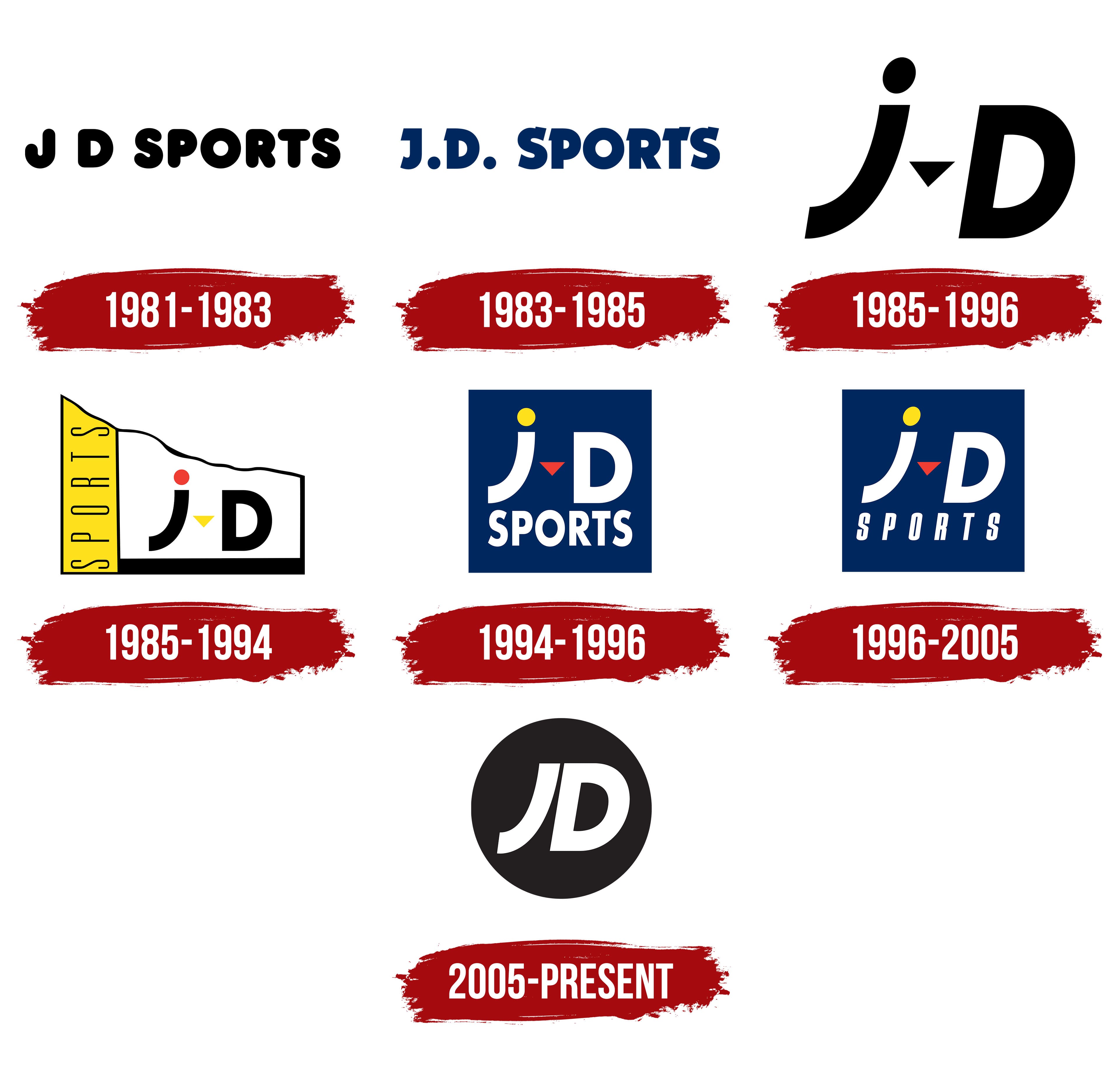
1981 – 1983

JD Sports takes its name from the first names of the two founders who opened a store in Bury, Greater Manchester, in 1981. John Wardle and David Makin called their business John David Sports. The name was later shortened to JD Sports, with “J” standing for John, “D” for David, and “Sports” identifying the store’s focus on sporting goods. The store sold everyday footwear and clothing, bringing sportswear into urban fashion.
The original sign read J D SPORTS. Black lettering ran in a single line across a light background, with a wide gap between the two initials. The sans-serif letters had heavy strokes and rounded contours. SPORTS occupied most of the sign, identifying the store’s specialty. The initials “J” and “D” maintained the connection to the owners’ names.
1983 – 1985
In the next version of the JD Sports logo, medium-sized round periods appeared after the “J” and “D.” The name became J.D. SPORTS, making the abbreviation of the two first names explicit. The horizontal layout stayed the same, while dark blue replaced black. The letters remained uppercase and upright, but the spacing tightened.
The letterforms became more angular. Short serifs and projecting details were added to the heavy strokes. Bold outer contours surrounded rounded interior spaces. The weight resembled Franklin Gothic Heavy or Impact, although the lettering included serifs. Periods distinguished the initials from SPORTS, while tighter spacing and heavier letterforms made the name more compact than on the original sign.
1985 – 1996

A separate version of the JD Sports logo later retained only the two-letter monogram, dropping Sports. A lowercase “j” replaced the uppercase “J,” with a large uppercase “D” beside it. Both letters leaned to the right and differed in height.
A separate round dot sat above the “j.” Its long stem curved to the left at the bottom. A small downward-pointing triangle appeared between the “j” and “D.” Its sharp corners contrasted with the round dot and the curved bottom of the “j.”
1985 – 1994
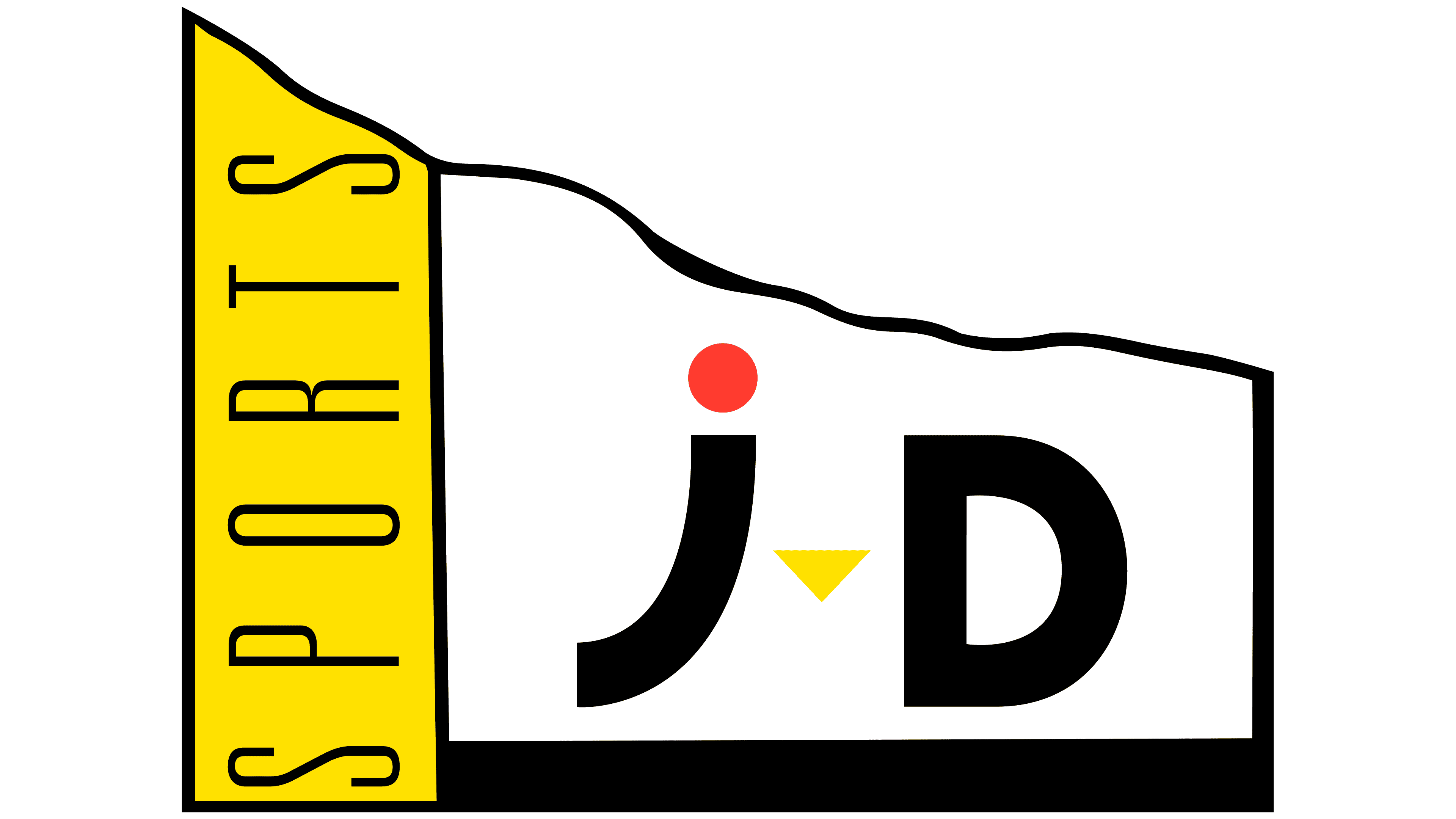
The JD Sports monogram also appeared in color, framed by a shape resembling an unfurled banner. A wavy upper edge suggested fabric, while a thick black horizontal band closed off the bottom. A black outline enclosed the main white field and a vertical yellow stripe on the left.
Black “j” and “D” letterforms occupied the white field. The round dot above the “j” was red, while the small triangle between the letters was yellow, matching the side stripe. SPORTS appeared in thin lettering on the stripe, rotated to read from bottom to top. The monogram and the word identifying the store’s specialty occupied separate sections of the emblem.
1994 – 1996
In the next JD Sports logo, the monogram and SPORTS were stacked inside a dark blue rectangle. Large white “j” and “D” letterforms occupied the upper portion, with “SPORTS” below.
The accent colors switched places compared with the banner version. The round dot above the “j” became yellow, and the triangle between the initials became red. Beneath them, SPORTS appeared in large, semibold sans-serif letters with tight spacing. The monogram was substantially larger than the lower line.
1996 – 2005
A further revision of the JD Sports logo changed the lower line. Tall, narrow, slanted letters with generous spacing replaced the tightly set lettering. SPORTS took up less space, giving the monogram more room. The thin, elongated letters below contrasted with the heavy “j” and “D.”
The color scheme remained unchanged. White letters appeared on a blue rectangle, with a yellow dot above the “j” and a red triangle between the initials. The emblem still contained the full JD Sports name, with the monogram much larger than SPORTS.
2005 – today
By 2005, the JD initials had become the basis of a circular emblem that could stand alone without the full name. The dot above the “j,” the triangle, and Sports were removed. Two redesigned letters filled nearly the entire disk, leaving only a narrow gap between them. The “J” kept its long lower curve extending left, while the “D” gained a broad, rounded bowl. A shared rightward slant unified the initials.
In the primary version, white letters appeared inside a black circle. A reversed version paired a dark monogram with a light disk. Yellow, already part of JD’s broader visual identity, was also used in the emblem, replacing the white initials against the black background. The letterforms and the circle’s proportions remained unchanged. The slogan “King of Trainers” emphasized the brand’s footwear specialty. In British English, “trainers” means sneakers.
The circular emblem appeared on JD’s drawstring bag. Customers kept using it to carry their belongings after a purchase, turning the prominently branded packaging into an everyday accessory. The black-and-yellow color scheme kept the bag connected to the store beyond the sales floor. In 2023, JD celebrated the bag’s 25th anniversary. Over the years, it became part of British youth culture and earned a place in the brand’s history alongside its signs and monogram.
In June 2025, the circle containing the JD initials became part of the international “Forever Forward” visual identity. Uncommon Creative Studio developed the system to unify the company’s branding across countries and strengthen its connection to youth culture. Benny Everitt served as the agency’s executive creative director. At the same time, JD’s head of brand, Louise Craggs, oversaw the project on the company’s side.
The historic monogram’s slant provided the starting point for “Forever Forward.” Its 10° angle informed supporting designs, including on-screen applications. Pedro Mota led the motion design work. For international use, F37 Foundry developed seven versions pairing the emblem with translations of “Forever Forward.” The circular JD emblem remained alongside the text, with letter proportions and the overall slant coordinated across versions.