


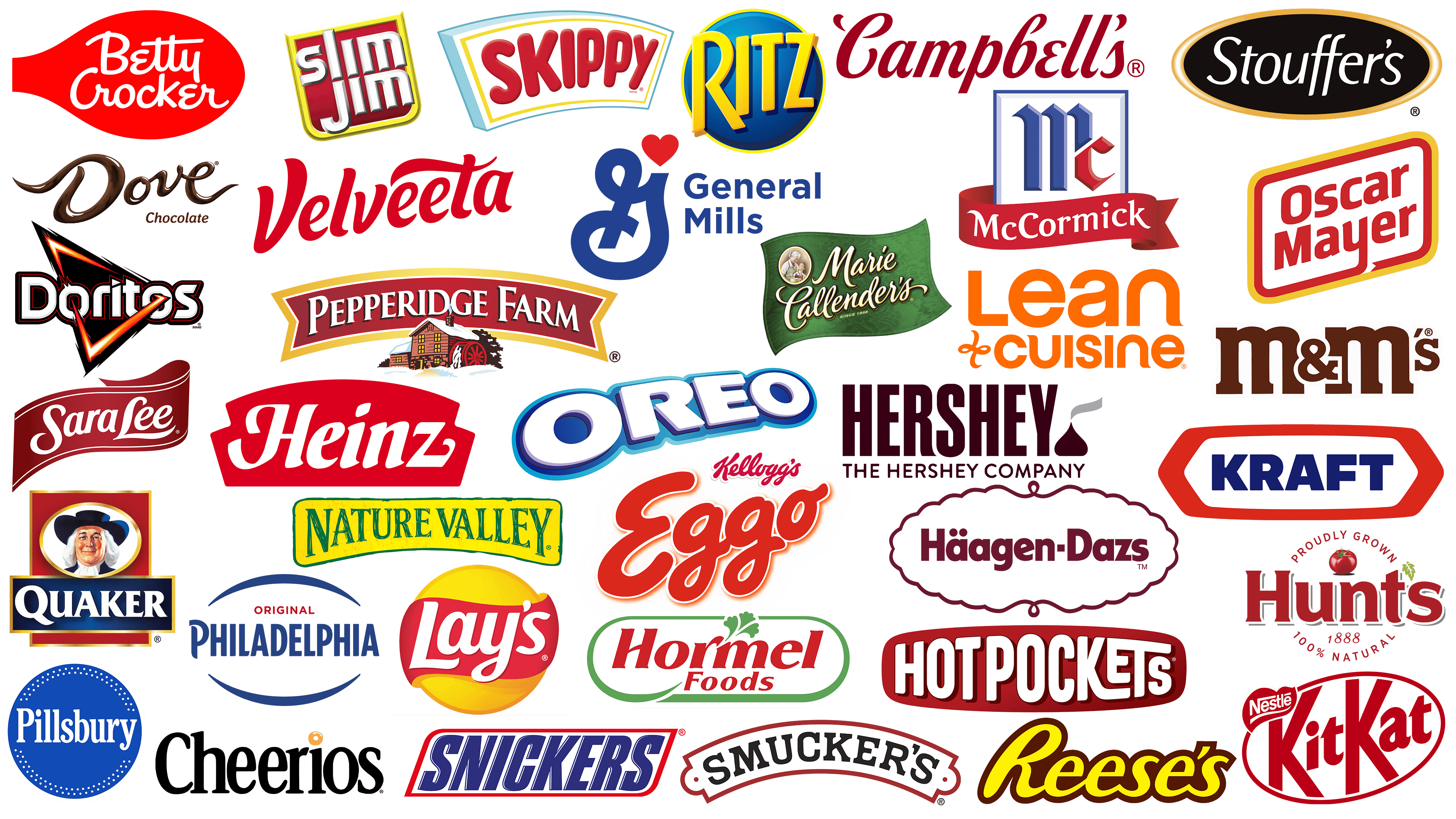
In America, food is often perceived as an integral part of culture. One can gain insight into a society’s mood, lifestyle, and habits through its food products. American supermarket shelves are filled with brands featuring catchy logos, helping consumers navigate an endless variety of goods. Competition for space in Americans’ grocery baskets is fierce, and companies strive to attract customers not with price, but with memorable style.
Today, the US food market is dominated by several large companies: Kraft Heinz, Coca-Cola, PepsiCo, Nestlé, and Mars. They own numerous brands, ranging from colorful candy packaging to classic cheese-and-meat snack packages. However, consumers choose not the company but the product with a story, charisma, or unusual taste.
Companies carefully craft product identities that reflect their brand character, making the product an integral part of consumers’ lives. A brand’s visual style tells its story within seconds of seeing the package. Therefore, food brands hold their logos tightly, knowing they influence purchasing decisions as strongly as taste or quality.
Next, we will examine several prominent American brands and their visual presentations, which have become integral parts of US food culture.
Dove Chocolate
![]()
The Dove Chocolate logo appears appetizing, resembling liquid chocolate poured neatly into lines that form the brand name. The letters are rendered in a handwritten style, with decorative tails on “D” pointing left and “E” pointing right. This enhances the association with handmade sweets. The brand originated in a small family confectionery in Chicago and later became a symbol of homemade comfort in the US chocolate industry. Today, chocolate is popular for its delicate candy texture and inspirational messages on the packaging.
Häagen Dazs
![]()
The Häagen-Dazs logo conveys a premium feel through deep burgundy lettering placed within an oval frame featuring decorative curves. The name may seem exotic, but it was actually invented by an American inspired by European ice cream-making traditions. This concept created an elite image around the company, attracting consumers in the high-end segment. The unusual name and thoughtful logo design became classic, associated with quality ice cream.
Hormel Foods
![]()
The Hormel Foods logo features red and green, highlighting the natural origins of the company’s products. The style references the brand’s family traditions, which were founded in Minnesota. Above the word “Hormel” is a drawing of broccoli, reinforcing the brand’s connection to natural ingredients. The letters are outlined in green, creating a sense of care and attention to detail. Today, the company is recognized for its canned meats and snacks, which are popular among American families.
Hunt’s
![]()
The Hunt’s logo features bright burgundy letters, complemented by a realistic tomato image at the top. The name is framed by circular text in a simple font, creating a fresh feel. A small green leaf is an apostrophe, emphasizing the brand’s natural ingredients. Its history dates back to California, where the company began producing canned tomatoes, thereby becoming an integral part of American cuisine. Today, the emblem remains a symbol of quality tomato products in the USA.
Lean Cuisine
![]()
The Lean Cuisine logo is dynamic: orange brings energy and liveliness. The name is set in a sans-serif font with rounded, smooth lines. A small playful symbol in the form of a swirl or spiral is placed to the left under the name. The brand is recognized in the USA as a producer of frozen dietary meals, offering ready-made portions for those seeking balanced eating without cooking.
Marie Callender’s
![]()
Marie Callender’s uses a cozy logo design that reflects a homey atmosphere. The name appears in white letters with a golden shadow against a green background resembling a flag or ribbon. Company founder Marie Callender began with a small pie-baking business in California, and the brand is now famous for its home-cooked recipes. On the left is an oval medallion depicting a grandmother and granddaughter, underscoring the brand’s family-oriented nature and its commitment to tradition.
Nature Valley
![]()
Nature Valley features a natural logo associated with the genuine origin of its ingredients. The name is displayed in green on a slightly curved yellow banner, emphasizing the brand’s connection to natural elements. The company’s original grain-based products are popular among active lifestyle enthusiasts. The brand was among the first cereal bar producers in the USA, shaping perceptions of healthy and convenient snacks.
Quaker
![]()
The Quaker logo is presented in a classic style. A prominent portrait of a man in traditional Quaker clothing symbolizes the company’s integrity, though the character is fictional. The brand name stands out in contrasting white letters on a blue background. It was the first American brand to produce oatmeal, influencing breakfast habits for generations of Americans. The brand’s name and symbol reflect its product reliability, making it one of the most popular breakfast choices in the USA.
Sara Lee
![]()
The Sara Lee logo appears festive, like a ribbon on a gift box. The elegant inscription features a white cursive font on a red, wavy ribbon with decorative lines along the edges. This style conveys a celebratory mood, recalling the first pies and pastries created by founder Charles Lubin. Today, in the USA, the brand is associated with baked goods, frozen desserts, and ready-made products convenient for home use and family celebrations.
Snickers
![]()
The Snickers logo is known for its dynamic and memorable style. The bar’s name is placed within a tilted, red-bordered frame filled with white, and the letters are displayed in bold blue font, creating an energetic brand perception. Named after the Mars family’s beloved horse, the bar became a part of American life, and its slogans and advertising campaigns made it synonymous with snacking on the go. Today, it is the best-selling chocolate bar in America.
Doritos
![]()
The Doritos logo is designed brightly, reflecting the shape of the brand’s chips. The triangle is the central design element, rendered in a fiery style with red and orange hues, surrounding the brand’s name in white letters with contrasting black outlines. The design reinforces perceptions of bold flavors and daring advertising campaigns aimed at a youthful audience. The chips became part of American culture, first appearing at Disneyland, where they were introduced as a new type of snack.
Reese’s
![]()
The Reese’s logo appears positive due to the use of a yellow font with soft lines, enclosed within a chocolate-colored outline. The style evokes the texture of H.B. Reese’s peanut butter candies. Originally handmade at a family factory in Pennsylvania, these candies gained mass popularity for their unique combination of salty peanut butter and sweet chocolate. It remains one of the most recognizable candy brands in the US, retaining the warmth of its family recipe.
M&M’s
![]()
The M&M’s logo is presented in lowercase letters and colored milk chocolate brown to visually associate it with the brand’s sweets. The letters are simple in shape and include an ampersand, adding a touch of originality. The brand’s candies first appeared in US soldiers’ rations during World War II, thanks to their practical shell that prevented them from melting. Today, the brand is renowned for its candy characters and diverse flavor options.
Pillsbury
![]()
The Pillsbury logo is neatly designed, displaying the brand’s name in white lettering against a blue background, featuring a dotted ornament around the circle’s edge. The composition resembles a stamp or seal, inspiring consumer trust. The brand established itself in the US as a producer of flour-based products and baking mixes. Doughboy, the smiling baker mascot, highlights the theme of homemade cooking.
Kraft
![]()
The Kraft logo appears strict: the name is written in dark blue capital letters, enclosed within a red hexagon. The geometry and colors emphasize the reliability of the brand’s products, founded by James L. Kraft. The company began with cheese and sauce production and eventually became one of America’s largest food manufacturers, offering a range of everyday products.
Oreo
![]()
The Oreo logo looks modern due to its bright blue color and voluminous white letters with smooth contours. The stylization evokes cream filling and crispy cookies, first created in New York. The cookies became a favorite treat for millions of American families, especially when dunked in milk. The brand became so ingrained in culture that it became an iconic everyday dessert.
Kit Kat
![]()
The Kit Kat logo features a memorable, slightly italicized font set within a red oval. The dynamic composition reflects the crispy structure of wafer bars meant to be snapped into pieces. The brand’s name originates from a famous 18th-century literary club that gathered in a London confectionery shop. The sweet gained popularity in the US after World War II, becoming a favored snack among Americans who appreciated simplicity and convenience.
Lay’s
![]()
The Lay’s logo appears optimistic due to its combination of a yellow circle and a red ribbon with white lettering. The design conveys a sense of sunny weather and highlights the brand’s main product: potato chips. The company was founded by Herman Lay in Tennessee, where he sold chips from his car. It is the market leader in the US, offering a wide range of flavors and hosting annual contests that encourage customers to create new combinations.
Ritz
![]()
The Ritz logo looks striking, with the brand’s name in bright yellow against a circular blue background. The design evokes the round shape of the famous Ritz crackers. The crackers were originally marketed as an affordable alternative to the expensive snacks at Ritz-Carlton hotels, but their accessible price and light flavor made them popular among Americans. The name became a symbol of affordable quality, suitable for everyday snacks and festive table appetizers.
Heinz
![]()
The Heinz logo has a traditional appearance, reflecting the brand’s stability, which was created by Henry John Heinz in Pennsylvania. White letters against a bright red background appear solid and are strongly associated with the company’s most famous product, ketchup. The company produced canned vegetables, but ketchup made Heinz famous in the US and worldwide. The iconic glass bottle and the distinctive “57 varieties” slogan became part of American history and lifestyle for generations.
Cheerios
![]()
The Cheerios logo looks appetizing because the small yellow ring replaces the usual dot above the letter “i.” Black letters in a rounded typeface with thin serifs appear friendly and approachable. The name refers to the English word “cheery,” meaning joyful. The yellow ring deliberately recalls crispy oat rings. The overall image evokes a cozy breakfast.
Eggo
![]()
Eggo emphasizes a homey atmosphere with rounded red letters highlighted in white, resembling a freshly toasted waffle removed from the toaster. The signature “Kellogg’s” inscription at the top guarantees quality from the famous breakfast food manufacturer. The name originated from the word “egg,” the main ingredient in the brand’s famous waffles. The logo looks friendly, capturing the feeling of a weekend breakfast when the whole family gathers.
Hershey
![]()
The Hershey logo appears strict and elegant due to its tall, narrow font. The deep chocolate color of the letters and the miniature chocolate “kiss” on the right make the brand appealing. The “Hershey’s Kiss” is one of the company’s best-known products, originally a small, foil-wrapped chocolate candy. Its silhouette is incorporated into the emblem. The emblem reflects the history of the chocolate giant’s success.
Skippy
![]()
The cheerful Skippy logo conveys the playful mood of peanut butter. Red letters appear three-dimensional, reminiscent of peanut butter’s texture, adding tactility to the image. A white background is framed by yellow and blue borders, creating a dynamic composition. The brand’s history began in California, and its emblem reflects the state’s sunny, positive spirit. The logo is easily recognizable and brightly perceived, making it popular among customers of all ages.
Betty Crocker
![]()
The Betty Crocker logo conveys the atmosphere of a home kitchen. The brand name is written in an expressive font, and the red spoon shape strengthens the association with baking. The red color emphasizes comfort, while the white font indicates product purity. The design has remained memorable for generations and is associated with homemade desserts that have been a familiar part of childhood. The brand originated as the image of a housewife who never existed, yet remains one of America’s popular symbols for home baking.
Hot Pockets
![]()
Hot Pockets are known for hot snacks and a vivid logo executed in intense red. Slightly modified white letters look dynamic, matching consumers’ lifestyles with quick meals anytime. The visual style is simple, emphasizing product accessibility.
General Mills
![]()
General Mills introduced a simple logo combining a strict corporate image with friendliness. The central letter “G” is topped with a red heart, symbolizing the company’s commitment to caring for its consumers. Blue represents reliability, while the heart signifies an emotional connection with customers. The company is a major producer of numerous recognizable brands, including Cheerios and Yoplait, and its logo serves as a universal quality mark across its entire product range.
Stouffer’s
![]()
Stouffer’s uses an elegant logo combining a black background with a golden oval frame. White letters in refined cursive reflect the premium character of the company’s frozen meals. A golden outline adds warmth to the brand’s image, known for classic dishes popular with American families. The brand inspires trust among consumers who appreciate quality and traditional taste.
McCormick
![]()
The McCormick logo appears solid due to the gothic-style blue “M”. The red letter “c” contrasts and brightens the design, giving it a lighter feel. The name is written in white on a red ribbon, creating a festive impression. The company is known in the American market for producing spices and seasonings essential to local cuisine. The logo conveys an impression of authority and reliability for products on store shelves.
Campbell’s
![]()
Campbell’s logo is easily recognizable for its traditional cursive style and red color, which symbolize comfort. The brand is associated with homemade canned soups, which have been popular in the USA for many years. The elegant letters evoke associations with traditional cuisine, highlighting products that have proven themselves over time. For many Americans, the company’s soups are part of daily life, and the packaging inscription is perceived as familiar and trustworthy.
Smucker’s
![]()
The Smucker’s logo has a warm character thanks to its simple and neat design. The name is written clearly in black font along a curved line, resembling an old-fashioned label framed by a red border. The emblem evokes associations with homemade jams made for over a century, and it maintains a traditional recipe. The design links the company’s past, emphasizing the family production atmosphere and stability across generations.
Oscar Mayer
![]()
The Oscar Mayer logo has a bright character thanks to its red and yellow colors, reminiscent of traditional American hot-dog and meat packaging. Letters are executed dynamically and in a modern style, enclosed within a speech-bubble-shaped frame, giving a friendly impression. The company is well-known in the US for its high-quality sausages and bacon, and its logo evokes picnics and street food, making it a familiar element of American food culture.
Pepperidge Farm
![]()
The American company Pepperidge Farm is famous for its baked goods. The company’s founder started baking bread for her son due to allergies, and over time, home baking evolved into a recognizable brand. The brand symbol is a cozy mill surrounded by trees. It reflects the rustic character of the products. Company items, such as the famous Milano cookies or aromatic Swirl bread, are associated with the warmth of family evenings and handmade baked goods.
Slim Jim
![]()
Slim Jim is known among Americans for its spicy meat snacks, such as elongated sausages. The name hints at the product’s thinness, which is emphasized by the dynamic logo featuring slanted letters. The brand is popular among sports fans for its convenient on-the-go snacking. Slim Jim gained cult status after an advertising campaign with the aggressive slogan “Snap into a Slim Jim,” making it a symbol of energy.
Philadelphia Cream Cheese
![]()
Philadelphia Cream Cheese is known for its creamy texture and is a key ingredient in American cheesecakes. Despite its name, the brand did not originate in Philadelphia; rather, it was named for the city’s reputation as a center of high-quality food products. The logo is calm and minimalist, featuring smooth lines that reflect the soft texture of the famous cheese, known for its gentle consistency.
Velveeta
![]()
Americans love Velveeta cheese for its creamy, melted texture. It was one of the first brands to advertise cheese meltability, positioning itself as an essential ingredient for macaroni and cheese. The name and logo are set in a soft cursive font to convey the product’s tender, creamy consistency, which blends easily into a variety of dishes. The product remains a sought-after ingredient in traditional American cuisine for its versatility and mild taste.
Conclusion
The best American food brands gained popularity for their original recipes and vibrant visual branding. In the US, companies aim to integrate their logos into consumers’ daily lives, transforming simple images into recognizable symbols. Through thoughtful design, brands convey the character of their products, creating consumer associations with quality and taste. Today, consumers choose familiar logos because they trust their long history. Such brands remain successful in the dynamic and competitive American food market.