 Kyndryl Logo PNG
IT infrastructure includes servers, networks, and cloud systems that enable banks, airlines, and retail chains to operate. Managing such systems requires monitoring, maintenance, and technical support. The Kyndryl logo represents a company that manages and maintains enterprise IT systems, including cloud platforms and networks.
Kyndryl was established in 2021 after IBM spun off its infrastructure division. This division had been part of Global Technology Services. IBM decided to separate in October 2020. The company aimed to focus on cloud technologies and artificial intelligence. IBM spun off infrastructure management into an independent business.
In February 2021, the new division was named Kyndryl. The name symbolized partnership and growth. In April, Martin Schroeter, who had previously held executive positions at IBM, was appointed CEO. In November 2021, Kyndryl began operating as an independent public company. Its shares were listed on the New York Stock Exchange under the ticker KD. Its initial market capitalization was about $19 billion. The company had more than 90,000 employees.
At the time of the spin-off, the company became the world’s largest IT infrastructure operator. Its revenue was about $ 19 billion. The client base included more than 4,000 companies from 115 countries, including 75 Fortune 100 companies.
In 2022, a large-scale transformation began. Kyndryl established independent business processes and signed partnerships with Microsoft Azure, Amazon Web Services, and Google Cloud. In the spring, the company signed a multi-year agreement with Microsoft to migrate enterprise systems to the cloud. In the summer, it announced restructuring and staff reductions.
Despite losses in 2022, Kyndryl strengthened its position in 2023. The company signed partnership agreements with VMware, Cisco, and Dell Technologies. In June, it completed the acquisition of Skytap, a company specializing in migrating legacy applications to the cloud.
By 2024, Kyndryl had achieved operational profitability. The company completed its financial stabilization phase and entered a growth stage in the cloud services segment.
The company remains one of the world’s largest players in IT infrastructure management and modernization. It continues to evolve toward hybrid cloud integration.
Meaning and History
What is Kyndryl?
An American IT infrastructure management company headquartered in New York, created after separating from IBM. It is the largest independent infrastructure services provider, with annual revenue of $ 19 billion and a staff of about 90,000. The main areas include hybrid clouds, digital workplace, enterprise infrastructure, SD-WAN, security, data management, and consulting. The company’s partners are Google Cloud, AWS, and Microsoft Azure. Competitors include Accenture, DXC Technology, Atos, Fujitsu, Infosys, Rackspace, and Wipro.
2021 – today
Kyndryl emerged when IBM spun off its infrastructure services business as an independent company. The new name and logo were intended to represent the experience of tens of thousands of employees under a separate brand. The identity centered on the lowercase word “kyndryl” and a vivid red-orange color. Through them, the company presented the themes of human involvement, partnership, and the development of enterprise technology.
On October 8, 2020, IBM announced plans to separate Managed Infrastructure Services from its Global Technology Services division. IBM intended to focus on hybrid cloud technology and artificial intelligence. The infrastructure business was prepared to operate as an independent, publicly traded company and enter into agreements with various technology providers. Under the temporary name NewCo, it brought together approximately 90,000 employees who maintained complex enterprise systems and critical IT infrastructure.
The company unveiled its permanent name on April 12, 2021. The company team and outside specialists considered approximately 200,000 options, including experiments with the letters “i” and “y.” Kyndryl combined modified parts of the words “kinship” and “tendril.” The opening “Kyn” refers to human connection and closeness, conveying lasting relationships with employees, customers, and partners. The ending “dryl” comes from a word describing a plant tendril or a young climbing shoot. The plant imagery connected the name with growth, development, and collaboration.
CEO Martin Schroeter explained the name through partnership and growth. Chief Marketing Officer Maria Bartolome Winans described it as the foundation of a reputation built through the company’s actions. The new wordmark represented the business of designing, managing, and modernizing enterprise IT systems while maintaining a connection to the IBM division’s experience.
The logo featuring seven lowercase letters was unveiled with the name. Winans explained the lowercase style as an expression of openness and a desire to describe the infrastructure business through its people. The team considered uppercase lettering too loud and too similar to the many abbreviations used in the technology industry. The custom form of the word “kyndryl” served as the emblem.
Landor developed the identity. Thomas Ordahl handled positioning, Jane Boynton handled creative direction, and Erin Wilson handled the identity system. The project team included Boynton, Joshua Jetson, Kurt Rice, and Jose Luis Cacho. Todd Simmons served as vice president of design. Martin Schroeter and Maria Bartolome Winans participated in the approval process.
Type designer Mike Abbink created the logo’s final form. After Landor presented the initial version to IBM leadership and the future Kyndryl, he revised the contours, letter spacing, stroke widths, connections, and proportions. The wordmark was created as a complete custom design based on the relationships between neighboring letters.
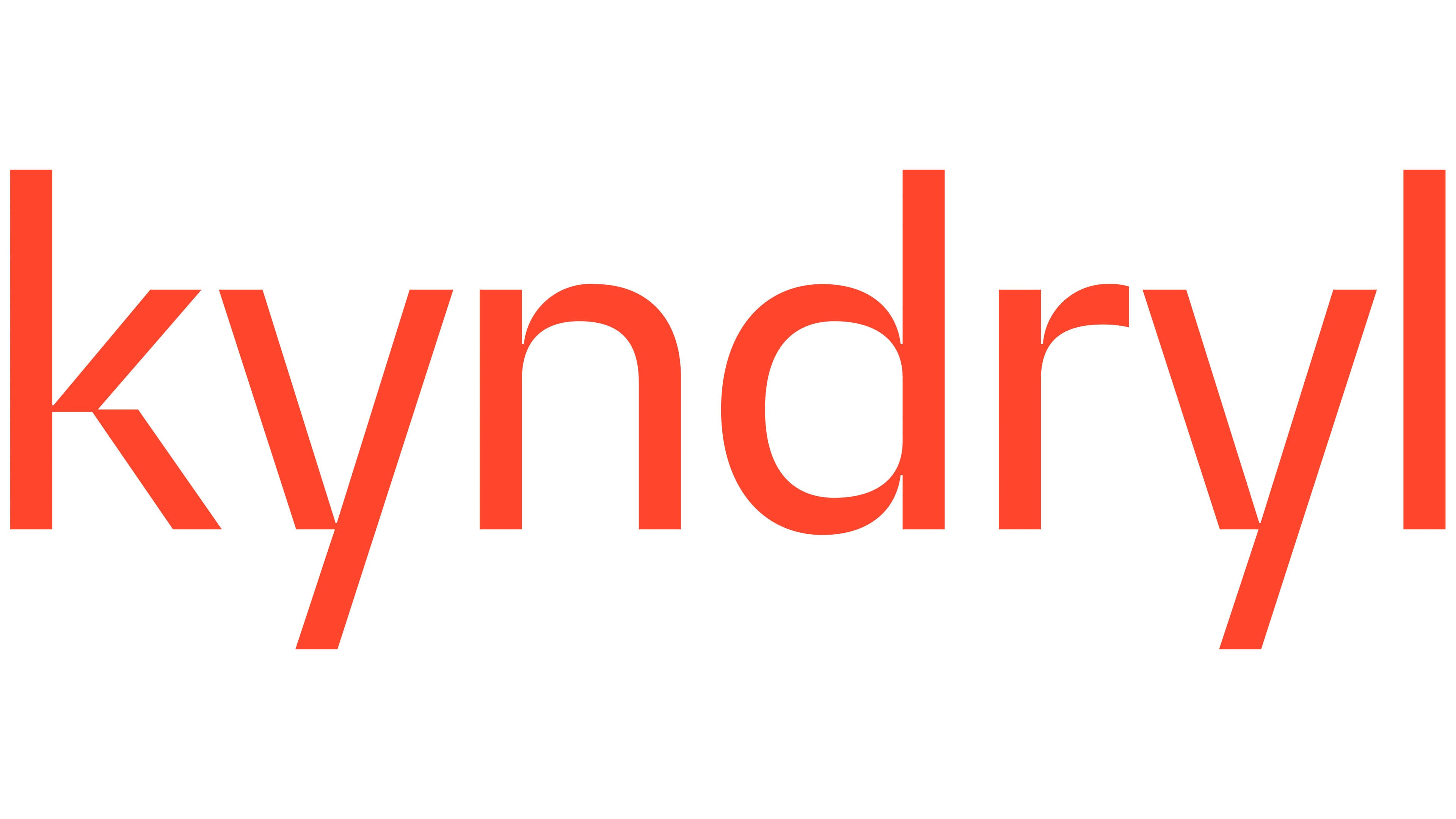
The main changes affected the initial “k.” Its upper and lower diagonals extend from the vertical stroke at sharp angles. Abbink aligned their directions with the two “y” letters. The rounded sections of the “n” and “d” soften the angular areas of the word; the short “r” connects the “d” with the second “y,” and the tall “l” completes the wordmark.
The thin sans-serif strokes have uniform widths. The vertical strokes of the “k,” “d,” and “l” rise above the main height of the lowercase letters, while both “y” letters descend below the baseline. The alternating upper and lower extensions create a wave-like silhouette. The lightweight wordmark differs from IBM’s heavy striped logo and presents Kyndryl under its new name.
Kyndryl Red became the primary color. It is a vivid red-orange shade with the code #FF462D. Winans associated it with a heartbeat, human involvement, and growth. Against a white background, the colored wordmark took the lead. The phrase “The Heart of Progress” continued the human theme. It emerged after conversations with customers who described infrastructure specialists as the heart and lungs of a business. The team combined the image of a working heart with technology’s continuous development.
During the separation, the company arranged to plant a tree in honor of its 90,000 employees. The specialists transferring from IBM were presented as the founders of the new company and the roots of Kyndryl, continuing the plant theme behind the name. IBM completed the separation on November 3, 2021. Kyndryl began operating independently on November 4, and its shares started trading on the New York Stock Exchange under the ticker “KD.” By the launch, the name, logo, Kyndryl Red, and “The Heart of Progress” had become part of a unified identity system.