


America has always been a country where drinks are part of the lifestyle. You can see people rushing through the streets of New York with Starbucks coffee, groups of friends in California cooling off with craft beer, or families in Florida relaxing in the sun with citrus lemonades. Although Coca-Cola has become permanently embedded in American life, store shelves offer a much wider palette of flavors, colors, and drink histories.
The USA is a country where thousands of original beverages were born. Some of them conquered the world, while others remained local treasures. American manufacturers create drinks based on society’s needs: some people choose natural juices and mineral water, while others prefer bright, sweet sodas with fruity aromas. Beverage producers closely follow consumer tastes, continuously expanding their product ranges to impress even the most demanding customers.
The Americans’ interest in their health has influenced the beverage market. Water with vitamins and electrolytes, as well as organic drinks, have gained popularity among urban residents. Yet Americans remain loyal to traditional tastes: cola, lemonade, and iced tea still top the sales charts.
Alcoholic beverages also offer a wide variety. Beer, ranging from classic types to experimental craft brews, holds the top spot in popularity among Americans, although many also appreciate wines from California or Oregon. Whiskey and bourbon occupy their niche in the market, representing stronger beverage categories.
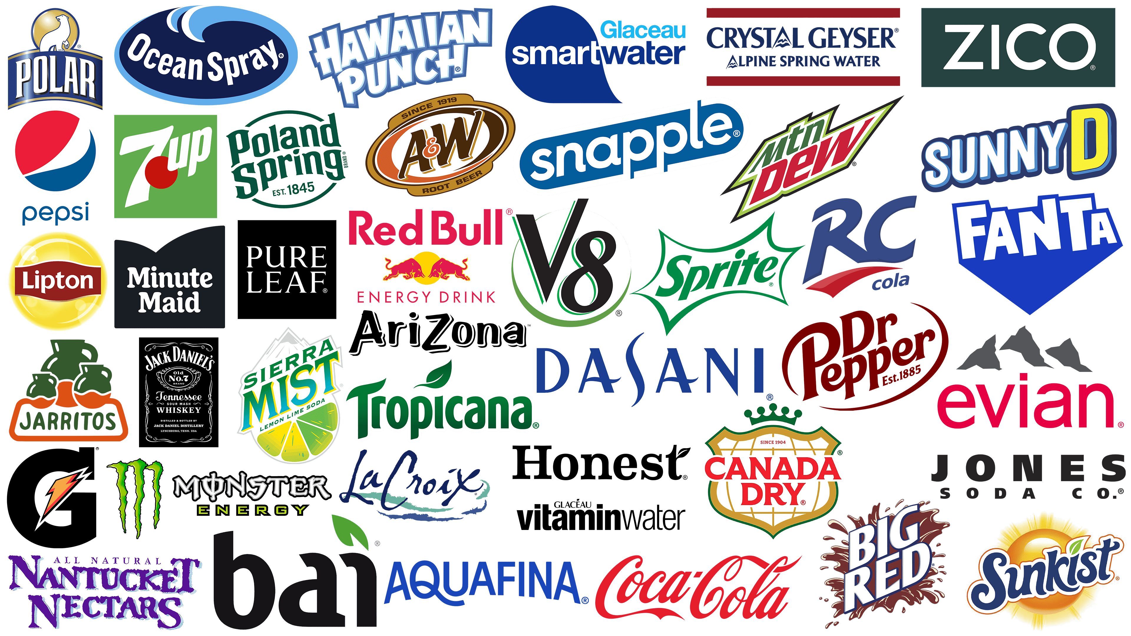
But drinks aren’t just about taste; they’re also about appearance, with logos playing an essential role in their image. American brands approach beverage visual identity carefully. Bright, stylish, and memorable emblems help drinks become part of everyday routines and people’s lives. Today, we’ll explore famous American beverages through their symbols, logos, origins, and significance to Americans.
Smartwater
![]()
The Smartwater logo is thoughtfully designed to highlight the unique qualities of water purified by vapor distillation and enriched with electrolytes. The brand name is set within a blue droplet, clearly visualizing the brand’s central idea of purity. The typeface is strict and sophisticated, reflecting the beverage’s premium nature. The brand is popular among celebrities and professionals who appreciate an original approach to ordinary water. The drink’s concept lies in its unique purification process, which imitates the formation of natural rainwater. The visual identity conveys aesthetics, minimalism, and scientific innovation.
Canada Dry
![]()
The history of Canada Dry began with a Canadian pharmacist who wanted to create an alternative to traditional sweet drinks. The brand’s name is associated with high-quality ginger ale. The logo is a shield topped with a golden crown symbolizing the drink’s authority in the international market. A globe inside the shield hints at worldwide recognition. The red name on a white background evokes a sense of tradition. The golden accents underline solidity, reinforcing its reputation as a time-tested brand.
Lipton
![]()
The brand was founded by entrepreneur Thomas Lipton, who made tea affordable to everyone. The brand initially sold tea from a small shop and later grew into an international corporation. The modern visual identity reflects the beverages’ optimistic character. A bright circular yellow background resembles the sun, with the brand’s name on a contrasting red ribbon. These colors evoke warmth and vitality. The Lipton logo has become part of everyday life for millions, remaining a symbol of quality tea.
Jones Soda
![]()
It’s a symbol of creativity in the soft drink world. The company gained fame for unusual flavors like bacon and bubblegum, as well as for personalized labels featuring photos submitted by brand fans. This turned the bottles into collectible items. A minimalist logo reflects this idea: strict black lettering emphasizes the brand’s personality and targets young, creative people. Bold experiments have made Jones Soda a cult drink for those who appreciate originality and openness to new experiences.
ZICO
![]()
ZICO chose the path of healthy coconut hydration, becoming a pioneer in the American market. Its simple logo conveys the company’s focus on naturalness and simplicity. Clear white letters on a dark green background appear minimalist, highlighting the purity and natural origin of coconut water. The brand is popular among supporters of healthy eating and active lifestyles, offering a natural alternative to traditional sports drinks. The clean taste and natural composition earned the trust of those favoring a natural approach to hydration.
Dr Pepper
![]()
Dr. Pepper represents an American classic among soft drinks, remaining popular for over a century. Its unique taste sets it apart from other sodas, and the brand maintains this individuality. The logo is rich red, and the rounded lettering evokes warmth and nostalgia for the good old days. The name and founding year underscore its long history and respect for tradition. Drinks stand out with distinctive marketing, using slogans and advertising campaigns with a light, ironic tone to differentiate themselves from competitors. It is perceived as a timeless symbol of true America, embodying stability and loyalty to the flavor.
Jack Daniel’s
![]()
Jack Daniel’s has a reputation as a Tennessee whiskey made according to an old recipe. Brand creator Jasper “Jack” Daniel gave it a unique, preserved character. The label is styled like vintage posters. Complex decorative elements and diverse fonts evoke associations with the traditions of old America. The name and emblem “Old No. 7” at the center of the composition are surrounded by classic patterns. The label’s appearance reflects the brand’s authority.
Pepsi
![]()
The Pepsi logo evokes festive associations through a circle divided by a smooth white wave into red and blue sections. The colors were inspired by the USA’s national colors, symbolizing the brand’s patriotism. The drink’s global recognition is enhanced by the circular shape, which creates positive perceptions among consumers of all ages. The name is designed in a light, friendly typeface below the emblem. Simplicity strengthens the brand’s perception as a drink suitable for any company. Over many years, the visual identity has become a pop-culture symbol of a fun lifestyle.
RC Cola
![]()
The oldest beverage created an alternative to two market giants, Coca-Cola and Pepsi. The brand’s royal status reflects its origins: the drink was invented by a pharmacist in Georgia. RC Cola became the first company to offer drinks in aluminum cans and low-calorie variants. The logo is simple: large blue letters “RC” underlined by an orange stripe. The emblem style evokes associations with reliability and stability. The straightforward product design helped the brand earn a place in the hearts of those who prefer classic taste and simplicity.
Evian
![]()
Evian originated from the accidental discovery of a mineral water spring in the Alpine town of Évian-les-Bains, France. The brand became famous for its water sourced from the Alps, symbolizing premium quality in the U.S. and worldwide. The logo features three mountain peaks in gray tones, creating a fresh atmosphere. Below them, the bright pink word “evian” emphasizes the softness of the image. The logo evokes associations with the Alpine nature from which the mineral water originates.
Polar Beverages
![]()
Polar Beverages maintains traditions in drink production, passing secrets from generation to generation over many years. The brand originated in New England and became popular with carbonated water and lemonade. Its logo features a proud polar bear against a golden sun, symbolizing the beverages’ coolness and purity. The dark blue color and classic font convey the company’s reliability and traditional character, which prioritize product quality and consumer loyalty.
Coca-Cola
![]()
Coca-Cola’s global fame began long before the era of modern brands. John Pemberton, creator of the original recipe, hardly imagined the popularity his creation would achieve. The drink is a symbol of American culture. Its vintage red lettering on a transparent background has remained almost unchanged for decades. The brand’s signature font is still associated with holidays, joy, and socializing, remaining timeless and unaffected by trends.
Ocean Spray
![]()
Ocean Spray’s history began with a small cooperative of cranberry farmers in Massachusetts. These producers popularized the famous cranberry juice, which became an integral part of holiday tables in the U.S. The logo reflects its origin. The oval dark-blue background resembles the ocean, and bright blue waves at the top reinforce associations with purity and freshness. White letters are harmoniously embedded within the oval, lending the image credibility.
Sunkist
![]()
Sunkist’s history began with simple citrus orchards in California and later became famous far beyond the state. Today, the drink is associated with sunny summers. Its logo is full of vibrant colors. The name is written in blue, with smooth lines that resemble sunlight reflecting on waves. Behind is a juicy sphere resembling a ripe orange. The gradient and rays enhance the summer mood, reflecting the beverage’s origin and taste.
Arizona
![]()
Arizona’s popular tea drink became known in the U.S. for its unusual flavors and attractive packaging in large cans. The brand is associated with affordability and variety. Its logo is in a relaxed style, with black letters styled as handwriting. The unusual positioning of the capital letter “Z” emphasizes the drink’s individuality. The design’s simplicity makes the brand recognizable and highlights its creative style.
Big Red
![]()
Tig Red soda stands out for its rich cream-cherry flavor and has become a symbol of the American South. The beverage’s history began in Texas, where it gained local legend status, captivating the public with its vibrant color and sweet childhood flavor. The logo emphasizes the drink’s bold character: the name is written in voluminous white letters, surrounded by a splash of dark red liquid. This visualization evokes energy and celebration, turning the bottle into a source of enjoyment.
7UP
![]()
The history of 7UP began with Charles Grigg’s ambitious experiment to create something different from traditional lemonade flavors. The result was a lemon-lime carbonated drink loved by Americans. Today, the brand’s symbolism draws attention with its unusual design, featuring a bright red circular drop that contrasts with the white number “7” and the word “UP.” The lettering seems to rise, creating a sense of motion and liveliness that reflects the beverage’s character.
Red Bull
![]()
Red Bull emerged from the Thai beverage “Krating Daeng,” which inspired Austrian businessman Dietrich Mateschitz to create the famous energy drink. The brand became popular in the USA through marketing connected with extreme sports. The beverage’s logo features two red bulls facing each other, with a golden disc resembling the sun in the background. Red and yellow colors enhance the energetic image. The name is written in large, red letters, completing the active impression.
SunnyD
![]()
The SunnyD logo is positive and vibrant, as if filled with sunlight. The brand’s symbolism features large white letters “Sunny,” outlined by a bold dark-blue border, and a bright yellow letter “D..” This creates a feeling of joy, ease, and a sunny mood, perfectly reflecting the drink’s character. The visual image is associated with the orange flavor that has delighted children and teenagers for decades. Bold design makes the brand appealing to those who prefer fruity flavors and a positive attitude.
Pure Leaf
![]()
Pure Leaf targets tea enthusiasts who prefer natural products without additives or artificial flavorings. Owned by PepsiCo, the brand stands out for its tea, which is made from real tea leaves and brewed traditionally. A black square with elegant white lettering conveys the brand’s core idea: the absolute purity of its ingredients. Despite the design’s simplicity, the image conveys a premium beverage impression, highlighting its naturalness.
Aquafina
![]()
Aquafina bottled water, produced by PepsiCo, gained popularity among consumers for its stringent purification standards and affordability. The brand name comes from the Latin words “aqua” (water) and “fina” (pure). The logo uses blue lettering, evoking associations with water. The wavy element in the letter “Q” mimics the movement of water, adding a sense of lightness. The visual image evokes perceptions of purity and freshness, reinforcing the brand’s positioning as a source of refreshment.
Snapple
![]()
The Snapple logo is playful, emphasizing the brand’s character as one that produces fruit drinks with the most unusual flavors. The name appears inside a blue rectangle with rounded edges, adding lightness to the design. The font is smooth and rounded, conveying the brand’s friendly, original advertising and humorous bottle-cap messages. The company initially entered the market as a producer of natural juices, later becoming legendary through tea beverages. The drinks stand out because they use natural ingredients and avoid artificial additives. The identity is relaxed and informal, appealing to consumers for vibrant flavors and a positive atmosphere.
Tropicana
![]()
Tropicana was founded on the dream of Italian immigrant Anthony Rossi, who sought to bring the freshness of Florida orange juice into American homes. Today, the brand is owned by PepsiCo and has become part of millions of families’ breakfasts. The name is presented in a bold green typeface. At the top of the inscription is a small leaf, emphasizing the juices’ natural origin. The green color conveys the drink’s naturalness, making it relatable to consumers.
Monster Energy
![]()
The company has a provocative character, positioning itself as a beverage leader for extreme sports enthusiasts. The brand made a name through collaborations with extreme athletes, drivers, and global music stars. Three green claw marks on the Monster emblem appear defiant. They resemble claw marks from a wild beast, reflecting the brand’s bold spirit. Green is associated with energy and vitality, while the black background intensifies perception, creating an image of strength. The stylish, sharp font in the name emphasizes the drink’s aggressiveness and vibrancy. The Monster Energy logo stands out among thousands of other energy drinks, attracting young people and anyone drawn to the thrill of driving and the rush of adrenaline.
Nantucket Nectars
![]()
Nantucket Nectars began with the initiative of two friends who set out to create fruit juices inspired by the atmosphere of Nantucket Island. The drink’s name originates from the island of the same name, known for its picturesque landscapes and unique history. The logo is designed in a handwritten style in soft purple, emphasizing the beverages’ naturalness and the company’s traditional approach to juice-making. Natural ingredients and bright fruit combinations make the drink popular among those who appreciate authentic taste and natural composition.
Mountain Dew
![]()
The Mountain Dew logo evokes adrenaline, resonating with the lifestyle of the drink’s fans. The name “Mtn Dew” is set within a stylized lightning bolt, evoking the brand’s explosive character and dynamism. The bright green color is associated with the company’s extreme-sports sponsorship, while the red letters heighten the identity’s perceived intensity. This combination evokes associations with bold taste and energy, which is popular among young people. The sharp angles in the design create a sense of speed, reinforcing the beverage’s reputation as a symbol of active recreation beloved by American extreme sports enthusiasts.
Sierra Mist
![]()
Sierra Mist’s citrus character makes the drink a worthy alternative to other famous lemon-lime soda brands. The name references the purity and coolness of mountain air, and the logo conveys this with bright, energetic energy. The inscription is done in green letters, smoothly transitioning from a light to a richer shade. The lemon and lime slices in the background emphasize the drink’s freshness. Since its market introduction, the company has earned recognition through its light taste, enabling it to firmly position itself among citrus drink lovers.
Crystal Geyser
![]()
The Crystal Geyser logo is associated with the natural freshness of mountain springs. The name is depicted in strict dark blue letters, with a small blue mountain-peak symbol with waves inside the first letter “A,” referencing the water’s alpine source. The “Alpine Spring Water” inscription reinforces the image, emphasizing the product’s natural origin. The emblem conveys purity, simplicity, and transparency, which have long been brand characteristics. The company earns consumers’ trust in natural water, partly due to its carefully designed visual identity.
A&W Root Beer
![]()
The A&W Root Beer logo has a vintage atmosphere reminiscent of American diners from the past century. The brand symbol is designed within an oval featuring warm brown tones reminiscent of the traditional sarsaparilla-based drink. The letters “A&W” are centered and rendered in a large, shadowed font, creating a three-dimensional effect. An orange outline around the letters adds playfulness, enlivening the composition. The inscription “Root Beer” at the bottom reinforces the brand style. Several generations have passed since the company’s founding, and the identity continues to reflect the spirit of old America, maintaining its popularity over the decades.
Honest Tea
![]()
Honest Tea arose from a commitment to creating natural beverages without artificial additives or excessive sugar. The product attracted supporters of a healthy lifestyle. Simplicity is also reflected in its logo. The name is written in a calm, serifed font. The main accent is a leaf harmoniously integrated into the letter “t.” The design evokes trust and associations with the beverages’ natural origins.
Hawaiian Punch
![]()
Hawaiian Punch was originally conceived as a dessert concentrate but became popular as a standalone beverage. The vibrant logo design reflects the drink’s festive character, evoking associations with sunny days and beach relaxation. The name is written in a stylized blue font reminiscent of ocean waves, highlighting the beverage’s exotic origin. Its original tropical-fruit taste earned the audience’s appreciation, symbolizing cheerful parties and carefree moods.
Minute Maid
![]()
Minute Maid is known for its orange juice, the first product in the U.S. made from frozen concentrate. The brand’s name arose from the idea of quickly preparing a fresh drink in just one minute. Today, the brand is owned by Coca-Cola and produces juices in various flavors, available in all American supermarkets. The logo features a soft font on a black background label. The shape of the upper boundary resembles an open fruit, hinting at the products’ naturalness.
Jarritos
![]()
Jarritos originated in Mexico and became widely known beyond its borders for its variety of fruit flavors and distinctive styling. The name, which translates from Spanish as “little jars,” is reflected in the logo: three traditional Mexican jars used for serving drinks. The logo features a contrasting orange-and-green palette, symbolizing the juiciness of fruits and the vividness of Mexican traditions. Unique flavors such as tamarind or guava helped the drink gain popularity among American consumers seeking unique experiences.
Poland Spring
![]()
Poland Spring’s history began in Maine at a small spring that symbolizes the purity of spring water on the U.S. East Coast. The brand is popular among fans of natural products. The name is written in green font within an oval. The reserved logo design evokes the brand’s history, as indicated by the founding year. This presentation conveys reliability and the water’s natural origin, earning consumer trust.
V8
![]()
The creator of V8 vegetable juice was William Peacock, who conceived of combining eight healthy vegetables in one drink. This concept made the brand popular among healthy-living enthusiasts. The V8 logo is minimalist. The two symbolic letters appear in a powerful font, with green lines reminiscent of fresh greenery. The number “8” wraps around the letter “V,” creating a cohesive composition. The design symbolizes the drink’s simple ingredients, reflecting its natural origins.
Vitaminwater
![]()
The Vitaminwater logo stylishly reflects modern health awareness. The name is written in an expressive font, emphasizing the first part, “vitamin.” In the word “Glacéau,” a neat leaf symbol appears over the letter “E,” hinting at the product’s natural ingredients and benefits. The black-and-white color scheme adds elegance and a sense of minimalism, underscoring the beverage’s premium status. The brand is known for thoughtful combinations of vitamins and refreshing fruit flavors. The logo shows the beverage is intended for active individuals who want to improve their well-being while maintaining style and good taste.
Gatorade
![]()
The sports drink Gatorade emerged from research by University of Florida scientists seeking ways to restore their football players’ strength. Today, the brand is globally recognized and associated with athletic victories. The powerful logo is a large letter “G,” depicted as a bright orange lightning bolt. The symbol conveys dynamism, energy, and quickness of response, reflecting the beverage’s sporting spirit at its core.
Dasani
![]()
The Dasani logo reflects the clarity inherent to the brand’s pure drinking water. The font is elegant, with elongated letters reminiscent of streams of water, giving a sense of visual lightness. The blue color is associated with deep natural sources, emphasizing the product’s natural origin. The most noticeable element is the central letter “S,” shaped like a stream of water, which sets the tone and highlights the essential freshness for people. The company has created a visual identity that expresses its desire to provide people with quality, accessible water, making it part of everyday life for millions of Americans.
Sprite
![]()
Sprite emerged during the popularity of lemon-lime beverages, becoming a strong competitor in the American market. Today, the brand is a leader in the U.S. soda market. Its logo features an energetic green font enclosed in a sharp, star-like shape. The curved lines create a sparkling atmosphere, conveying a sense of freshness. The visual design reflects the soda’s character, which is known for its refreshing taste.
LaCroix
![]()
LaCroix sparkling water won consumers over with its vibrant flavors and distinctive packaging, becoming a cult product among young people in the U.S. The name is presented in a handwritten, casual, and slightly careless font. Under the inscription, wavy blue and turquoise lines evoke the freshness and lightness of sparkling drinks. The symbol reflects an atmosphere of carefree relaxation and natural freshness.
Fanta
![]()
The company symbolizes carefree living for an entire generation and has become globally famous for its wide variety of fruity flavors. The drink gained popularity among youth, becoming one of the brightest brands in the Coca-Cola lineup. The Fanta emblem is presented in dynamic blue, with the text written in a playful, informal style as if the letters are dancing. Slight asymmetry adds a sense of movement, hinting at fun and celebration. The brand regularly updates its flavor offerings, combining traditional and unusual fruit blends to create an atmosphere of eternal summer.
Bai
![]()
Bai beverages are a find for lovers of naturalness and pure ingredients. The balance between taste and health benefits is at the core of the brand’s concept. A black minimalist logo emphasizes simplicity and a close connection to nature, with the main accent being a green leaf replacing the dot over the letter “i.” The plant motif communicates freshness and natural ingredients, making the drink stand out on store shelves.
Conclusion
The most famous beverages in the U.S. reflect American society’s range of tastes and preferences. They appeared in different parts of the country and across eras, becoming a unifying force that bridged generations and social groups. Logoed drinks carry the brand’s history and are part of consumer culture. For Americans, it’s important not only to quench thirst but also to receive emotions and impressions from what’s in their glass. Bright colors, inscriptions, and original shapes make beverages part of daily life for millions of people. Their emblems symbolize cities, states, and eras, connecting people with the country’s traditions, history, and values.