


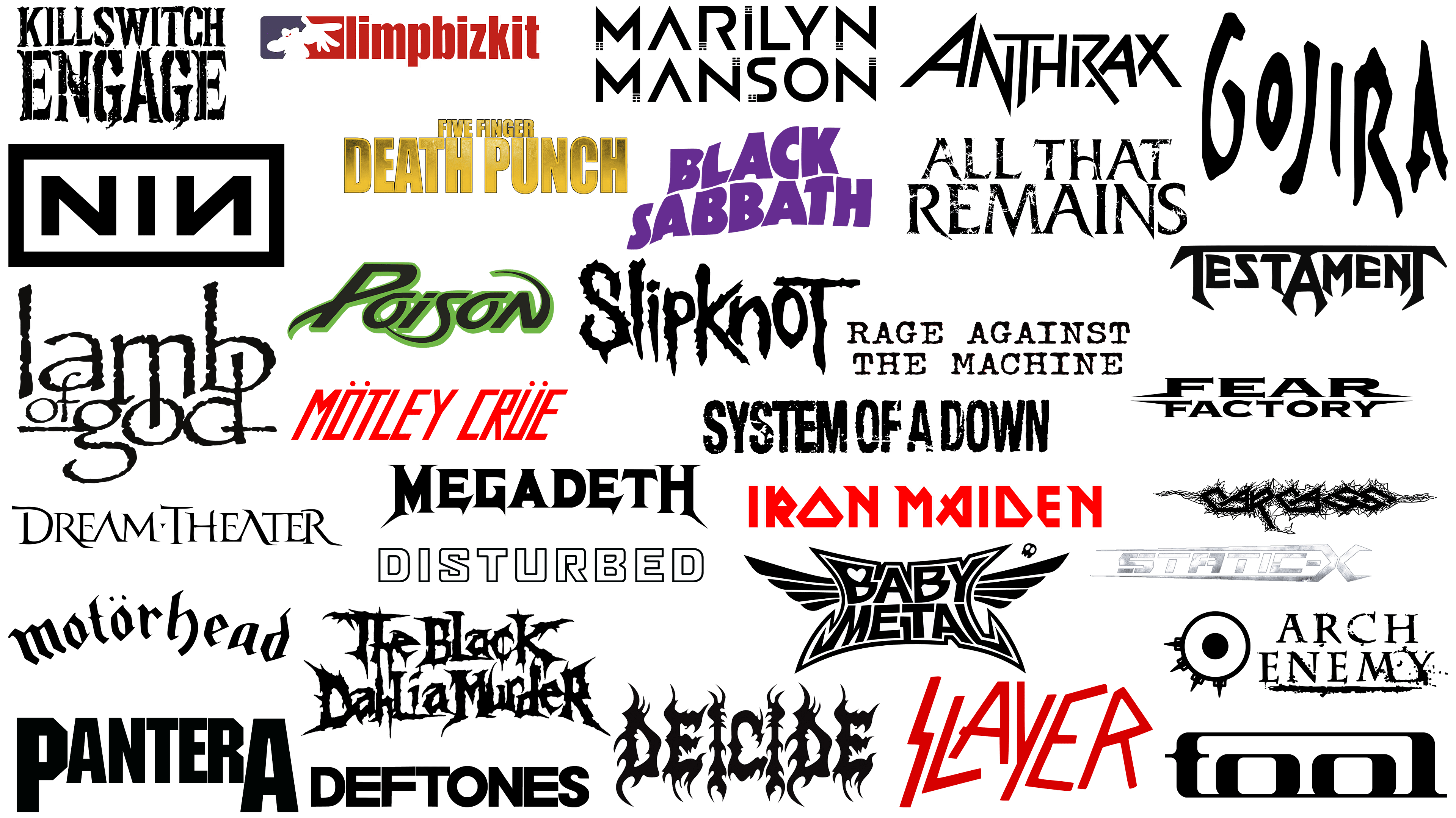
 Most Famous Metal Bands and Their Logos PNG
The logos of metal bands have become an independent part of musical culture. Through symbols, musicians express what is difficult to convey with words alone. They can be mysterious, mystical, or aggressive. They tell entire stories, referencing ancient myths, urban legends, and historical events described in the band’s songs.
Over the decades, the metal scene has created its visual aesthetics. Fans wear t-shirts with symbols of their favorite performers and use patches, posters, and accessories featuring band imagery to show their unity and dedication to the music they love. Thus, band emblems become part of the listener’s identity, a statement about their tastes and views.
However, the tradition of creating striking emblems originated before the metal era. It was metal musicians who first began to use vivid visual imagery that reflected the style of their music and the ideology of their songs. Well-known bands choose memorable symbols that are deliberately intimidating or provocative, evoking strong emotions.
In this article, we will examine the logos of the world’s most famous metal bands and reveal the history and meaning of their symbols. You will learn how the imagery is connected to the band’s sound and why these emblems have become legendary.
Mercyful Fate
![]()
The Mercyful Fate logo is executed with gothic elegance. The letters are refined and slender, with sharp ends and decorative elements reminiscent of medieval calligraphy. The band became legendary for mystical and dark themes inspired by occultism and magic. Their emblem complements the group’s distinctive atmosphere of mystery and dark romanticism. The lettering style matches the group’s aesthetic, creating an impactful image in the spirit of classic horror.
Dream Theater
![]()
Dream Theater presents itself through a sophisticated logo that reflects the complex musical structure of its work. Light, elongated lines resembling calligraphic handwriting reflect the musicians’ technical mastery and virtuosity. The band is known for compositions featuring unusual time signatures and technical complexity, all of which are reflected in the elegance and intricacy of the graphics. Ancient elements and subtle letter curves emphasize the mysterious atmosphere of their conceptual albums. The group remains one of the leaders in progressive metal, and its emblem conveys its detailed, intellectual approach.
Guns N’ Roses
![]()
The Guns N’ Roses logo remains a legendary and iconic symbol of the rock era. The image of two revolvers entwined with thorny roses against a metal circle creates a strong contrast between harshness and romance. The band’s name is positioned in a semicircle, standing out on a golden background and adding brightness to the visual composition. The symbolism of weapons and flowers speaks of the dual nature of the group’s music, combining melody and aggression. Visually, it conveys an atmosphere of rebellion and classic rock, earning the band worldwide fans and cementing Guns N’ Roses’ place in music history.
Limp Bizkit
![]()
The Limp Bizkit logo combines vibrant style with the band’s boldness. The red band name inscription uses a simple font but appears provocative due to its intense color. Next to it is a cartoon-style silhouette of a person wearing a cap with an outstretched hand, hinting at playfulness and provocation. The graphic resembles street art, highlighting Limp Bizkit’s nu-metal and hip-hop musical mix. The two-tone background enhances the dynamics, giving the emblem a sense of brightness and liveliness and reflecting the mood of their music and energetic concerts.
Carcass
![]()
The British death metal band Carcass’s logo features a prickly, disturbing character that reflects the group’s extreme sound and dark lyrics. The letters appear distorted, with signs of fraying and entanglement, resembling torn or slashed fabric, reinforcing associations with the surgical, painful themes of their albums. Sharp lines and chaotic, intertwining strokes create an anxious atmosphere that matches the band’s genre. The graphics’ spiky style visualizes their music’s uncompromising heaviness and aggression.
Dio
![]()
The band Dio’s visual style stands out for its use of a vibrant gothic font, which is perceived as epic. The stylized letters, executed in intense red, evoke the drama and passion inherent in the band’s frontman, Ronnie James Dio. Ornamental, flowing shapes evoke a sense of mystique and a medieval atmosphere, characteristic of many of the band’s songs. As a result, the logo illustrates the musical and stage presence of one of metal’s most significant names.
Motörhead
![]()
The Motörhead logo possesses rebellious energy, reflecting the spirit of the band’s musical legacy. The band’s name is set in a classic gothic font, giving it a rough, rebellious character. The umlaut above the letter “ö” adds specificity and references traditional heavy rock aesthetics. Sharp, slightly curved font lines create a sense of aggression, matching the band’s musical style, full of powerful bass lines and piercing guitar riffs. The restrained monochrome of the font enhances the overall impression of severity and brutality.
Ghost
![]()
The Ghost logo combines mysticism and theatricality. The inscription is executed in a Gothic style, with particular emphasis on symbolism: the initial letter “G” curves elegantly, and the letter “T” transforms into an inverted cross, hinting at the occult and ritualistic themes that characterize the band’s creativity. The band became famous for its stage image and performances in costumes stylized as Catholic ceremonies. The identity reflects the atmosphere of mystery and intrigue that has surrounded the group since its inception.
Metallica
![]()
Metallica’s logo is an iconic symbol of heavy metal. Sharp letters with lightning at the ends of “M” and “A” create an aggressive style that reflects the band’s music. An early version of the symbol appeared on the debut album cover, accompanying the band during the peak of thrash metal. The font’s aggressiveness evokes the uncompromising sound of the guitar parts and the harshness of the lyrics. This design became a distinctive feature of the band’s image, accompanying them through decades and numerous world tours. The metallic arrows at the ends of the letters, resembling electric charges, visually transmit explosive energy, making the band one of the pillars of heavy music.
Cannibal Corpse
![]()
The Cannibal Corpse emblem is executed in a gruesome, shocking style, reflecting the nature of the group known for dark and violent lyrics. The name appears in letters that seem to drip with blood, flowing downward to create the effect of melting, decaying symbols. The distorted outlines of the font evoke feelings of something horrific, painful, and forbidden, emphasizing the group’s brutal image and extreme nature. The design highlights the group’s reputation as one of the most provocative and significant bands in death metal, with the emblem’s shape conveying the atmosphere of their music.
Pantera
![]()
The Pantera logo represents a brutal reflection of the band’s music. The letters appear as massive metal blocks, expressing the aggressiveness of their compositions. The group’s strength lay in powerful guitar parts and vocalist Phil Anselmo’s charisma, around which their fan base formed. The name is executed in a rigid, uncompromising style. Such a choice emphasizes the directness and heaviness of the group’s music, serving as a benchmark for many younger bands. Fans perceive the identity as a musical challenge, through which the band earned cult status on the global stage.
Deicide
![]()
The Deicide logo resembles a fiery spell. The name appears as letters engulfed in flames, giving the inscription a demonic look. The visual design harmonizes with the band, known for provocative themes covering anti-Christian motifs. The letterforms appear dark and frightening, highlighting the music’s dark style and atmosphere and compelling fans to immerse themselves in themes of spiritual struggle and rebellion.
Devin Townsend
![]()
Devin Townsend’s visual identity reflects the ambitious nature of the Canadian musician, known for combining metal and progressive sounds. The original logo merges the initials “D” and “T” into an infinity symbol with a metallic finish. The design’s smooth curves and sharp edges hint at the contrast within his compositions, from atmospheric melodies to powerful metal. The polished metallic shine symbolizes Townsend’s innovation and drive for musical development, emphasizing his significance in the contemporary progressive genre.
Megadeth
![]()
The Megadeth logo embodies the dark aesthetics of thrash metal. The letters are styled with rigid, sharp forms conveying tension and menace. At both ends of the word, sharp, blade-like projections appear, symbolizing the aggressive nature of their musical style. The use of black emphasizes the heaviness of their sound, and the band’s themes are connected to social and political issues.
Fear Factory
![]()
The visual identity of the American band Fear Factory conveys an industrial aesthetic. The logo looks technological: letters feature sharp geometry and horizontal lines, reminiscent of metal structures or machine parts. The font reflects the group’s aggressive sound and thematic focus on human-technology interaction. The black color highlights the harsh, mechanized style, capturing the spirit of industrial metal that the band has long known.
Five Finger Death Punch
![]()
The Five Finger Death Punch logo reflects their uncompromising nature in the heavy music genre. The band’s name appears in a large, straightforward font with a golden hue, creating an atmosphere of raw power. The two-level text heightens the sense of heaviness and pressure, making the band memorable to metal fans. The gold gradient effect hints at the group’s success and reflects their rapid rise in the heavy metal scene. The font indicates straightforwardness and an uncompromising approach in their music. The identity suits the group’s energetic performances and aggressive lyrics.
Arch Enemy
![]()
The Arch Enemy emblem is memorable. The Swedish band uses the image of a large eye surrounded by spikes, reminiscent of an ancient symbol of protection or aggression. The band’s name is depicted in a slightly damaged font, emphasizing the extremity of their music. The group stands out in the scene with melodic death metal and strong lyrics about struggle and resistance, expressed clearly in their bold logo.
Static-X
![]()
The Static-X logo reflects the aggression and mechanical energy of their music. Sharp, angular letter shapes and strict outlines create a metallic, almost futuristic appearance. The silver shade imitates steel and supports the technological power image typical of the industrial metal band. The dynamic composition with elongated lines adds speed and momentum, visually resembling high-speed mechanisms. The emblem emphasizes Static-X’s rebellious spirit, fusing heavy metal and electronics and visually representing them in the heavy music world.
Judas Priest
![]()
The Judas Priest logo exudes energy. The group’s style is characterized by directness and power, conveyed through the diagonal positioning and jagged lines beneath the name. Letters are sharply structured, resembling sword blades or lightning, enhancing the effect of dynamism and speed. This matches the group’s musical direction and is one of the iconic names in heavy metal. The name visualizes their musical credo: fury, drive, and fearlessness.
Lamb of God
![]()
The Lamb of God logo is executed disturbingly, using a font that resembles scratched lettering. The name reflects the band’s irony and touches on religious and social themes. Their lyrics criticize society and its vices, adding a serious tone. The font resembles rough engraving, highlighting the band’s gloomy mood and harsh sound. The words “of god” are smaller, emphasizing “lamb” and increasing the ambiguity of the name. The logo intensifies the confrontational atmosphere and evokes associations with sharp and harsh musical themes.
Avenged Sevenfold
![]()
Avenged Sevenfold features a dark symbol called “Deathbat,” which became the band’s trademark. A skull with bat wings is surrounded by slightly worn letters conveying a gothic horror atmosphere. The American band is known for melodic compositions with mystical and gothic themes. The emblem reflects their music: epic, tragic, and atmospheric, like an illustration from a gothic novel.
Mötley Crüe
![]()
The Mötley Crüe logo looks bold, emphasizing the band’s lifestyle and style. The inscription is executed in a swift, sharp red font, highlighting the group’s courage and passion, known for wild performances and provocative imagery. The double dots above “o” and “u” underscore the provocative style and stylistic connection to the European metal scene. The slanted font adds dynamism, creating a visual effect of speed and tension consistent with the explosive atmosphere of the band’s concerts. The visual identity reflects the band’s aesthetic boldness, combining brightness and provocation.
Cryptic Slaughter
![]()
The Cryptic Slaughter emblem resembles electrical discharges. The letters are elongated and distorted, as if drawn by a trembling hand. The inscription appears to have been scratched into the surface with a sharp object, giving it a dark, suitably harsh effect. The group is considered one of the first in the crossover thrash genre, blending punk and metal, and the symbol reflects the chaos and energy inherent in their music.
Slipknot
![]()
Slipknot’s visual style is filled with chaos. The band’s name is depicted in irregular lines resembling dripping paint or dark liquid. The letters are elongated and distorted, emphasizing the unsettling image of the band, known for performing in creepy masks. The number of members in the group is represented in its emblem, a nine-pointed star (nonagram). The star symbolizes the musicians’ unity, although the text version of the emblem is expressive enough to stand alone as the band’s mark.
Iron Maiden
![]()
The Iron Maiden logo cannot be mistaken for any other: red letters carved from steel evoke associations with epic battles and legendary heroes. The font resembles ancient scripts or mysterious runes, reflecting the themes of history, mysticism, and myth in their songs. The band has turned their visual identity into an essential part of their stage show, featuring the famous character Eddie, beloved by fans. The inscription is known far beyond the metal scene, demonstrating the strength and consistency of a group that influenced many musicians of subsequent generations.
Testament
![]()
Testament chose an aggressive emblem that expresses their music’s brutal, sharp character. Angular letters with pointed ends look massive and threatening, resembling ancient tools or weapons, matching the band’s heavy riffs and fast guitar parts. The Testament logo draws on ancient, primitive imagery, reflecting themes in their lyrics about human history, mythology, and the struggle for survival. The central letter “A,” resembling a spearhead, becomes a key visual element, underscoring the band’s aggressive thrash-metal style.
Emmure
![]()
Emmure uses an aggressive gothic font in their logo, reflecting the harsh nature of their music. Dark letters decorated with sharp edges and curls appear intimidating. The worn surface of the font creates a sense of rawness and roughness, highlighting the group’s uncompromising, heavy sound. The inscription’s style demonstrates the band’s affiliation with deathcore and hardcore, becoming a hallmark of a group beloved for its fierce live performances and powerful recordings.
King Diamond
![]()
The Gothic King Diamond logo is filled with mysticism, typical of the band’s entire history and stage image. Written in a complex and decorative font, letters intertwine smoothly to form patterns, conveying the theatricality and mystery for which the band is known. The black-and-white color scheme enhances the dark atmosphere, close to mystical themes explored in their work. A key accent is the bat figure hovering above the name, adding further mystery. The visual image expresses the complexity of the music and the intensity of their stage performances.
Kiss
![]()
The Kiss logo embodies glam-metal brightness. Its lightning-shaped “S” letters have become symbols of the band’s energetic performances and shows, for which it is renowned. The emblem’s aesthetics echo the theatrical images of band members and their vivid stage costumes, creating an atmosphere of outrageousness during concerts. Clear black letters with white outlines provide contrast. The design is one of the most striking elements of the image, setting the band apart from others. This identity has transcended music, becoming a part of pop culture and a rock ‘n’ roll symbol.
Babymetal
![]()
The Japanese group Babymetal has combined metal with pop culture, reflecting this in a striking logo. The inscription features two-level letters with wings stretched between them, referencing anime and manga symbolism. Inside the first letter “B,” a miniature heart contrasts with the metal’s severity. Another subtle detail is a small skull placed at the side, indicating the band’s connection to heavier genres despite its playful appearance.
Rammstein
![]()
The Rammstein logo symbolizes industrial brutality. A strict cross, integrated with the letter “R,” reflects the band’s harsh musical style. Straight-angled fonts, rough letterforms, and a heavy appearance convey the rigidity inherent in the band’s sound. The musicians designed the symbol themselves, aiming to convey the darkness and strength of German industrial music. This identity emphasizes the group’s image through the mechanical precision of its riffs and dark poetry in its lyrics. The symbol embodies the genre’s rough, dark aesthetics.
Disturbed
![]()
The Disturbed logo stands out for neatness and restraint. The thin-lined letters create a sense of precision, aligning with the band’s precise sound. The emblem’s restrained appearance contrasts with metal band stereotypes, reflecting a blend of heavy guitar riffs and structured melodies. The band is famous for its unique approach to lyrics, addressing psychological and social themes. The strict minimalism of the visual identity conveys confidence in music that doesn’t require loud visual elements to enhance the impression.
Deftones
![]()
The Deftones logo is intentionally strict and minimalist, reflecting their musical atmosphere. The group’s name is presented in a heavy font. The letters’ weight and monumentality convey the experimental spirit of their sound, skillfully blending nu-metal, alternative rock, and shoegaze. The emblem’s external simplicity hides deeper layers of meaning, reminiscent of the band’s music, full of unexpected solutions. The musicians have repeatedly changed album styles, and the strict font reflects consistency in their creative approach, despite genre experiments.
Amon Amarth
![]()
Amon Amarth conveys the atmosphere of ancient sagas. The band’s name is written in a decorative font reminiscent of ancient Viking script, with swirls and curves resembling runic inscriptions. The group is known for songs about northern mythology and heroic Viking exploits, and its symbolism immerses listeners in legends and epic stories, complementing its powerful, epic style.
Nine Inch Nails
![]()
The Nine Inch Nails logo was created by Trent Reznor in collaboration with designer Gary Talpas, inspired by minimalism and industrial precision. The simple composition features three letters within a geometric rectangle, with the second letter, “N,” mirrored, creating a sense of symmetry and balance. Initially appearing in the band’s video, the symbol became their trademark and has remained largely unchanged since its creation, becoming one of the iconic images in industrial rock.
Anthrax
![]()
The Anthrax logo is strict. The band’s name is executed in geometric letters with sharp angles and lines intersecting at acute angles. The inscription resembles a stylized symbol of danger or warning, fitting for a band known for aggressive sound and sharp lyrics. Anthrax is one of the brightest representatives of the thrash metal scene, and its emblem emphasizes the band’s dynamic and powerful qualities.
Misfits
![]()
The Misfits’ logo embodies a sense of gloom, matching the band’s horror-punk style. The “Fiend skull,” a creepy face with empty eye sockets and a wide grin, conveys a feeling of anxiety and unpredictability. A simple black-and-white contrast adds uniqueness to the image. Due to its simplicity and distinctiveness, the visual identity became an iconic sign for music fans and the entire alternative culture. Using this gloomy symbol, the band created a movement that inspired many other artists and performers, turning the Fiend skull into a true legend.
Trivium
![]()
The Trivium logo looks like a seal of an ancient order, with the letter “T” depicted as a sword piercing through the band’s name. Above is a circular mystical symbol that emphasizes the band’s interest in history and mythology from various cultures, reflected in their lyrics and music. The design style combines modern elements with medieval motifs, matching the band’s energetic sound, filled with epic themes and vivid guitar solos.
Black Sabbath
![]()
The Black Sabbath logo is rendered in purple, with rounded letters arranged in a wave-like pattern. The chosen color is associated with mysticism and mystery in the band’s compositions. The wavy arrangement symbolizes the psychedelic influence in the musicians’ early works. Despite the dark atmosphere of many songs, the inscription’s style is surprisingly soft, creating an unusual contrast with the heavy sound. The emblem highlights the group’s paradoxical creativity that forever changed rock music.
Killswitch Engage
![]()
The Killswitch Engage logo resembles a battle flag that has been worn over time. The inscription appears to have been roughly stamped or carved into a metal plate, creating an atmosphere of toughness and tension. The band gained fame for their musical combination of melody and heaviness, reflected in the harsh appearance of the lettering. The cracked and damaged letters underline the hardness and roughness of their compositions. Musicians have always stood for honesty and emotion in their songs, avoiding superficial lyrics, a sentiment also conveyed by the brutal nature of their identity.
Slayer
![]()
The band’s name is written in letters resembling lightning bolts. The red color emphasizes the tension present in the band’s music. The logo was created by hand and conveys the aggressiveness of their style, rooted in fast guitar riffs and sharp lyrics, permeated by a dark atmosphere of war and chaos. Slanted letters resemble runes or secret symbols, adding a sense of danger. Such a design has become part of Slayer’s image, symbolizing the band’s musical aggression and inspiring an entire generation of extreme metal fans.
Cattle Decapitation
![]()
The Cattle Decapitation logo immerses the viewer in an apocalyptic atmosphere. The lettering is executed as broken roots and dripping shapes, reminiscent of dark rituals or bleeding wounds. Dark streams from the symbols enhance the catastrophic image, echoing the group’s themes of environmental collapse and human irresponsibility. The graphic evokes associations with ancient writings or warnings from a vanished civilization, underscored by aggressive shapes and a frightening execution style.
Ozzy Osbourne
![]()
Ozzy Osbourne’s logo visualizes the artist’s provocative individuality. Letters resembling mystical runes intertwine into an extravagant composition with aggressive geometry and sharp lines. Curved edges and contrasting design create a gothic image, referencing his reputation as the “Prince of Darkness.” The lettering’s external contours lend it a sense of monumentality, highlighting its legendary status in metal. The symbolism of the “O,” resembling an ancient sign, enhances the mystical impression. The emblem symbolizes his wild shows and rebellious anthems, making Osbourne a stage icon.
Gojira
![]()
The minimalist style of Gojira’s logo is a true signature of the band. The name appears in elongated, slightly blurred letters, vaguely reminiscent of cave paintings. The inscription looks mysterious, as if carved by ancient people on cave walls. The group advocates environmental protection and addresses ecological issues and the natural balance in their songs. The simplicity of the forms reflects internal harmony and tranquility, in contrast to the heaviness of their musical compositions.
Mastodon
![]()
Mastodon’s design is modeled after an antique signboard, lending an air of mystery. Ornate lines and intricate ornamentation evoke associations with mythical stories that inspire musicians as they create albums. The central part of the lettering is surrounded by thin golden lines, resembling antique frames, topped by symbols of the night sky. The logo reflects the composition’s depth and atmosphere, balancing heavy sound and melody. The design conveys artistry and the band’s aspiration to create something unique and memorable, becoming a recognizable part of their image.
Van Halen
![]()
The famous Van Halen wings were created by illustrator Dave Bhang, who gave the band’s initials a geometric shape resembling wings. The symbol “VH” consists of clear, straight lines with parallel strokes diverging outward and upward. The graphic is stylized to reflect the dynamics and energy of live performances, and today, fans perceive the emblem as inseparable from the band’s music, which has made it a leading act in hard rock and metal.
All That Remains
![]()
The All That Remains logo has a rugged, dramatic appearance that reflects the band’s style, combining aggression with melody. The letters appear in a large, worn-out font, with damage suggesting battle scars or destruction. This visual approach conveys emotional tension and themes of struggle prevalent in their music. The simple, expressive design emphasizes the band’s resilience, power, and musical energy.
Poison
![]()
Poison’s logo stands out due to its brightness and boldness. The band’s name is executed in acid-green shades, with a sense of speed, created by elongated lines and dynamic letter curves. The color choice highlights the group’s image, associated with glam rock’s vivid and provocative aesthetics. Musicians are remembered for their concerts and stage outfits, complemented by the striking design of their emblems.
System of a Down
![]()
The name System of a Down is rendered in a rough font, as if stamped onto a concrete wall. The group intentionally avoids complex symbols, leaving open space for listeners’ emotions. The worn texture of the text feels like evidence of struggle, one that the band participates in through their songs. Their music challenges systems and social norms, often addressing sharp topics such as politics and human rights. Thus, the logo is kept extremely simple, showing the band’s confidence in the strength of their messages. The black-and-white contrast enhances the impression of rigidity and intransigence.
Napalm Death
![]()
The Napalm Death emblem appears chaotic. The band’s name evokes tangled threads or barbed wire, suggesting a painful, disordered structure. The band is one of the most significant in grindcore. It is famous for its fast, radical playing style, and the inscription conveys the uncompromising, protest-oriented spirit of its creativity.
Korn
![]()
The band Korn got its name from a spontaneous prank by vocalist Jonathan Davis, who distorted the word “corn” to sound like a child’s illiteracy. This idea was reflected in the logo, which looks carelessly drawn with charcoal on a wall: letters seem to drip and crack before your eyes. Such handwriting evokes anxiety, highlighting the atmosphere of the band’s songs. Over the years, the design has hardly changed, remaining a symbol of an alternative direction in heavy music.
Sepultura
![]()
Sepultura’s logo appears aggressive, with sharp lines rendered as scythe blades along the inscription’s edges. The letters are rough and chaotic, intensifying the impression of primal force and energy. The band’s style is vividly reflected in the design of its name: the Brazilian group is famous for its musical power and socially oriented lyrics that address real-world contemporary issues. The blades integrated into the design visually emphasize the sharpness and uncompromising nature of their message.
Marilyn Manson
![]()
Marilyn Manson’s emblem stands out with originality, highlighting the group’s unconventional character. The clear geometric font and unusual details, such as horizontal lines on certain letters, create an atmosphere of mystery and slight discomfort, characteristic of Manson’s music and image. The black-and-white palette emphasizes minimalism and gloom, matching the aesthetics of industrial metal, gothic style, and the group’s provocative themes. The logo effectively demonstrates restrained extravagance and the band’s unique artistic style.
Death
![]()
The red Death logo is highly symbolic. The band’s name is set in a sharp, thin-line font, with an explicit allusion to inevitability: the famous scythe of death positioned over the letter “D.” The first half of the inscription features sharp, angular outlines. In contrast, in the second half, the letter “T” is transformed into a stylized cross, intensifying the group’s sinister image. The band is considered a pioneer of the death metal scene, and the emblem conveys its dark, brutal, and uncompromising style.
Rage Against the Machine
![]()
The Rage Against the Machine logo is created without decoration, highlighting the band’s protest-oriented character. Letters appear as if typed on an old typewriter, reinforcing associations with revolutionary proclamations and underground leaflets. The group is famous for being outspoken on social issues, and the simplicity of their identity reflects the musicians’ rejection of unnecessary details in favor of truthful and direct messaging. The inscription style evokes confrontation with the system and authorities, matching the vivid performances and lyrics, in which musicians speak without censorship or compromise.
The Black Dahlia Murder
![]()
The Black Dahlia Murder logo is created in the aggressive style typical of the death metal scene. Letters appear sharp and jagged, resembling barbed wire or shattered glass fragments. The band’s name references the infamous unsolved murder from the mid-20th century, adding a sinister undertone to the group’s image. Spikes and sharp bends highlight the drama and brutality of the band’s sound, turning the emblem into a manifesto of extreme music.
Tool
![]()
The Tool logo conveys the band’s complexity through abstractly interwoven letter geometry, forming a unified shape. The heavy font, reminiscent of industrial stamping, creates an impression of depth and density. The lower edges of the letters slightly widen, reinforcing a sense of stability and inner strength. Elongated font lines emphasize the band’s progressive musical style, filled with experimental sounds and philosophical subtexts. Minimalism heightens the sense of mystery, reflecting the enigmatic and complex nature of their work.
Conclusion
Creating a logo for a metal band has become an art form in itself. Musicians strive to create a memorable symbol that looks natural on any surface, from T-shirts and guitars to club walls and city streets. The simpler the emblem’s graphics, the easier it is for fans to use it to express their musical identity.
However, the simplicity of form doesn’t exclude the depth of meaning. A successful emblem matches the atmosphere and style of the group’s songs, highlighting the musicians’ mood and character. Some bands highlight dark aesthetics and provocative symbolism; others, mystical and epic themes; while others prefer aggression and chaos.
We have examined the symbolism of the world’s most popular metal bands and seen how musicians embody their music through different visual imagery. The strength of a successful symbol is in clearly, vividly, and accessibly delivering the musical message, transforming the logo into a tool for spreading the band’s ideas and promoting its identity. The most famous metal bands have found a balance between visual simplicity and deep meaning, making their emblems part of musical history.