


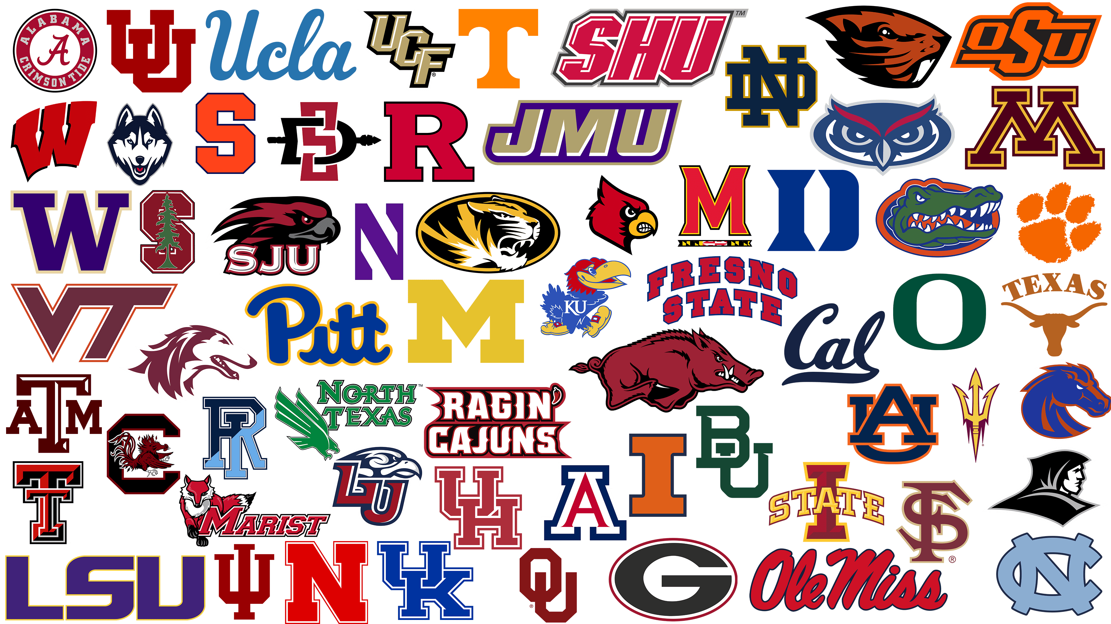
 Most Famous Softball Logos PNG
Softball emerged as an alternative to baseball, designed to be less harsh and aggressive. Its appearance is linked to the desire to enable women and children to participate. The fast pitching, lighter ball, and smaller field made the game accessible, engaging, and universal. Gradually, softball grew into a major sporting phenomenon.
The global popularity of softball began in the mid-20th century when the first championships were held. The New Zealand men’s team became the absolute leader among men, proving their superiority in seven tournaments. Women’s softball, meanwhile, became the United States’ premier sport, with female athletes securing 12 world championship titles.
At the Olympic level, softball gained recognition only in women’s competitions and was added to the Summer Olympics. Debuting in Atlanta, it remained in the Olympic program for several cycles, briefly disappeared, and then returned to the Tokyo Olympics, which have a strong affinity for this sport.
The article will discuss the identities of popular American softball teams that achieved global fame through their success and distinctive symbolism. Each team’s story is conveyed through the symbolism and color schemes of its emblems.
Florida Atlantic Owls
![]()
The Florida Atlantic Owl’s emblem appears aggressive due to the owl’s gaze. It uses deep blue, red, and silver. Red accents resemble eyebrows, highlighting the bird’s stern character. The owl symbolizes wisdom, and its stern gaze suggests the team’s uncompromising competitive attitude.
Arkansas Razorbacks
![]()
The emblem features a fierce boar lunging forward. The artists meticulously detailed the boar to convey its combative spirit, with sharp tusks, furrowed brows, and tense muscles that emphasize aggression. The burgundy color, characteristic of the university, enhances the impression of vigor. The name recalls the animal’s wild nature. The boar has been the team’s mascot since 1909, when a coach first compared the players to this animal for their persistence on the field. Today, the Arkansas Razorbacks’ emblem is popular among softball fans and has become a symbol of the state as a whole.
Arizona Wildcats
![]()
The Arizona Wildcats logo centers on the letter “A,” executed in vivid red and dark blue. The letter is enclosed in a strong, dark blue outline that contrasts with and emphasizes its shape. Red signifies the team’s fighting spirit, while blue adds confidence. Strict lines emphasize discipline and aggression, conveying the team’s determination to achieve victory. The visual design appears convincing, embodying the University of Arizona’s character and athletic traditions.
North Texas Mean Green
![]()
The North Texas Mean Green emblem reflects the team’s aggression and energy through an eagle slicing through space. The predator is depicted in an attacking pose, its sharp contours emphasized, and the lines on the wings create a sense of speed. Above the bird figure is the team’s name, “North Texas,” set in a powerful font with white edges, giving the letters a three-dimensional look. The distinctive green color symbolizes the team’s youth, vitality, and determination to win. The eagle’s dynamic posture becomes a metaphor for the athletes’ quick reactions and fighting spirit, emphasizing the team’s ambition on the softball field.
Texas Tech Red Raiders
![]()
The Texas Tech Red Raiders emblem features the letter “T” in red and black. The letter’s geometric design, outlined in gray, makes the image appear volumetric and vivid. Red signifies strength and confidence, while black represents rigor. The logo conveys the team’s masculinity and assertiveness, showcasing the combative spirit of Texas Tech University’s athletes.
Stanford Cardinals
![]()
The Stanford Cardinals logo features a bright scarlet “S” with a green pine tree at its center. The pine conveys a natural character and a sense of sustainability, emphasizing the university’s connection to California’s forests. The scarlet color reflects the team’s boldness and energy. The pine tree makes the emblem stand out among traditional athletic symbols, reminding us of Stanford’s commitment to ecology and active lifestyles. University athletes proudly wear the emblem, demonstrating dedication to victory and ecological initiatives.
LSU Tigers
![]()
The LSU Tigers logo features large letters, with the “LSU” lettering in deep purple, which emphasizes the team’s prestige. The rigid, geometric letters reflect the strong, confident character of Louisiana athletes. The purple color reflects university traditions and symbolizes the team’s nobility, sportsmanship, and pursuit of excellence. The university is one of the most successful athletic programs in the United States.
UCLA Bruins
![]()
The UCLA Bruins emblem expresses collegiate style through the smooth inscription “Ucla.” The letters are in a soft blue, in line with the university’s heritage and status. The cursive lines of the logo add lightness, highlighting the team’s agility and dynamism. The blue hue symbolizes determination, reinforcing the university’s image as a leader in athletic competitions. The identity is simple by design but imbued with the spirit of tradition, representing the team’s victories and its aspiration to be first.
Rutgers Scarlet Knights
![]()
The Rutgers Scarlet Knights logo features a bold red “R”. The letter’s form appears stable, reflecting the team’s strength and reliability on the field. The bright red color relates to the team’s name and symbolizes courage, competitive spirit, and players’ will to win. A thin line outlines the letter, adding neatness and attractiveness to the logo.
Fresno State Bulldogs
![]()
The Fresno State Bulldogs emblem is represented by text. The words “Fresno State” are arranged in an arch, showcasing a collegiate style. The red letters feature rigid geometric shapes and are complemented by a dark blue outline, which enhances the design’s visual impact. The red-and-blue color palette reflects the team’s symbolism and conveys its players’ fighting spirit. The arched arrangement of the text is traditional in collegiate sports, adding a sense of heritage and spirit. The vibrant and bold logo effectively conveys the team’s character and competitive spirit.
Maryland Terrapins
![]()
The Maryland Terrapins logo is expressive, featuring a massive red “M” letter outlined in gold and black. The angular, strict forms of the font convey the team’s power. A lower banner in Maryland flag colors emphasizes the team’s regional identity. Red symbolizes the players’ dynamism, gold speaks of victories, and black adds authority to the design. The visual composition underscores the team’s character on the field.
Oklahoma State University Cowboys
![]()
The Oklahoma State University Cowboys emblem consists of the intertwined letters “OSU,” rendered in bright orange and outlined in black. The lettering uses an angular font that conveys speed and determination, characteristic of the team’s athletic style. The color palette reflects the spirit of the team and its fans, whose enthusiasm resonates throughout every game. The identity evokes university traditions and the athletes’ combative nature. The vivid orange symbolizes determination, distinguishing the team from competitors.
Tennessee Volunteers
![]()
The Tennessee Volunteers logo features a large, vibrant orange “T” at its center. The font is minimalistic and characterized by clarity and solidity. The bright orange shade is associated with energy and passion, reflecting the team’s character and competitive aggressiveness. Over the years, the logo has become established among fans as a symbol of victories and sporting traditions. The simplicity of execution enhances its recognizability.
James Madison Dukes
![]()
The James Madison Dukes logo features the bold letters “JMU,” rendered in bright purple with a golden outline. The color symbolizes ambition and grandeur, reflecting the team’s name. The golden border adds expressiveness to the design, highlighting the team’s importance and its aspiration to lead. Students and athletes at the university identify themselves with this vibrant emblem, viewing it as a representation of their team spirit and athletic character.
Marist Red Foxes
![]()
The Marist Red Foxes’ emblem conveys the team’s character through the image of a cunning fox stepping forward. The animal’s gaze is piercing, and its movements are soft, showing players’ cleverness and readiness to outplay any opponent. The fox’s reddish color reflects the team’s fiery spirit, emphasizing players’ assertiveness. Next to it is the team’s name in a clear, stylized, italic font, enhancing the dynamic feel. The fox was chosen as a tribute to the college’s mascot, which has been the college’s mascot since its founding. The identity symbolizes the team’s softball agility and cleverness, helping athletes feel confident on the field.
Arizona State Sun Devils
![]()
The Arizona State Sun Devils’ emblem features a sharp and aggressive trident painted in bright gold with a dark maroon outline. The gold color conveys Arizona’s hot climate and the team’s combative character. The trident evokes the image of a sun devil, underscoring the university athletes’ boldness and assertiveness. The symbolism conveys an energetic mood and emphasizes the Arizona State University team’s sports ambitions.
Auburn Tigers
![]()
The Auburn Tigers’ emblem unites the letters “A” and “U” into a solid, monolithic mark. The dark blue color, paired with an orange outline, lends the logo a sense of richness, making its appearance stable and serious. The letters’ shapes are clearly defined, and their interlocking forms look harmonious, reinforcing the team’s sense of unity. The orange outline enhances contrast, emphasizing the players’ energy and vitality. University tradition is intertwined with the history of victories. The image conveys the team’s determination and aspiration to win at softball.
Kansas Jayhawks
![]()
The Kansas Jayhawks logo features the university’s mascot, a bird in a striking pose, rendered in deep blue, bright red, and golden yellow. The mascot wears shoes with playful details, and a white inscription “KU” adorns its chest. Blue reflects team confidence, red emphasizes excitement, and yellow adds a cheerful touch to the design. The bird symbol is tied to Kansas history, dating back long before it became the university mascot. Its origins are linked to two local birds: the jay and the hawk, which represent freedom and strength.
Florida Gators
![]()
The Florida Gators’ emblem features an intimidating green alligator’s head, baring its teeth. The contrast between the green skin and the bright blue-orange outline underscores the image’s aggressive character. The blue-orange color scheme references university symbolism and emphasizes the team’s ambitious spirit. Clear lines and sharp predator teeth demonstrate the strength and aggression for which the softball team is famous. The logo serves as a sign of team pride and competitive spirit in all competitions.
Nebraska Cornhuskers
![]()
The Nebraska Cornhuskers’ emblem features a large letter “N” that symbolizes both the team’s name and the state of Nebraska. The bright red color symbolizes the team’s fighting spirit and reflects the region’s agricultural roots, particularly its corn cultivation. The letter is clear and large, giving it both energy and seriousness. The white outline makes the design contrastive. The softball team embodies the spirit of a region that values perseverance and teamwork, and the logo captures the atmosphere of unity and support among players and fans.
Michigan Wolverines
![]()
The Michigan Wolverines logo features the letter “M” in a deep yellow shade. The color expresses the team’s optimism. The minimalist shape reflects the university’s stability and demonstrates continuity in its athletic traditions. The letter “M” is historically associated with the university, highlighting the team’s softball heritage.
Ole Miss Rebels
![]()
The Ole Miss Rebels logo features neat lettering of the team’s name in red, outlined in dark blue. The cursive font resembles a handwritten signature, adding a touch of liveliness to the emblem. The bright red reflects players’ character, confidence, and emotionality on the softball field. The name “Ole Miss” is an informal nickname for the University of Mississippi, historically associated with its traditions and southern charm.
North Carolina Tar Heels
![]()
The North Carolina Tar Heels’ emblem consists of the intertwined letters “N” and “C” in a soft blue. Blue symbolizes the team’s calmness and confidence. The intertwined letters emphasize the players’ unity, reflecting their friendly attitude and team spirit. The logo has strong historical roots, establishing it as a symbol of the university’s athletic achievements.
Utah Utes
![]()
The Utah Utes logo features two intertwined letters, “UU,” painted in a deep red. The shade symbolizes the team’s will, determination, and fighting spirit. Clear, strict lines make the visual image expressive, while the letters’ geometric shapes emphasize the university team’s stability and reliability. Visual simplicity ensures easy recognition of the Utah Utes’ symbolism, reflecting the university’s enduring athletic traditions.
Syracuse Orange
![]()
The Syracuse Orange logo appears massive because of the letter “S,” which is rendered in a geometric style with neat, angular cuts. The vibrant orange color symbolizes the energy the team needs during games. The blue outline serves as a frame, enhancing the emblem’s contrast. The team has a rich history in softball, and its symbol conveys the group’s athletic character, highlighting its determination and commitment.
Missouri Tigers
![]()
The Missouri Tigers’ emblem features a tiger’s head, drawn with bold lines that emphasize movement and aggression. Golden and white strokes on a black background create a sharp contrast, reflecting the team’s assertiveness and fighting spirit. The oval outline completes the composition, and its golden hue amplifies the image’s dynamic. The logo reflects the softball team’s aggressive style, known for its fierce play and drive to win. The team’s symbol embodies the university’s athletic spirit, underscoring its authority in collegiate sports.
Providence Friars
![]()
The Providence Friars’ emblem depicts the stern profile of a monk, his face obscured by a black hood. The use of black and gray shades conveys a somber aesthetic. The logo’s design references the historical roots of Providence University, founded by Dominican monks whose image symbolizes perseverance and spiritual strength. The drawing’s clear lines create a memorable style, supporting the team’s reputation as a disciplined, strong-willed competitor on the athletic field.
Georgia Bulldogs
![]()
The Georgia Bulldogs logo stands out for its distinctive oval-shaped “G.” The black letter with a white center is outlined in red, emphasizing the team’s passion and grit on the field. The symbol originated from the university’s desire to create an emblem that conveys boldness and team spirit and was first used in the mid-20th century. It became an element of university pride, associated with viewers as a symbol of strong character and victories in softball competitions.
Southern Illinois Salukis
![]()
The Southern Illinois Salukis logo features the aggressive head of a Saluki, a breed of hunting dog, depicted in burgundy. The drawing’s contours are sharp and pronounced, creating an impression of a fast, attacking team. The name Salukis honors an ancient breed renowned for its speed, endurance, and ability to excel over long distances. The Southern Illinois University team adopted this symbol to emphasize their attacking style of play. The image of the Saluki has become a symbol of aggression and a spirit of victory, associated with the pursuit of leadership and dominance.
Liberty Flames
![]()
The Liberty Flames emblem employs a confident, contrasting color palette. The letters “LU” appear in bold red, outlined with white and blue. Above them is an eagle’s head, symbolizing pride and independence. The eagle looks forward, reflecting the team’s determination to win. The colors match the American flag, emphasizing Liberty University’s and its teams’ patriotism.
Kentucky Wildcats
![]()
The Kentucky Wildcats logo consists of monumental letters “U” and “K” that overlap to form a cohesive composition. The distinctive blue letters, outlined in white, create a strong visual effect that conveys the team’s dedication to university traditions. The letters’ geometry appears stable, inspiring respect for the team’s strength and professionalism. The graphics are minimalistic and facilitate quick recognition. This symbolizes the team’s athletic character and persistence.
Houston Cougars
![]()
The Houston Cougars logo is sporty, featuring intertwined letters “UH” in a rich scarlet shade with contrasting white outlines. The scarlet tone symbolizes persistence, while the geometric shape of the letters emphasizes determination. The clarity of lines and the proportions of the font shape the team’s image, which is focused on winning. The team’s style is characterized by persistent play; therefore, the graphic symbolizes the athletes’ energy and connects traditional and modern styles.
Notre Dame Fighting Irish
![]()
The Notre Dame Fighting Irish logo is notable for the intertwined letters “ND,” executed in deep blue with a golden outline. The strict geometric font symbolizes tradition and stability. The color scheme reflects the university’s history, which is closely tied to victories and the team’s rich heritage. Blue is associated with reliability and confidence, while gold is associated with prestige. The emblem symbolizes the university’s athletic fame and the team’s confidence on the field.
Baylor Bears
![]()
The Baylor Bears logo depicts the interlocking capital letters “BU” in green. The symbol features confident lines and shapes, suggesting cohesion and unity. The green hue connects to nature and renewal, conveying the idea of athletic growth. “BU” is easily perceived due to its large geometric form. The design reflects the team’s athletic composure and serves as a reminder of the university’s strong traditions.
Boise State Broncos
![]()
The Boise State Broncos’ emblem features a bronco’s head, colored blue with an orange outline. Blue conveys firmness, while orange adds energy. The animal’s design is aggressive, with expressive eyes and sharp lines, symbolizing the team’s athletic character. The name honors wild horses and symbolizes the players’ free spirit.
Wisconsin Badgers
![]()
The Wisconsin Badgers’ emblem features the letter “W” set at an angle, symbolizing determination. The bright red color, framed by a black outline, conveys the team’s aggression and embodies its strong-willed character. The “W” appears carved from powerful sports equipment, emphasizing the athletes’ fighting spirit. The red shade reflects the energy of fans and players, their unified emotions and aspirations on the field.
Virginia Tech Hokies
![]()
The Virginia Tech Hokies’ emblem features the letters “V” and “T” merged into one unified symbol. The burgundy color of the main part is accentuated by a thin orange outline, creating contrast. The angled lines of the letters add energy and convey the team’s dynamic style of play. The simple design, with clear lines, effectively expresses the symbol, illustrating the team’s persistence and ambition on the softball field. Using traditional university colors helps establish a connection between the identity and the university’s history and spirit.
Indiana Hoosiers
![]()
The Indiana Hoosiers logo consists of the stylized letters “IU” combined into a single frimson cfigure. The color conveys the team’s authority, highlighting its long history at the top of collegiate sports. The letters form a strict monogram with stable, confident contours. Over the years, this emblem’s style has become an integral part of Indiana’s sporting culture, symbolizing the university’s historic victories and its athletic traditions.
Louisville Cardinals
![]()
The Louisville Cardinals’ emblem stands out for its aggressive depiction of the cardinal bird, sharply rendered in red and yellow. The stern gaze and tightly clenched beak underscore the team’s fighting spirit and combative nature. The red color conveys energy, reflecting the dynamics and ambitions of the University of Louisville’s sports teams, which have repeatedly demonstrated strength at national softball competitions. The cardinal symbol emphasizes Kentucky’s traditions, where these birds are common, and embodies the team’s competitive spirit and readiness for sporting challenges.
Sacred Heart Pioneers
![]()
The Sacred Heart Pioneers logo captures attention with its bold, italicized “SHU” letters, set against a deep red background. A gray outline enhances the contrast and creates a sense of volume. The design is characterized by the sporting energy and assertiveness inherent to the Connecticut University team. The brand is known for its history of persistence, as the name “Pioneers” signifies trailblazers, reflecting the team’s readiness to advance and conquer new sporting milestones. The identity conveys strength, reinforcing the reputation of the university’s athletes as determined competitors.
Minnesota Golden Gophers
![]()
The Minnesota Golden Gophers logo features the letter “M” in maroon with a golden outline. The maroon color conveys the team’s composure and emphasizes university traditions. The sharp angles of the letter lend the image confidence, showcasing the players’ assertiveness. The “M” symbol is closely associated with the University of Minnesota’s successful softball teams, reflecting the university’s athletic character.
Clemson Tigers
![]()
The Clemson Tigers logo is charismatic thanks to its bright orange tiger paw print. The rough edges create the impression of a real wild animal track, conveying the team’s spirit and energy on the field. According to legend, the original print was taken from an actual tiger at a zoo, ensuring authenticity. The vivid orange shade conveys excitement, underscoring the team’s readiness to compete for leadership in softball. The emblem fosters players’ competitive spirit, enabling them to pursue new achievements with confidence.
Northwestern Wildcats
![]()
The Northwestern Wildcats logo features a concise purple “N”. The shade is associated with the university’s royal traditions, reflecting the team’s ambition and prestige. The letter’s strict geometric lines emphasize its character, combining simplicity and aggression. The angle of the central stroke enhances the image’s dynamism. The identity naturally reflects their fighting spirit, showcasing the desire to achieve new successes on the field.
Iowa State Cyclones
![]()
The Iowa State Cyclones emblem is distinguished by its shape and bold color combination. Central to the composition is a large letter “I,” rendered in a deep burgundy shade and outlined in gold. The word “STATE” is placed across the central letter in bold, gold lettering, with reddish shadows that add depth and energy. The logo’s visual design conveys the team’s assertiveness and drive to dominate in the sports arena. The burgundy-and-gold color scheme connects it to university traditions and the team’s vibrant play, highlighting their confidence and competitive spirit on the field.
Illinois Fighting Illini
![]()
The Illinois Fighting Illini logo features a wide “I” in vivid orange outlined in blue. The color combination reflects the team’s passion and its stability throughout sporting history. The University of Illinois made the “I” emblem a symbol of an indomitable character, emphasizing the ambition and unity of athletes on the field. The letter’s geometric precision underscores the team’s discipline, while the color contrast enhances its emotional impact.
UCF Knights
![]()
The UCF Knights logo features the letters “UCF,” originally intertwined, in gold with white accents and a black outline. The university chose the golden shade to symbolize the team’s ambition, while the strict font conveys their determination to win. Because of its inclined positioning and sharp lines, the design appears dynamic. It has become the hallmark of the Central Florida Knights, further affirming their reputation as leaders on the softball field.
Alabama Crimson Tide
![]()
The Alabama Crimson Tide logo stands out with its expressive design. The main feature is an elegant, antique-style red letter “A” set inside a circle bearing the team’s name. The name is written in a light-colored font, contrasting with the ring’s bright background. The circular form symbolizes the unity and connection of players to the University of Alabama’s history. The red color symbolizes the team’s passion for sports and their energy in every match. Due to its design, fans perceive the emblem as a symbol of the team’s reliability and focus on softball success.
Oklahoma Sooners
![]()
The Oklahoma Sooners logo has interlocking letters “O” and “U” in a rich crimson shade. The large, angular letters create an impression of firmness and solidity. The crimson color symbolizes the team’s strength of spirit and will to win. The term “Sooners” is rooted in Oklahoma’s historical past, referring to the first settlers who moved into new territories in search of opportunities. Like these pioneers, the softball team aims to achieve new athletic milestones. The visual identity reflects players’ competitive character and university pride.
California Golden Bears
![]()
The California Golden Bears’ symbol is presented by the abbreviation “Cal,” written in dark blue cursive script. The curved lettering appears harmonious, highlighting the brand’s traditional nature and its affiliation with collegiate sports teams. The color reflects respect for the university’s history and creates a sense of reliability.
Texas Longhorns
![]()
The Texas Longhorns’ emblem features a confident silhouette of a longhorn bull’s head, characterized by its long, impressive horns. A rich shade of orange symbolizes the team’s perseverance and strength. The word “TEXAS” above emphasizes the university team’s authority. The choice of mascot has deep historical roots in Texas, where longhorns traditionally symbolize independence and power. These qualities are embodied by the softball players, who demonstrate character and persistence on the field.
Washington Huskies
![]()
The Washington Huskies’ emblem appears minimalist, consisting solely of a massive letter “W” in deep purple with a subtle gold outline. The restrained style symbolizes the team’s prestige and its pursuit of excellence. The colors reflect the university’s status and traditions, while strict lines emphasize the team’s reliability on the softball field. The letter’s classic shape ensures recognition. It reflects the team’s determination to achieve leadership and high standards.
South Carolina Gamecocks
![]()
The South Carolina Gamecocks logo features a fighting rooster in an aggressive stance, symbolizing the team’s ferocity and determination. The burgundy rooster, with sharply defined lines and spread wings, is set inside a massive black letter “C,” outlined in burgundy. The bird’s depiction is aggressive, and details like claws and an open beak convey readiness for battle. The team’s traditional colors highlight its combative character and determination to win. The entire image serves as a visual statement of the players’ courage and persistence.
Duke Blue Devils
![]()
The Duke Blue Devils logo features the letter “D” in dark blue. The letter is created in a simple geometric style, with straight, clear edges. The chosen design style conveys the team’s strictness and discipline. The university selected blue to signify classic standards and athletic authority. The visual image symbolizes the team’s athletic character and shows confidence on the field.
San Diego State Aztecs
![]()
The San Diego State Aztecs’ emblem reflects the team’s energetic character. Central to the logo are intertwined letters “S,” “D,” and “S,” pierced by an Aztec spear. Red highlights the athletes’ combative nature, while black adds depth to the silhouette. The spear recalls the heritage and spirit of the ancient Aztec civilization, whose image the university chose for its teams. The symbol illustrates the university’s historical connections and athletic ambitions.
Pittsburgh Panthers
![]()
The Pittsburgh Panthers logo appears playful because the original design of the “Pitt” inscription resembles handwriting. The dark blue color symbolizes tradition and confidence, while the gold outline enhances contrast, adding brightness to the identity. The inscription has smooth curves, creating a feeling of lightness. The brand is linked to Pittsburgh’s city history, where sports have played a crucial role. The inscription, which has become the team’s hallmark, conveys the atmosphere of a city known for its sporting traditions.
Saint Joseph’s Hawks
![]()
The Saint Joseph’s Hawks logo looks assertive. It depicts a hawk with burgundy feathers and a black beak. The bird gazes forward with confidence and determination. Ruffled feathers highlight the predator’s character, while sharp lines add dynamism. Below the bird’s head is the large inscription “SJU,” in a bold, white-outline font that contrasts with the hawk’s dark silhouette. The color palette adheres to the team’s brand colors, emphasizing a sporty, aggressive tone.
Texas A&M Aggies
![]()
The Texas A&M Aggies logo looks monumental, with the massive letters “ATM “forming a solid sign. Each letter is geometric, conveying the team’s power and fighting spirit. The burgundy color reinforces the connection to university traditions, symbolizing strength and determination to win. The emblem’s history is interesting: it originally served as a sign for the university’s military cadets and later became a symbol for all sports teams. The letters intertwine in an unusual way, reflecting player unity and team energy. Today, the identity is recognized at stadiums and fields as embodying the athletic spirit and university tradition.
Oregon Ducks
![]()
The Oregon Ducks logo features the letter “O” in deep green. The “O” shape is slightly elongated with smooth lines. The natural and fresh green color emphasizes the team’s connection to its home state, Oregon. The symbol reflects the players’ character, resilience on the field, and ability to overcome obstacles. The logo inspires athletes toward victory.
Rhode Island Rams
![]()
The Rhode Island Rams logo is uniquely executed, combining the letters “R” and “I” into a complex graphic divided diagonally between dark blue and sky blue. This design emphasizes player unity and the team’s modernity. The sky-blue shade symbolizes openness, while dark blue adds stability to the composition. The intertwined letters create an unusual image that sets the team apart.
UConn Huskies
![]()
The UConn Huskies emblem features a husky’s face in a cold color palette accented by a bright red tongue. The animal’s blue eyes express determination. Dark blue symbolizes the team’s discipline and commitment. The dog breed represents the team’s endurance and desire to win.
Florida State Seminoles
![]()
The Florida State Seminoles’ emblem features the intertwined letters “FSU, in a vintage style. The garnet hue adds a classic touch. Golden outlines complement the luxurious design. Gothic fonts inspire the intertwining letters and honor the university’s traditions, which date back to the 19th century. The elegant font lines are complemented by the letters’ strict shapes, emphasizing the blend of classical elements and contemporary design. The identity is used on equipment, reinforcing the sporting status of one of the most titled softball teams in the NCAA.
Louisiana Ragin’ Cajuns
![]()
The Louisiana Ragin’ Cajuns logo stands out with its style and original design. The name is represented by three-dimensional letters, painted white with red outlining on a dark background. A small red pepper complements the image, hinting at the team’s fiery energy and aggression. Using this spicy element in the emblem conveys the explosive character of the athletes from Louisiana. The lettering highlights the team’s strength and dynamism, creating a striking appearance on the playing field.
Oregon State Beavers
![]()
The Oregon State Beavers logo depicts a beaver’s head in contrasting colors. The animal was chosen as the university’s symbol due to its persistence. The graphic reflects the team’s assertiveness and readiness to fight for victory.
Conclusion
We examined American softball teams from an unusual perspective through their visual identities. The symbols illustrate the vibrancy of the softball world. Each emblem represents a team’s history and achievements. Logos conveys the game’s atmosphere, the player’s character, and the fans’ emotions. Softball has united numerous fans, and appealing logos have made these teams famous not only at home but also far beyond their borders.